Saturday, March 31, 2012

Odd Men Out

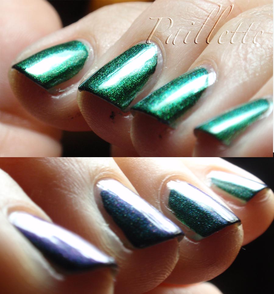
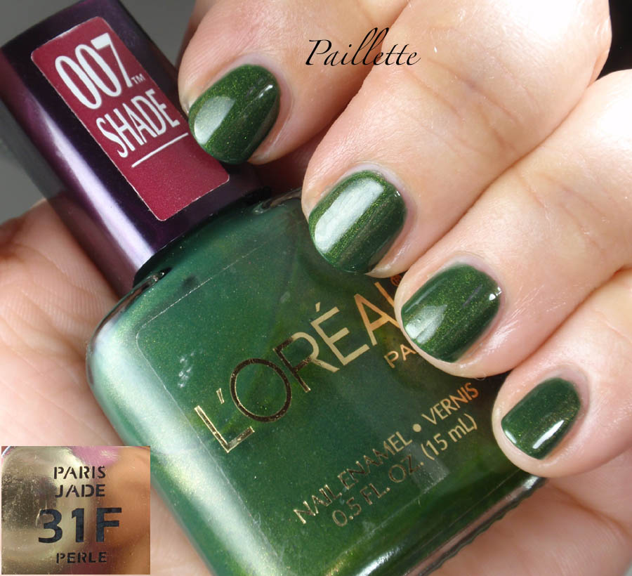
A trio of greens that finish up the month of March.
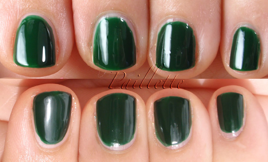
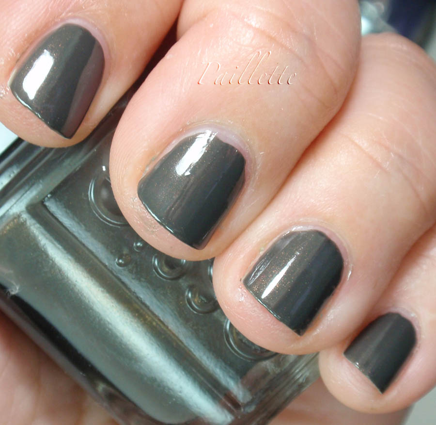


CQ Corduroy.
A soft grayed down green, that is very subtle and very understated. It is a blue leaning green, though, not a khaki. It reminds me of cactus skin.
Two coats, no worries!


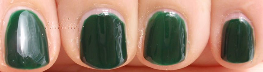
Another dusty grayed green. Similar to CQ Corduroy in that aspect, however very much the yellow version of a dusty gray green.
Two coats, but not very self-leveling and seemed to show, despite being a creme, all the application. Very odd.
I wanted to love this polish a lot because I love Nicole by OPI in general, but I am kind of let down by it.
Don't know why, hmm.


Typo!!!!

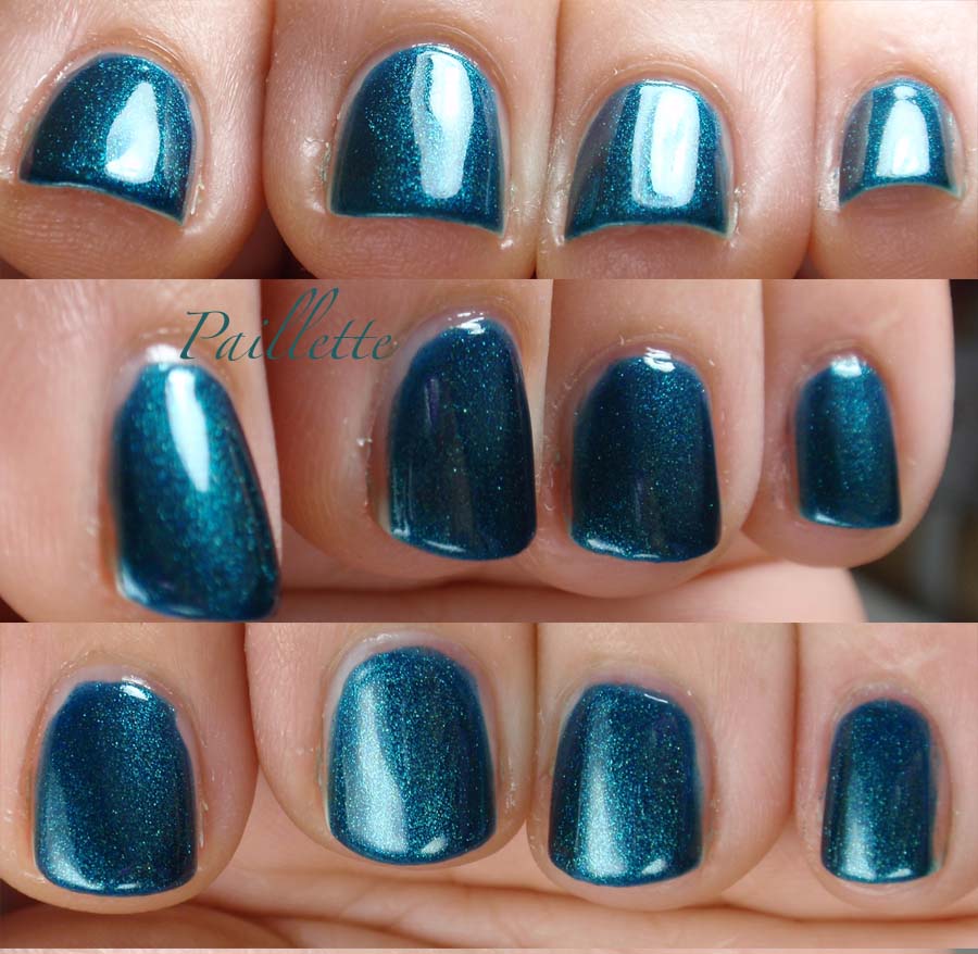
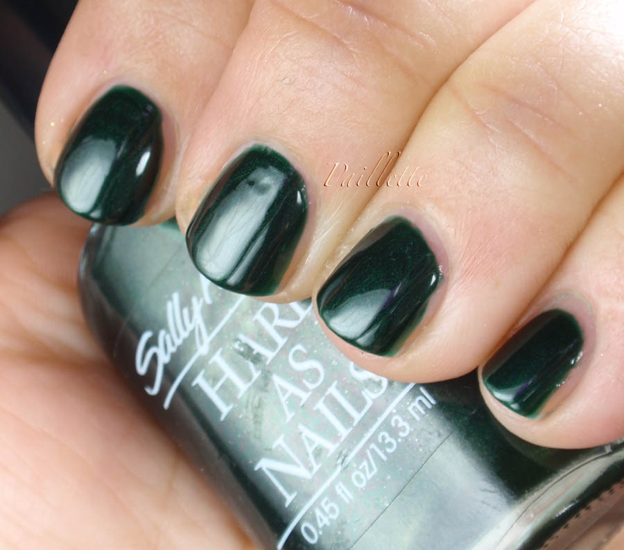
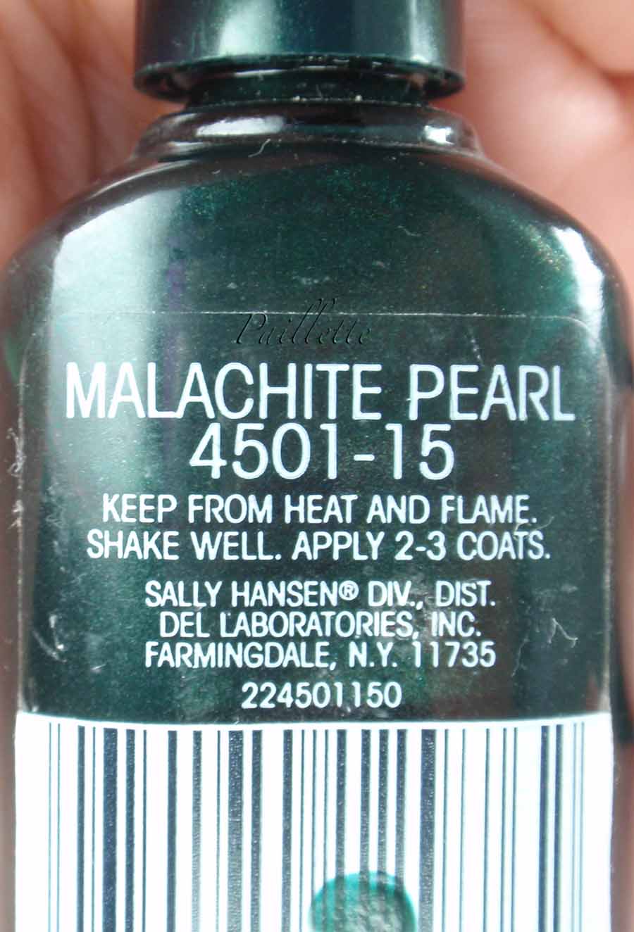
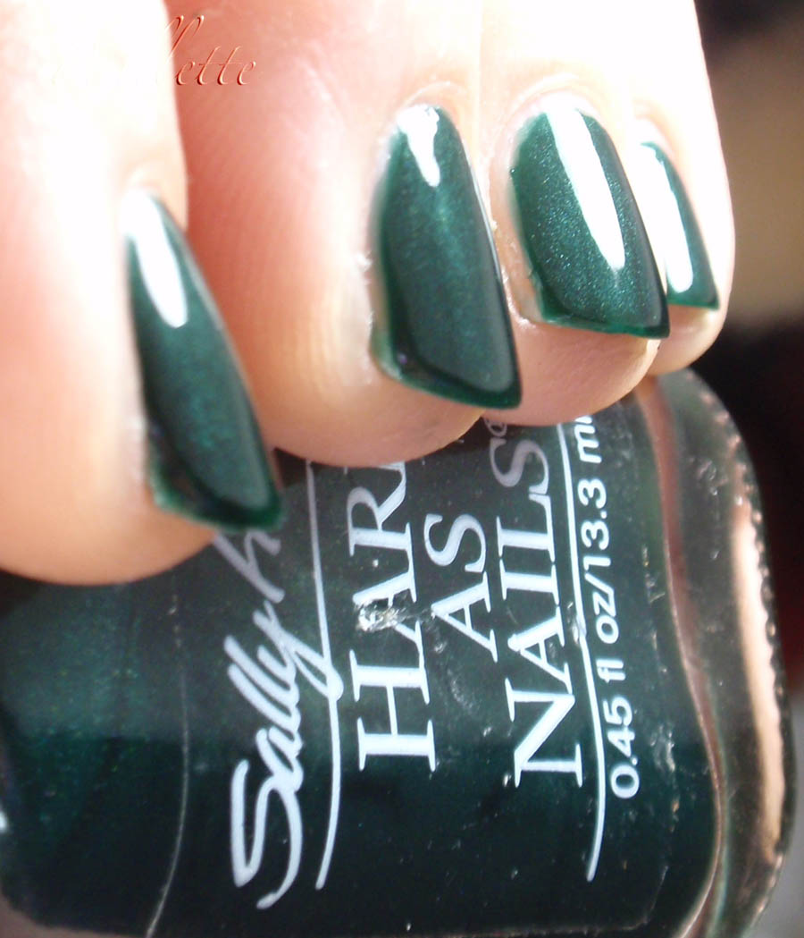
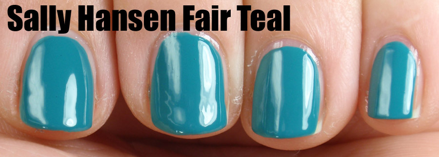
Fairy Teal, but Sally Hansen. A two coater that is absolutely gorgeous! I threw it in because I have not worn this polish in a while, never blogged it and since it's so well known it would be a nice comparison to show how the other two look.

Two coats here, and a lovely formula. Not that "surprisingly quick dry" type of polish, but with a quick dry top coat, it's a winner!

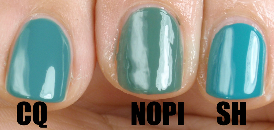
Here is a comparison of all three.


The Fairy Teal is even more bright in real life, but you can see CQ Corduroy is a very grayed down version of that blue leaning green.
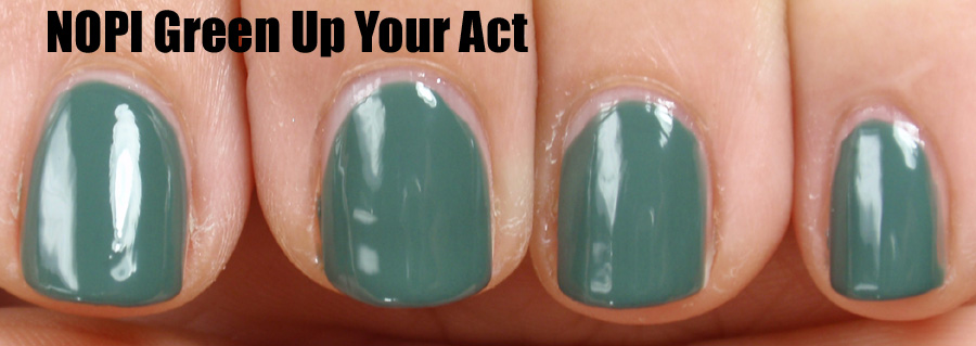
Green Up Your Act really shows that it's not self leveling and shows all the bumps, for some reason I could not get it to just play nice!

Thanks for reading my little nail polish journal!

And thanks for going along for this green ride!! I really love doing themes, perhaps another theme down the pike!
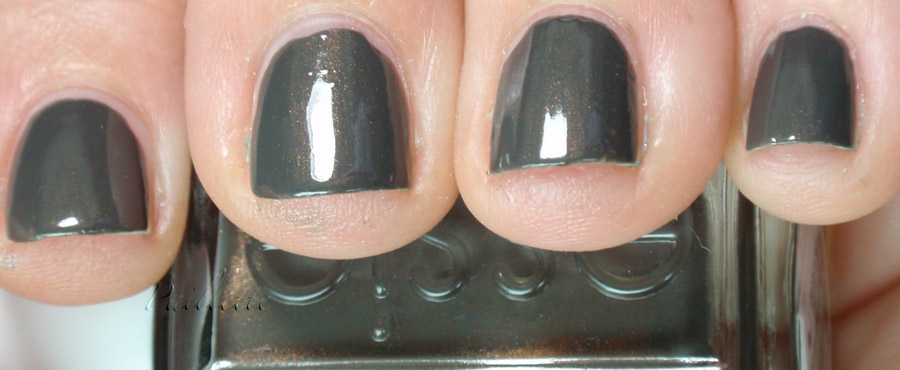
Two Olives in My Martini

Here are a couple of olive greens for you!

When I was a little kid, I love knock knock jokes.

Knock knock!
Who's there?
Olive!
Olive who?
OLIVE YOU!!!

Ok, back to business....


Avon't Olive Green. This is one coat! Seriously!!

It is supposed to be a dupe of RBL's Orbis non Sufficit, a blogger polish from a few years ago. I confess that this formula knocked my socks right off. I wore it for a few days and admit that it really is such a nice formula that I think I will poke around and look for some unique colors in this brand. Also, I will say that I am so off some of the department store brands that I might rethink Avon for some basics. It may be an anomoly, but a pretty nice one!!


Old UK Maybelline Racing Green. Nothing really as sharp or deep as a true racing green, but a soft shimmer, or perhaps a touch frosty, olive green.

It is two coats here and easy to wear. Easy to use, and since clean up is such a challenge for me, you can see pretty easy to apply.

I found both on eBay for a really low price. I knew about Avon's Olive Green as a possible dupe, but I confess that sometimes I browse around for obscure green polishes because I'm a little bit loving green.

ha. ha.  ahem.

Thanks for reading my nail polish journal!

Thursday, March 29, 2012

A couple of Mints

I wanted to do a huge mint comparison, but for some reason I never got it together because I had so many other greens I wanted to do!

Here are a couple!

Diamond Cosmetics Sea Spray


Three coats, a gorgeous light green shot through with golden shimmer.


The base is more of a frosty shimmer than a creme, giving a frothy/foamy feel. Ever been on the beach on a really windy day and the foam blows up along the beach? It reminds me of it!


As you can see the gold shimmer is very pronounced, which is always a win!


A combo, here, e.l.f. Mint Cream topped with Barielle's Buddha-ful

Mint Cream was a little bit dicey at first, but in the end worked out. I have many, many, many mints, so this isn't high on my "favored children" list.
Barielle's Buddha-ful is a milky based minty flake. It shifts a little bit lavender pink, which is ever-so-precious, I love it so much!!

One coat here did the job!

I will say that of all the flakies I own, this one did a weird thing, it actually made dents in the polish creating a few divets where a smooth surface was what I expected after two top coats.

Even after I redid this manicure with another mint - Essie, I believe - it did the same thing. Odd. I may need a thicker top coat, though my quick dry is pretty thick. Oddness.

Here are the bottles!


As you can see here the e.l.f. looks a bit more turquoise, but it's not quite so brightly pigmented or as blue in real life.

If you are into flakies, Buddha-ful is a nice one.

Also Diamond Cosmetics is always an affordable way to get a lot of neat colors. I am not affiliated in any way, but I always seem to like what I see when I put on their polish.

Thanks for reading my nail polish journal!

Wednesday, March 28, 2012

A Form of Art

Duochromality.

I love how light plays with color. I know at times I've gone all gobbledy-gook over tungsten versus daylight corrected light, or how a color is affected by afternoon sunlight. I know. I'm a little nutty.

But duochromes are pretty nice.

This is Artform 503. It's pedigree is that, and Australian nail polish fans know this better than I do, it started out through Artform, but they no longer sell it under their label, but it is now under Ozotic's label. Same number.

Here is a photo:


It goes from a green to a silvery purple. Though it is rather amazing as a green.


I admit my photos don't capture the warmer shift to a rose/mulberry it is supposed to shift to, but I do love it so much.

That beetle carapace green is a fave of mine.

I think now that I've finally really worn it, I need to look for more of these!

Thanks for reading my little nail polish journal!!


Tuesday, March 27, 2012

Comp-ish

Well, I've been hoping for some sunshine, but the one day it shone, I wasn't able to swatch, so holo greens are kind of off the table for march, but I plan on doing holos later this summer.

OK, so what do I have?

An OPI: Jade is the New Black.

I am not sure where the title comes from, but hey, it's OPI, pun-tacular polishes are de rigueur.


It is not a super bright green, but not like any jade I have ever seen - for the sake of clarity I've been to museums in London, New York and Taiwan, that's my experience with jade sculpture, and white jade is even more valuable, plus I had some jade jewelry while living in Japan.

However, despite my experience, this does fall under the jade category. It's a soft green, not dusty, but demure. It reminds me of Essie Going Incognito, but not quite as nice, frankly.
I blogged about it here.

I feel like it's a workhorse green. Last time I wore it I was stunned by the incredible lack of stamina it had in the tip wear department. This was not much better despite double topcoat action in a subsequent wearing.

Two coats, nice dry time and a pretty color.

What else to do with a color that leaves me a little less than enthralled? Use it as a layering polish!

Onward with the comps!

I have these three white/cream colored polishes with a blue shimmer that remind me of Illamasqua's Prism. Though Illa calls theirs an iridescent, it sure looks blue in a lot of swatches, although I am sure it pulls some pink, per their site photo.

I am in kind of a mode to declutter and am building up toward a blog sale basically because I really feel I've got little room to expand when new stuff I'm excited about comes along.

Ok, so here are the bottles:


OPI - Give Me The Moon. A milky sheer in a pale gray/white base. Blue shimmer is strong.

L.A. Girl - Sheer Impulse. The lightest latte colored, almost buff really, one and it has a blue shimmer, too.

WetnWild - Ice Blue Pearl. White base, blue shimmer.


I put them over JitNB:


You can see that GMTM is in a pale shimmer base, Sheer Impuls is also in a less translucent base and the IBP is in the most translucent base.
I think I used two coats on all of them. GMTM was reviewed here in the OPI Night Brights Collection I did last year.

No opalescence, but blue shimmer. WetnWild seems to be closest to a sheer top coat, etc.

Then I plonked them over a pale pink/nude from L'Oreal called Pink-a-Boo. This is a Dollar Tree polish that is pretty nice for a base coat and lets these sheers do their thing: let the shimmer shine through.


Photos enlarge, too.

(I sometimes see my blog on a monitor with a different resolution than my home computer and I kind of freaked out how big my photos are, so I am making them a touch smaller)

This is all two coats over the base coat.

I love how this base polish looks, I also like all three shimmers. Each has its strength and though L.A.Girl is probably my least favorite, the WetnWild is such a win, if you don't have a blue shimmery polish, try to find it - it's not on the market at the WnW drug store display - because it does pull a little pinkish/purpleish, too, so it has that iridescence, which reminds me of Illamasqua Prism.

OK. Wow. I just googled it and I see it's a hard to find polish. Yoiks. How did that happen? Holy cats!

Thanks for reading my little nail polish journal!

Saturday, March 24, 2012

Princessa's Rule

Another Princessa found it's way into my collection and I wanted to share.


It's called Emerald Shimmer, though I will say that it pulls slightly more blue in the photo here than it is in real life, it's a true emerald.
A glass fleck shimmer that needed four coats to get any sort of coverage, I am a little bummed out. I think over a green creme, though it will be fine.
I had hoped for a foil when I saw it, but in real life it was not meant to be.

I have to laugh about the Princessa bottles.


As a layering polish I think it's a good one, I didn't try it, but since it's such an obscure brand/polish I doubt if it's more than just me saying "hey! look at what I have!"

Thanks for reading my little nail polish journal!

Thursday, March 22, 2012

Trekker Homage

Yes, Misa did it and did it well.

I don't have a collection to show you, but I love Misa's Surreal Escape from winter 2011. I have most of them and as I write this I plan on buying the ones that I don't have.

Misa, like Milani, is another underrated brand.

This one, Phasers on Stunning dings three important bells in my "happy nail polish place"

First the pix, then the bells:


Here we have three coats and you can see that it is similar to OPI's Not Like the Movies, but in a green version. That same metallic duochrome, but instead of purple and green, this is a soft grassy green to an amber/coral combo. Still has that metallic skin feel and a pop of glitter hither and thither.

What are the bell ringers?
Well the formula for a start. Wow, nice! I love it! Though this is a bit sheer requiring three coats, it really isn't problematic.
Next is the duochrome, who doesn't love it? It pops and I don't have to contort to see it.
Finally the name. Phasers on Stunning!! Are you kidding??? I was the kid who grew up on Star Trek re-runs and could name the episode on the first 30 second opening bit! Never been to a convention and I grew out of it after a while, but I still hold a fond memory of watching that show and all the corn that it could dish up. Who doesn't love a fun cultural reference?

Otherwise, I threw it over black to see how it shook out:


Although it is sheer, this, at one coat, really does pop some of that delicious green that I love so well.

You can see the scant glitter, but the green is more pronounced against the dark, which I love.

Much love here!

Thanks for reading my little nail polish journal!

Tuesday, March 20, 2012

Milani = Underrated

I have to say that if Milani is pretty consistently good whenever I try it.

Here is another example: Key Lime Shine.


A gorgeous chrome that has a pale green tint. Though "lime"isn't the first thing I think of, I can hardly fault it. It feels more like a pale celadon or celery, but lime? Hmm.

The thing I am realizing about chromes is that they are pretty unforgiving of ridged nails or bubbles. This mani would be perfect if I had done a bit of clean up, for I will concede it shows every wobble.

What is a win, for me at least, is that this has a ridge filling base coat underneath it makes this look so nice. I will wear it again and always wear this basecoat, it's two coats basecoat and two coats KLS and I love the shine.

This polish also dried pretty fast, but chromes in general do, for me, at least.

If you can find it - it's not on the Milani site - I recommend it above the Sally Hansen Chromes for the formula. Most chromes cover very well, and this one is two coats.

I believe if you Google it you can still find it, though, which is good. I recall reading about this on Polish Addict blog (a great blog, now no longer active, but loaded with some amazing swatches, one of my inspirations for getting into polish) had some great pix and I had to get it. No regrets, that's for sure.

Thanks for reading my nail polish journal!

Thursday, March 15, 2012

Green Jelly Franken

Almost!

A few weeks back I finally did the SinfulColors' Holiday 2011 collection. A number of great shimmers and one deeply greeniful green called Last Chance.

I mentioned frankening it into a jelly so I added about 1/4 of a bottle of Last Chance to about 1/2 a bottle of some clear polish.

I pulled out Illmasqua Rampage, because it was the closest thing I have to that kind of jelly dark green and you can see the similarities and the differences.


Illamasqua Rampage is on top with two coats, my Last Chance Franken is on the bottom with three coats.
You can see that Last Chance is a touch more yellow and perhaps three coats is too much, because as I look at the photos, I see that it is less jelly than I'd hoped and still rather dense.

Another side by side comparison:


Left to right:

  • Franken
  • Rampage
  • Franken
  • Rampage


Here you can see the franken is a bit more translucent, and a bit more light/yellow than Rampage.

Still, a worthy polish to franken a dark green jelly, that's for certain!

Thanks for reading my nail polish journal!

Wednesday, March 14, 2012

Seeing Green?

L.A. Girl Deep Sea Mica is a hard polish to photograph.


I swear I think I'm in an alternative universe when I see this photo. I swear on a stack of bottles of acetone that this is actually a much more green polish. It is a teal-y kind of green, with some green flash going on. My camera would not see it any other way.

So this is sort of the exception to the greens, but it is a beauty of a polish. Three coats, very metallic, but not chrome.

Here's the bottle:


Am I drifting away from green? Like a leaf in a gust of wind, I go where my eye takes me, though my camera may not follow.

Meanwhile, three coats, easy to work with formula and pretty good dry time, though not one of those "wow, it's already dry?" kind of polishes.

I find mine at Discount Cosmetic Outlet's website, a sort of online Dollar Tree, that appears to have them cheaper than Cherry Culture and L.A. Girl's website.

Thanks for reading my nail polish journal!

Monday, March 12, 2012

Summer!

Well, New York Summer, that is!

I have to admit the only reason I purchased Summer Amaranth was to try to franken Nars Zulu. Now that I have a bottle of Nars Zulu, I kind of feel like I should just wear it and enjoy it!

It is a jelly, so it has that boiled sweets, or hard candy look about it. It is very glossy, here it is without a top coat. Nice!!
I will say here and now I absolutely need to do an anti-stain procedure on my nails: it totally is affectint the way this polish looks, I think you can see the pinkie nail is the best because it's less stained, but the other fingers do drag it down into a darker,  muddy green, when in fact it is a bright, clear green. Almost a kelly, but not really.

I love this polish, it's highly affordable, and now that Zulu is out, it's easily found at the etailers that carry it.

I am planning on getting a couple more of that brand, the formula is pretty easy to work with.

Thanks for reading my little nail polish journal!

Thursday, March 8, 2012

Take Me To Your Chateau

Orly's Chateau, no less!


As dark as you can imagine, a pine-y green blue that is quite an amazing shade.

I think it's been largely overlooked in the collection that it originated in, Orly's Holiday 2011. It was filled with a pair of glassy particle shimmer purples and Androgynie. This one, though is very dark, but not impossibly dark.

If you like a vamp, this is a gorgeous vamp.

Here it is under the lamps a little bit brighter to show the shade off a bit better.

Pine-y goodness!!!

Orly's formula was quite easy to apply and though I did use three coats, I had few issues with it (mainly my own application). I didn't do clean-up and I confess that a dark color does show up my squirrel-y application, a lot!

Thanks for reading my little nail polish journal!

Tuesday, March 6, 2012

Lowering the Bar

Dive Bar.

A place that is so nasty that it's supposed to be cool.

Apparently.

When this polish came out I was on it like a flea on a lazy hound.

It has, in the bottle, a gorgeous green, aqua, and purple shift.


This is under lamps, so I think it's kind of a let down for me. Which is a real bummer because in my frenzy to make sure I didn't miss it, I sure did buy a back up bottle, which was probably unwise.

I think, to its credit, under sunlight, it should be quite the fabulous polish, but sun has been unavailable.

It reminds me of a Sally Hansen duochrome, perhaps Rainbow Presents, but without the green/amber shift.

The formula, however, does have a greatness about it: easy to work with, dries easily and wears nicely. My nails are now always under a bit of duress with handling things and so I am really seeing what polishes hold up against it.

I originally pulled this out thinking it might be similar to OPI Glacier Bay Blues, but it's nothing like it. At all.

A little dark, and perhaps a little less wow than I'd hoped, but Essie's formula is always a win.

Thanks for reading my llittle nail polish journal!

Sunday, March 4, 2012

Essie Gets Armed

Essie Armed & Ready is one of those polishes that should be a red and spelled "Armed and Red-y" but it isn't, it's a dark khaki green, the color of an old army blanket, loaded with a gold shimmer.

It's not a true shimmer, but this creme-mit-shimmer, aka "hidden shimmer".

These can be frustrating in low light, but when the good light peeks in, yay team!


Tasty! Lovely contrast against the taupe flavored green. Gold shimmer is my weakness, to be honest.

This is two coats, easy formula and very little I can say about Essie nail polish that isn't good, I love the formula.

Here are some photos where it won't cough up the shimmer:


You can also see that it trends slightly taupe in certain light, too. Other times, quite a muddy green.
Unique color, one of those Ugly Pretty colors I adore.
I like how in the last photo you can see the shimmer in the bottle taunting me. Naughty shimmer!!!

Thanks for reading my little nail polish journal!

Friday, March 2, 2012

Another Green From My Heart

I thought I'd throw out some of my faves to start the month out.

Let's carry on with Sally Hansen Malachite Pearl:


A blackened green shimmer. They call it a pearl, but it really doesn't have a pearl finish at all.


Note the fabulous cap-matching! hello Nail Polish Makers! Bring that back, would ya? I know it's cheaper and more chic to have your own label remain in prominance, but that look is so cool.

Three coats, easy formula, a little loose, but not impossible. I know it's old school chemistry, and it's pretty par for the course when it comes to dry time.

Payoff, though, is so unique:


What more can I say? A beautiful pine green shimmer.

Luminous, fabulous.

I think this is a top ten green for me, totally perfect shimmer, darkness and great color.

If you run across it, grab it, particularly if you love dark green and shimmer!

Thank you for reading my little nail polish journal!

Thursday, March 1, 2012

Third Annual Green Polish For March!

You know it, I love green!

March is a perfect month to throw it all out there!

I have a lot of green and I am swatching my hands off!

First up, is a green that I think you will love, I know I do!


L'Oreal Paris Jade.

It's a glorious deep neutral green with a yellow golden shimmer shot through it. In this light you can see the base isn't too yellow and at times there is a bit of a blue feel to it. But, it really is so gorgeous.

I found this at a pretty recent Dollar Tree venture. I must confess that sometimes the L'Oreal formula is so spot on, I can't see straight! This is no exception - I have found exceptions among these older polishes, too - and though I put three coats on, I won't complain!

LOVE IT!!!
Two snaps up!!!
Not too dark, perfectly neutral green base! Yay!

Here is a bottle shot with the shimmer popping:


You can see how it contrasts with the base so perfectly. Had this been a sharply yellow tinted base green, the gold would be pretty buried in it, but here it emerges so perfectly.

Good gravy, gush much?

I do not have one clue which James Bond movie this is released with, though I am guessing it's some time during the Pierce Brosnan run. Don't you wish bottles had a date on them?

Thanks for reading my little nail polish journal!