Showing posts with label Jessica. Show all posts

Tuesday, March 29, 2016

Greens for March: Jessica's Envy

Here's a polish I've had for too long and realize I hadn't blogged it. Worse, or best(?) I have a dupe!
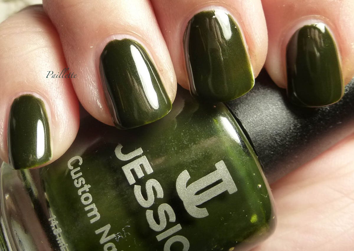
Jessica Divine Pine


Three coats, no top coat. Shine on! Note please that my photo is blown out a bit to show the yellow undertone, it's darker than this normally.

This polish has secret shimmer, but it's super hard to see. It also doesn't have a uniform creamy formula, the particles are larger, like they are in a suspension (well duh) but the first coat shows more of this, and the overall effect is that it gives it a "foamy" feeling rather than a straight creme finish. This lightens the polish up, more light moves through it and it's less dense than a standard creme.

It's warm, it's a yellow green that's been crushed down into the vamp zone. Kid yourself not, it will go black under much lighting.

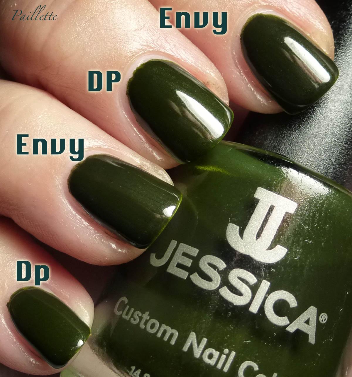
I compared it to Zoya Envy and guess what? Yup....


I would say that Zoya is a slight bit deeper, though not by much. The more I look at the photo the less I can really tell them apart. 

I've blogged Zoya Envy a couple of times before and formula-wise, I'd say they were about the same. 

Jessica is readily available online. I found mine on their website quite some time ago when I first saw this polish on Scrangie's site. 

If you like shades like this, but want something a little more luminous than Zoya Envy, this polish I do recommend. Though Zoya works the sales quite often, I've noticed (at least this year) they limit promotions to polishes they want to promote, rather than people like who have long wish lists and a tight budget. 

Thanks for reading my little nail polish journal!
Wednesday, December 9, 2015

Peridot, et al.

Three duochromes that are pretty nice!


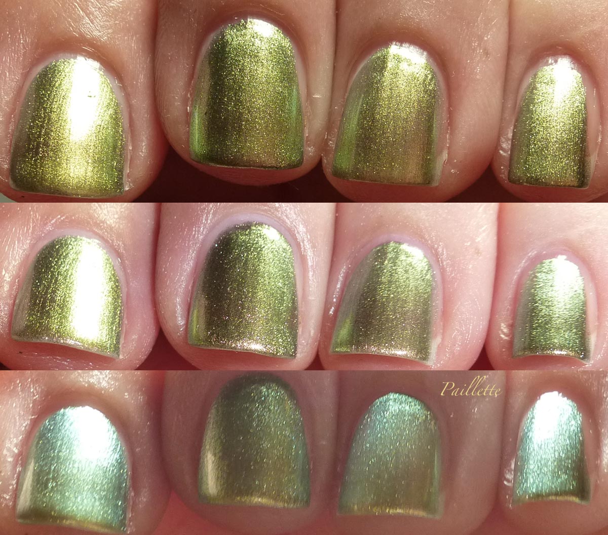
OPI Just Spotted The Lizard and Chanel Peridot


Two coats, no top coat. 

Left to right:
OPI Just Spotted the Lizard
Chanel Peridot
OPI Just Spotted the Lizard
Chanel Peridot

I know they are dupes, it's pure and simple. The OPI is a bit more thin than the Chanel. Pure and simple. Two coats of Chanel Peridot=Three coats of OPI JSTL.

I also think Chanel Peridot has a bit more lustre, but perhaps that's more personal taste.

Enlarge the photo and you can see that OPI really needs a third coat.

Here's another photo set showing a bit of the change:


Very, very, very hard to get the beautiful blue/green shift. These babies sat squarely at a warm earthy warm.

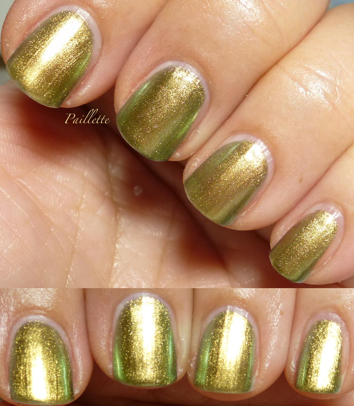
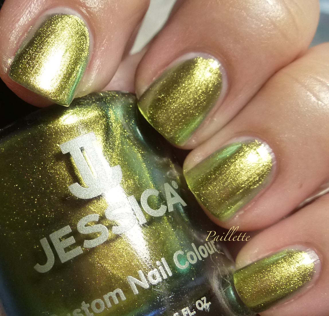
After I finished this comparison, I was putting it away and found a bottle of Jessica Iridescent Eye.
(What?)


Jessica Iridescent Eye


This is as good as the Chanel. This is three coats, where, two would have done, I just habitually do three.

I love this polish because it isn't quite as hard as the OPI and Chanel, which is means that it shifts over into the softer blue/green with a bit more ease.

Here's a photo of the shift:


Voila.

Many people complained about how warm Chanel and OPI are, but it's the nature of the beast. Jessica Iridescent Eye is more neutral, because it pulls into that cooler realm more easily.

It's like a bridge between Missha HGR01 (blogged here) and OPI/Chanel's offerings.


Thanks for reading my little nail polish journal!
Saturday, April 4, 2015

Jessica Texture Collection Part 2 - Glitters

Hey Sweet People!

Back with a set of Jessica texture polishes I found on Nail Supplies rather randomly.

Here is a back link to part 1.

All are three coats, no top coats. Definitely needed three coats.

As I mentioned in part one, these were slow to dry. In some cases I had to redo them because I'd nudge one thinking it was dry and complete failure to dry occurred. Ugh.


Rough and Ready


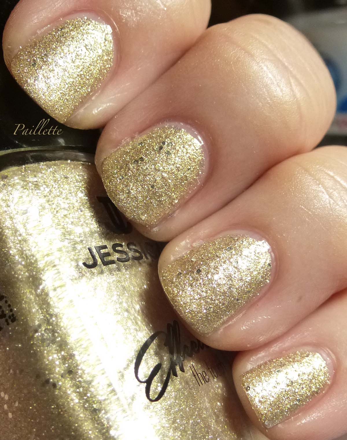
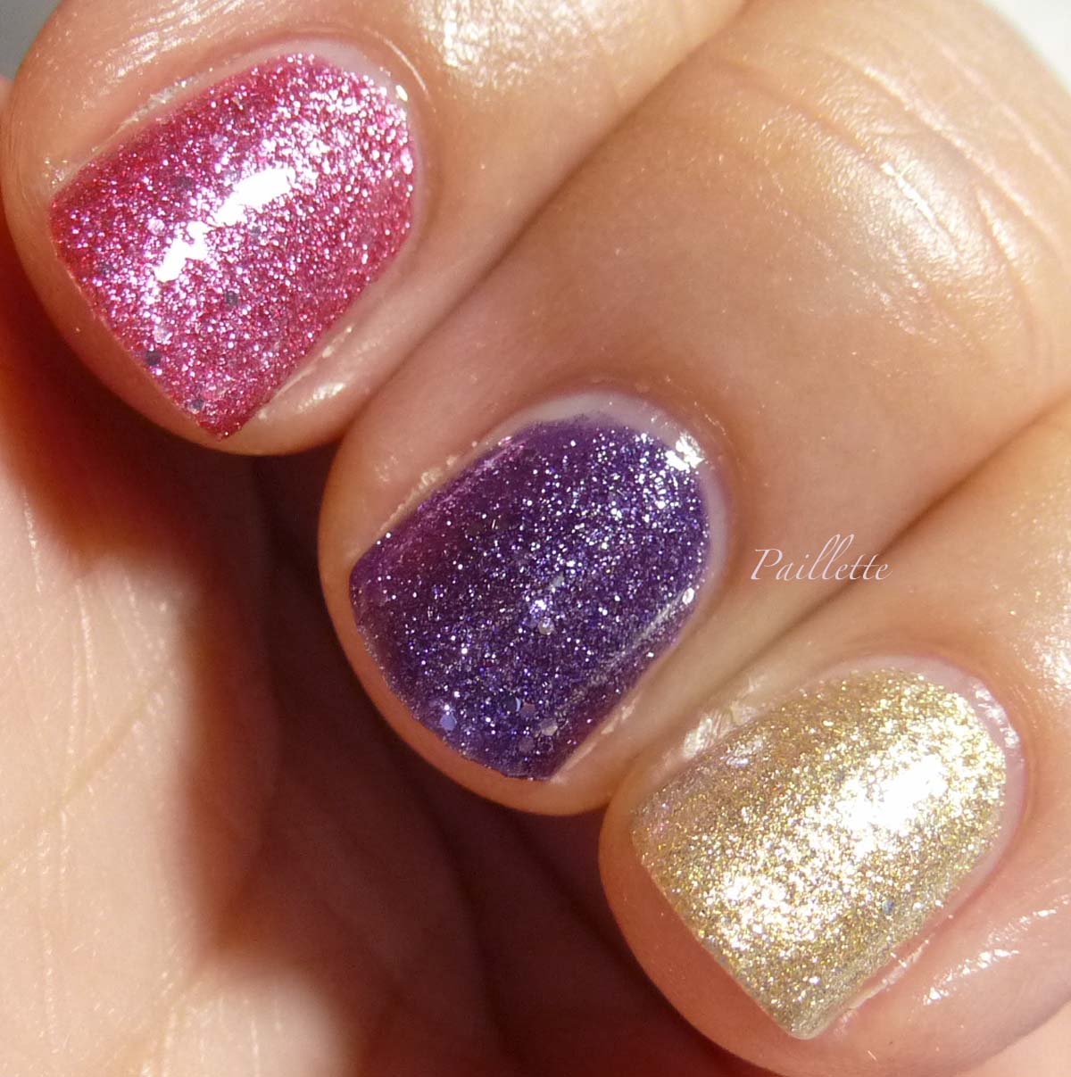
I really love these glitter textures. There is just not much fail with a full cover glitter. This is a delightful strawberry red and there is a bit of silver tossed in as well.


Gives Me Goosebumps


Beautiful blue violet type of purple. A little blown out at the top, but captures the color well. Some silver mixed into the purple.


Touch It


Beautiful gold that is fairly neutral for a gold, nothing to suggest a platine, but not super yellow.


Here is trio shot:


Left to right:

  • Rough and Ready
  • Gives Me Goosbumps
  • Touch It

This photo is a bit warm, but shows a bit more texture of the gold.


These are available at Nailsupplies.us, not affiliated. I will say at $4.20 plus the cost of shipping, which begins at about $14 and is usually $16, this means I am prone to buy more polishes when I do order to offset shipping. This breaks down to nearly $5 and at only 11 mL per bottle this isn't quite the "deal" when you add the way the formula performs.

$30 for this formula fiasco. There are days when I wish I could return crap like this to etailers.

Right now I have all of these in a little box until I figure out what to do with these.
It's like the matrix won't hold together and the formula won't evaporate and I'm used to dealing with polishes that are slow to dry (my old Sally Hansen collection has been a LABOR of love on that point).

I will try more base coats and see what is up. Personally, I really hate that I can't use any decent, easily available base coat and make a polish work. This is such a non-issue I never even think about base coats beyond: do I have one.


Meanwhile, I think that there are textures equal to these in look, but certainly with better formulas.

It's not like you want to put a big old quick dry top coat in order to dry it, the texture partially includes that "dry" look that comes with the texture territory.

Thank you for reading my nail polish journal.

Thursday, April 2, 2015

Jessica Texture Collection Part 1 - Pastels

I found a set of Jessica Cosmetics textures on NailSupplies when I ordered several other polishes and the end of 2014.

I have to admit this trend doesn't feel like a total fad, it's more like a finish that you can live with or without, and with a topcoat you can do both.

Nice.

Three are pastels that look like plain creme polishes in the bottle, three are traditional texture glitters. I don't know about you, but I've had many a glitter polish pre-date the texture trend by just being rough by its very nature. 

Tried to get angles to show the texture, which is challenging in the pastels, but not impossible. 

Let's get busy!

A few notes about the pastels.
They have a low profile texture made up by tiny glass beads. It's not bad and not too difficult to cover up with a top coat should you move on past texture.
I will say that these were tricky to get to dry. I had a bit of trouble with them not drying very well. I wanted to attribute this to my base coats, which are basically reworked nudes with some treatment and regular base coat mixed in. The worst part though, was when I tried to wear one again and had a normal base coat and still had issues.
This has really taken a lot of pleasure out of this collection.
Worse still, for me, was that these were over $4 a bottle plus shipping added on at Nail Supplies - which always is a minimum of $14, so easily 50 to 75 cents a bottle.  I am not super pleased and I will try to be neutral on this point in my review because your experience may be different.
I will add, though, that my bases that I used were thin as heck, one coat, and dried to a very hard finish before I even swatched each time. Garrrrgh!!!

Finally: three coats as these are thin polishes. No top coats.


Excite Me


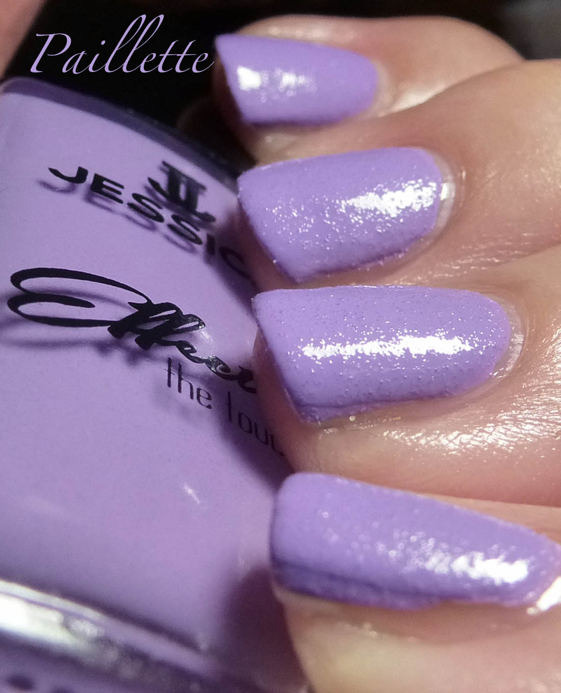
This is a medium lavender. Not bad. I like that it's a clear light purple and not too dusty.


Here is a better image of the texture.


Chills Down Your Spine


You can see in the bottle the translucent beads clinging to the side. This is tricky on the nail because it will read as translucent holes. You need at least three coats on this one.


Here you can see more of that clear bead action. 


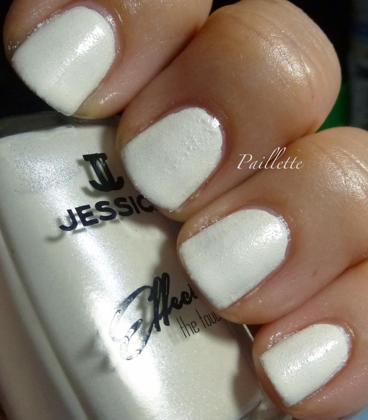
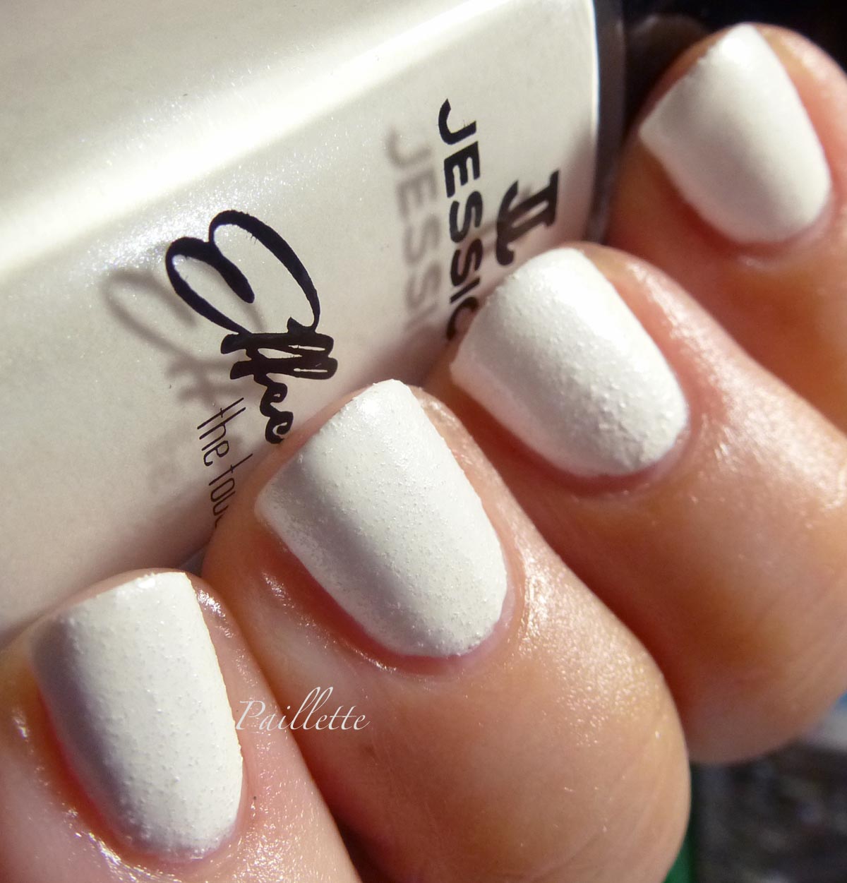
White Hot


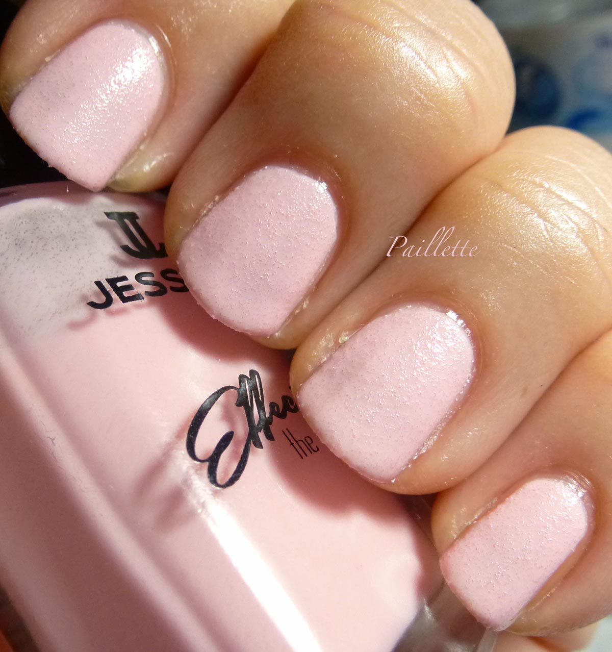
This is a little under exposed to see the texture. White Hot is a pearly white. I love the pearl finish without frostiness. This is so nice.


Better exposure and you can see, particularly if you enlarge it, the pearly finish. Well, at least in the bottle.


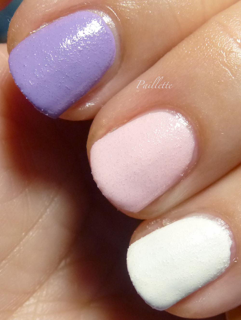
Here is a trio shot:


Left to right:

  • Excite Me
  • Chills Down Your Spine
  • White Hot

If you enlarge, you can see the way the little texture balls make clear windows on the lower layers in the pink polish.


I will say that these days unless the color is particularly RARE or UNIQUE if the formula isn't up to snuff, I feel a strong sense of disappointment. That "spark of joy" to quote Mari Kondo, isn't there.

Soon I will blog about my efforts to upgrade craptastic formulas, but I don't know if I want to do that with these.
Hate to have a grouse-y post, but these really just weren't the win. 

Part 2 soon!

Thank you for reading my little nail polish journal!
Wednesday, November 27, 2013

Woodland Creatures

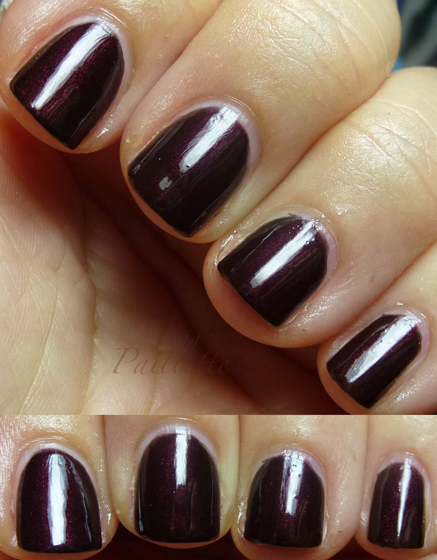
Here are a pair of warm shades of redwood. They are similar, but one is deeper than the other. Both have a black base, but in differing degrees.

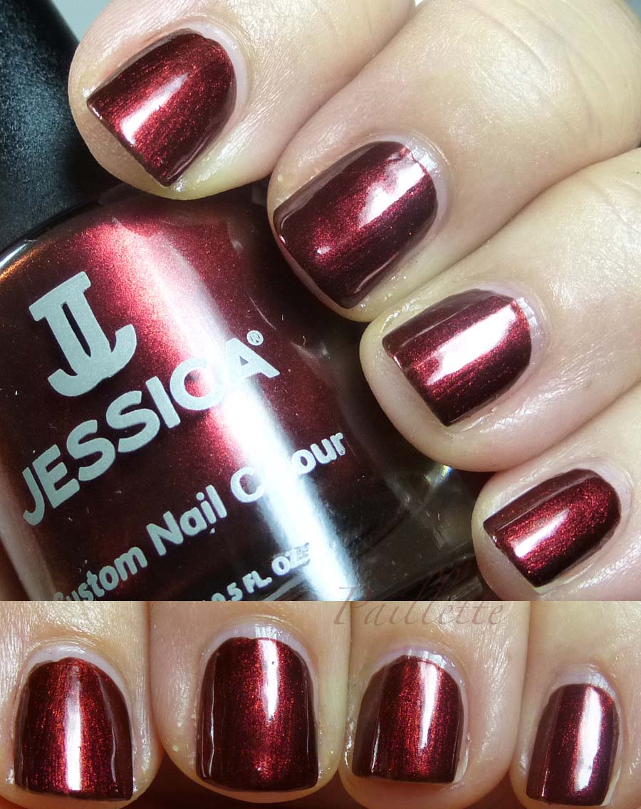
First up a polish I've wanted for a while and found on a blog sale, Jessica Cinnamon Kiss.


Graciously warm shimmer in a black base, blackens around the edges in shadow. Three coats, fabulous formula.
Somewhat hard to find, but there is the Jessica website and it's on Transdesign/Nailsupplies.us
(not affiliated)
Cinnamon Kiss shifts slightly from a madeira to a burgundy. Nice!


Next up is OPI Midnight in Moscow


Very much a deep black base with the same shade of redwood shimmer.
This required four coats, however it handled very well and dried nicely.
Turns black in dark light but the right light enables a flash of this shimmer.
I rather like these blacks with red shimmer. I have a Sally Hansen mini that is similar.

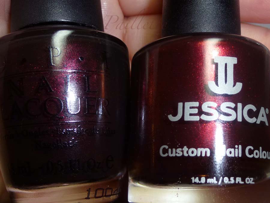
Here they are next to each other:


Really unlike each other Cinnamon Kiss is considerably warmer than Midnight in Moscow, but they both remind me of redwood trees.

Here is my bottle shot!


Hope you enjoyed!

Thanks for reading my little nail polish journal!