Monday, June 29, 2015

Four Foamy Toppers

Hey folks: blog sale is full of stuff!! Thanks!!

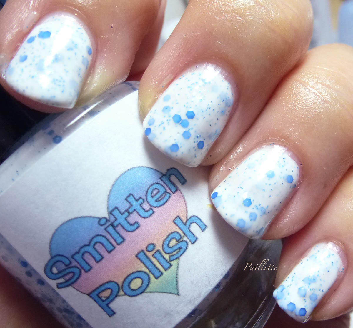
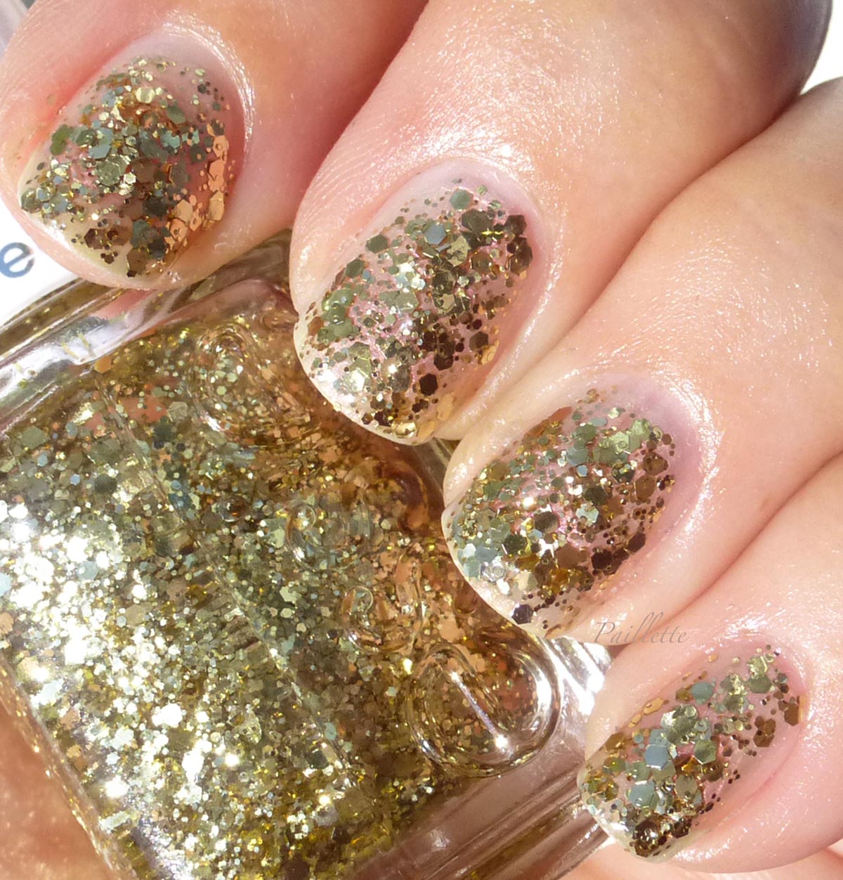
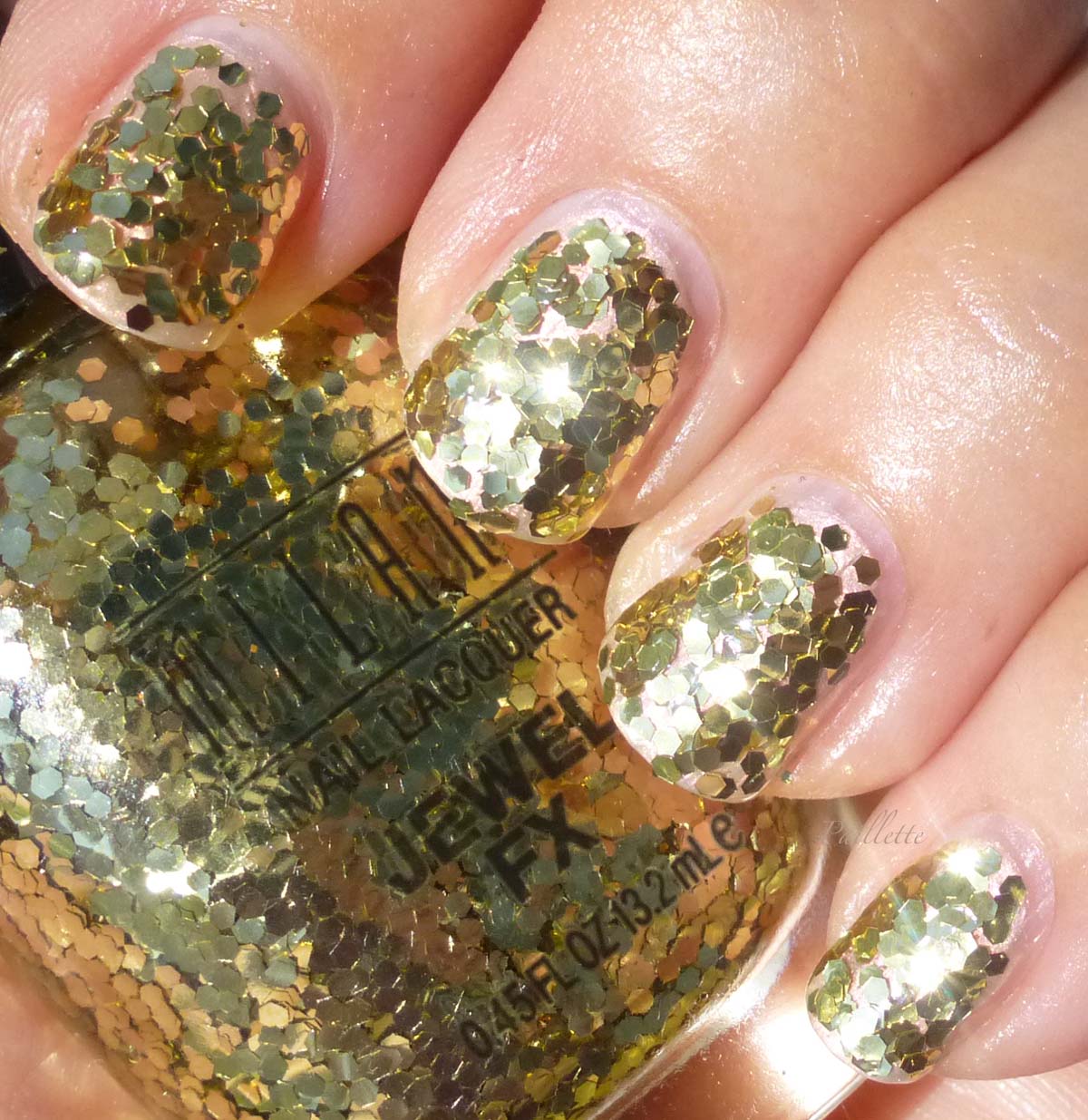
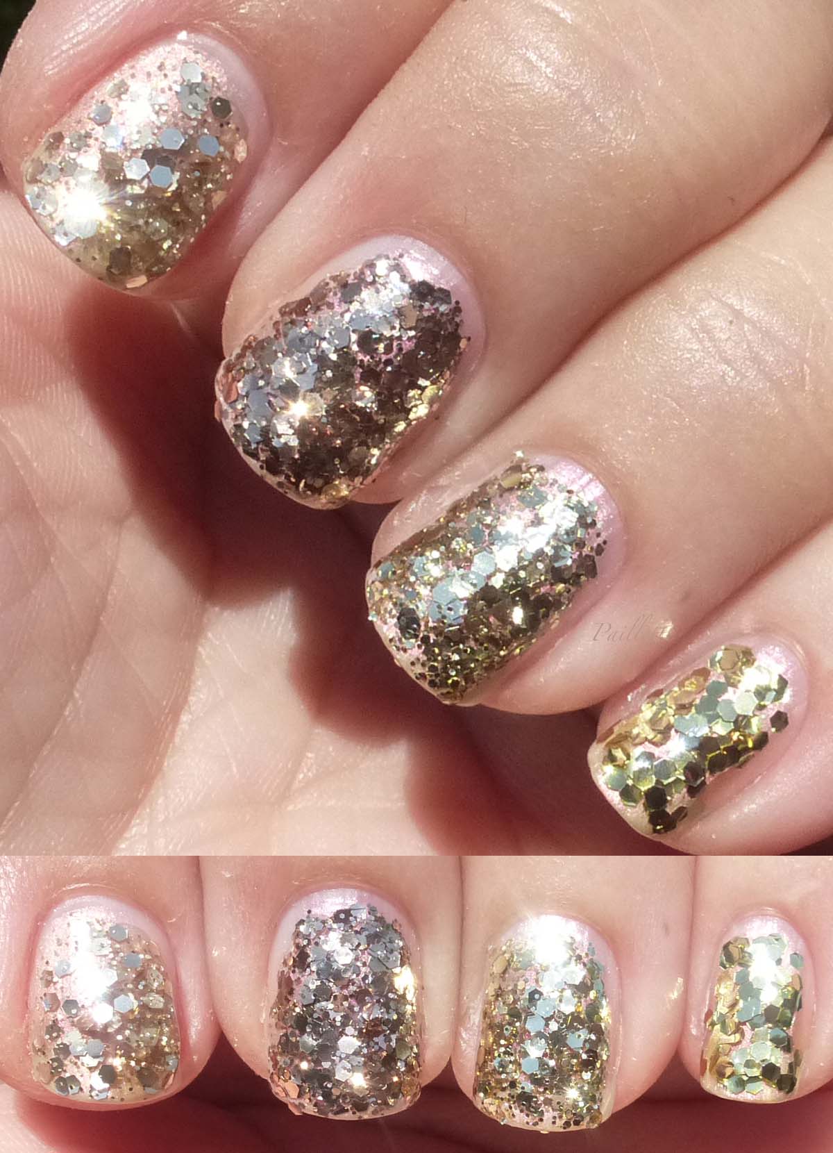
Four toppers that fall under "sheer, but not sheer enough" or "too sheer and won't really build" that are over a pretty medium blue.

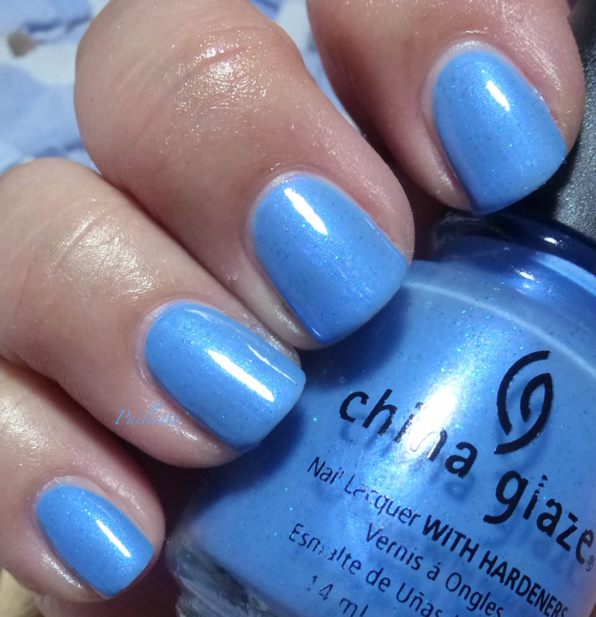
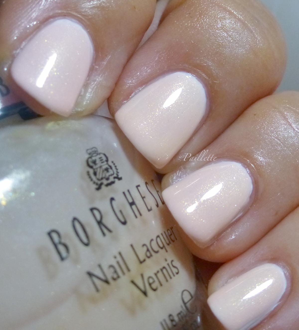
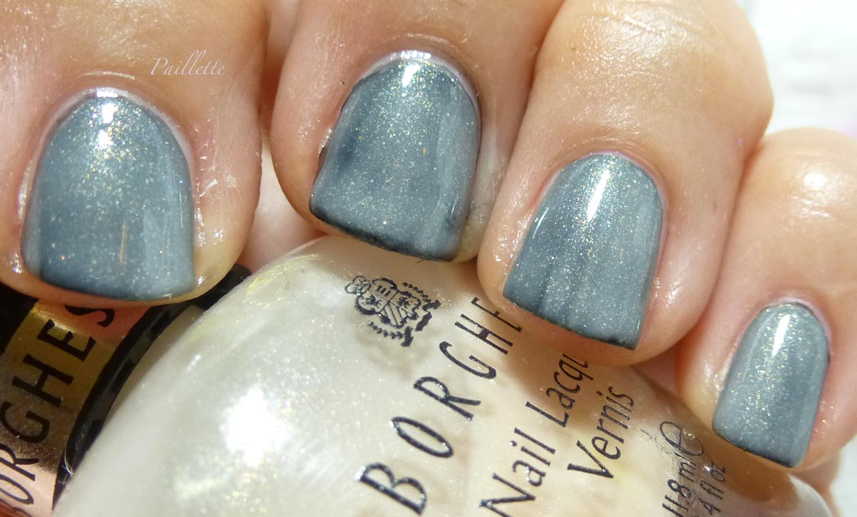
The base is Borghese Capriccio Blue, which I blogged here. It was in their Rapid Dry line, however the Borghese website shows zero nail polish at all, so I think it's gone the way of the Dodo. I believe that you can find the brand on eBay and various places that sell job lotted kind of stuff. I'd suggest, however, that if you want a similar blue, you could easily find something akin to it in the SinfulColors or Sally Hansen or maybe WetnWild or NYC collections. I picked it as a fairly medium shade that would be light enough to not battle with the elements in these polishes that don't do well over deep shades.

Three coats of the Borghese and two coats of the toppers. Oh, no top coat.

Let's go!


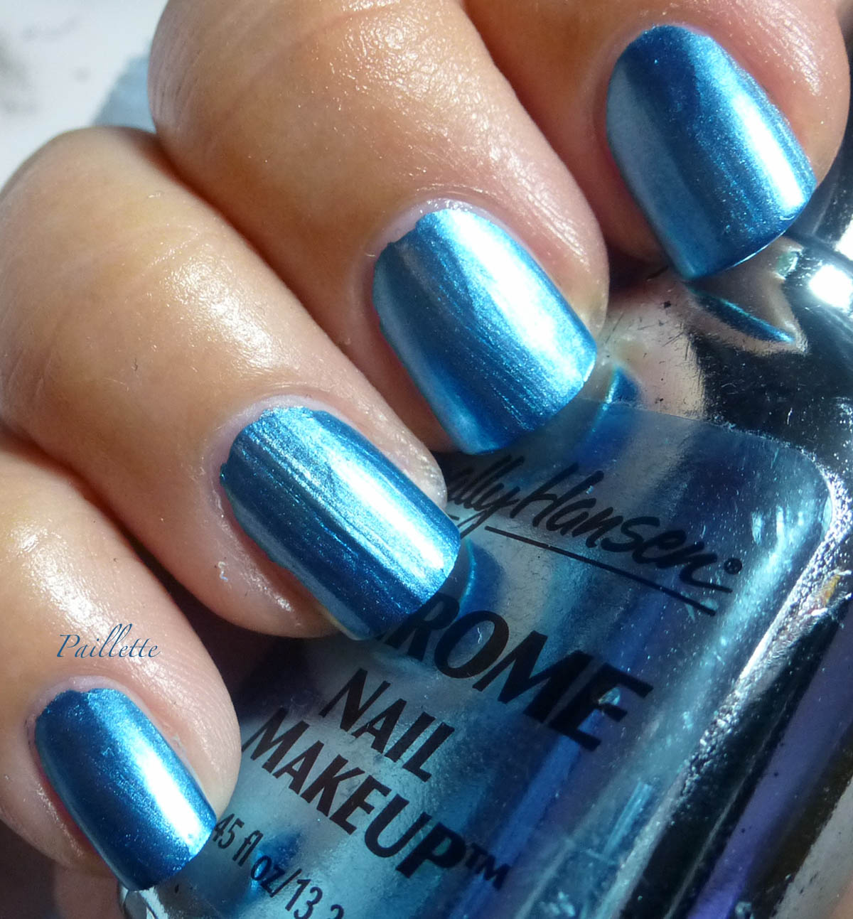
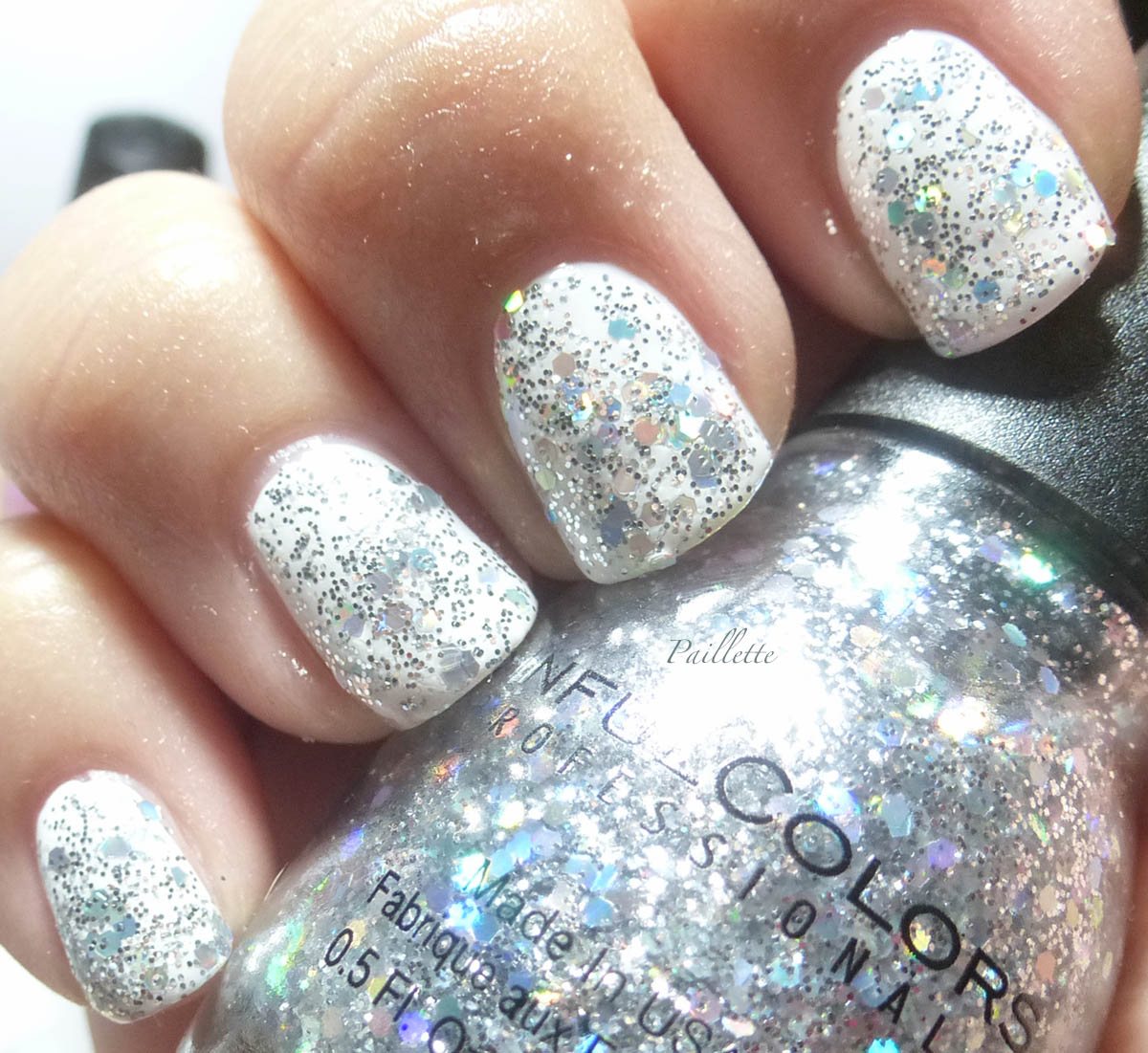
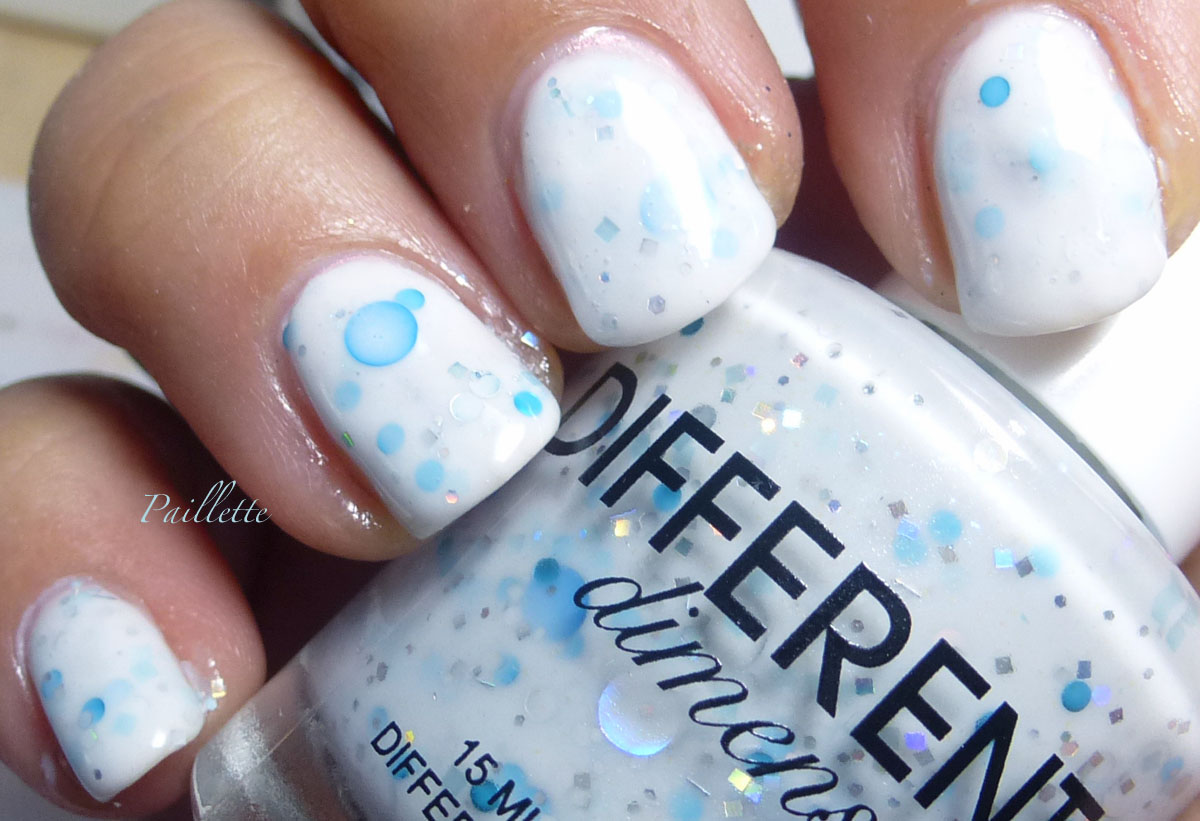
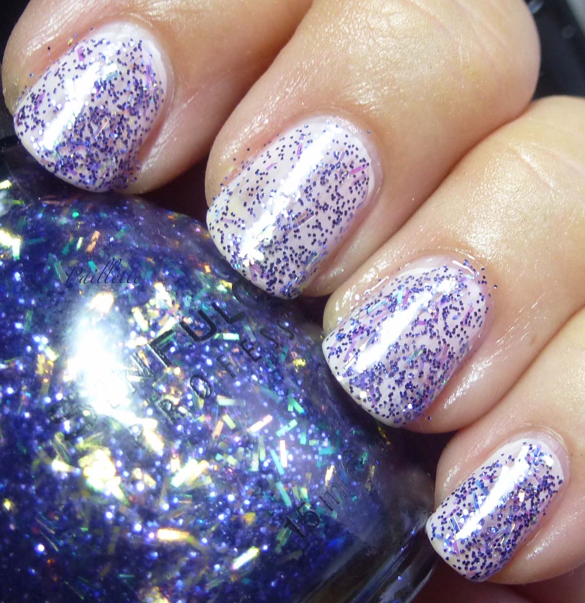
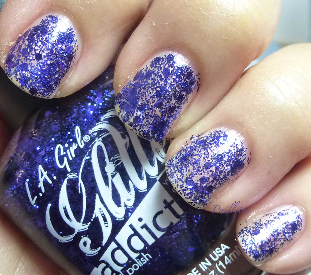
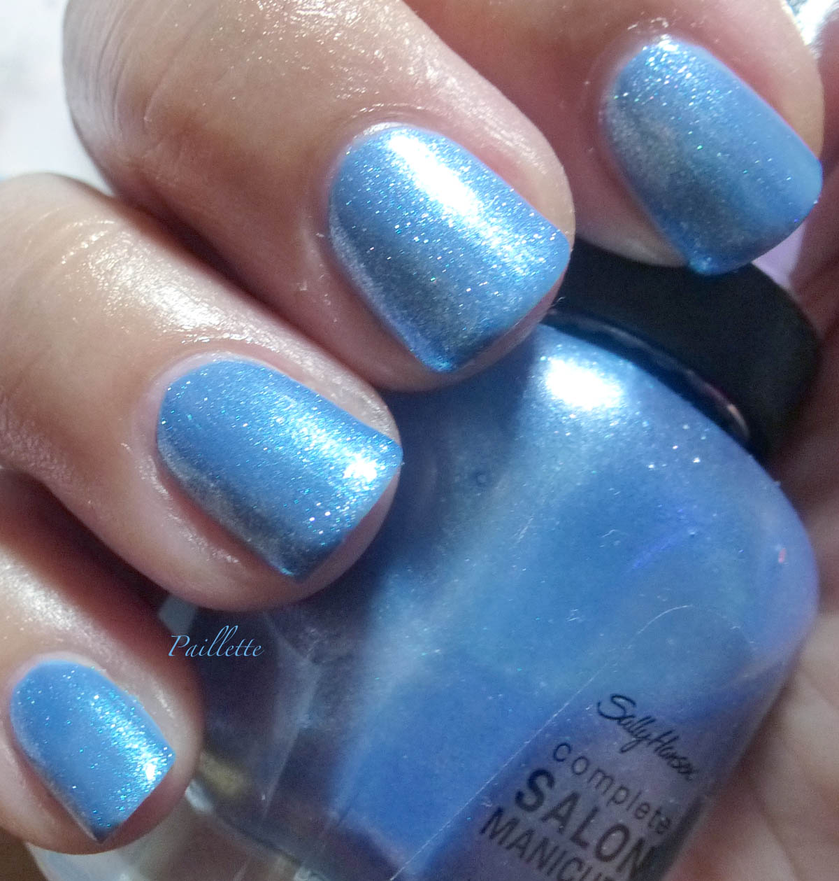
Sally Hansen Complete Salon Manicure Tulle Kit 


You can see that it brings out the blue glass fleck dancing around in the light. This seems to not require as much light and it's a real win. Found this at Rite Aid last year and am so glad I did.
This one does work well over darker shades, but seems to thrive on medium bases.

Tulle Kit is still on eBay if no longer at Rite Aid. I've never seen a CSM show up at the Dollar Tree, but you never know! 


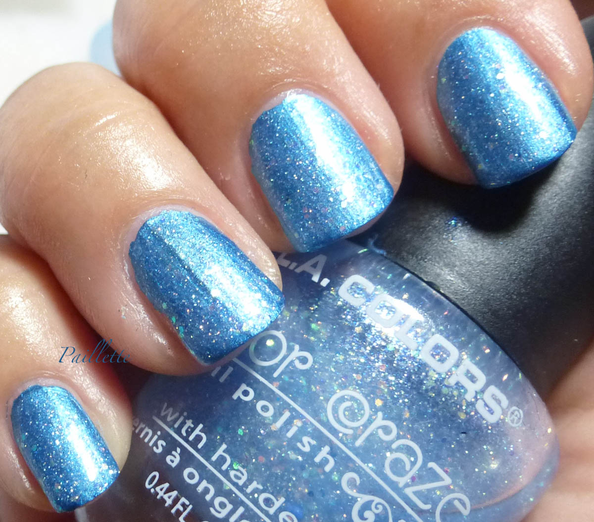
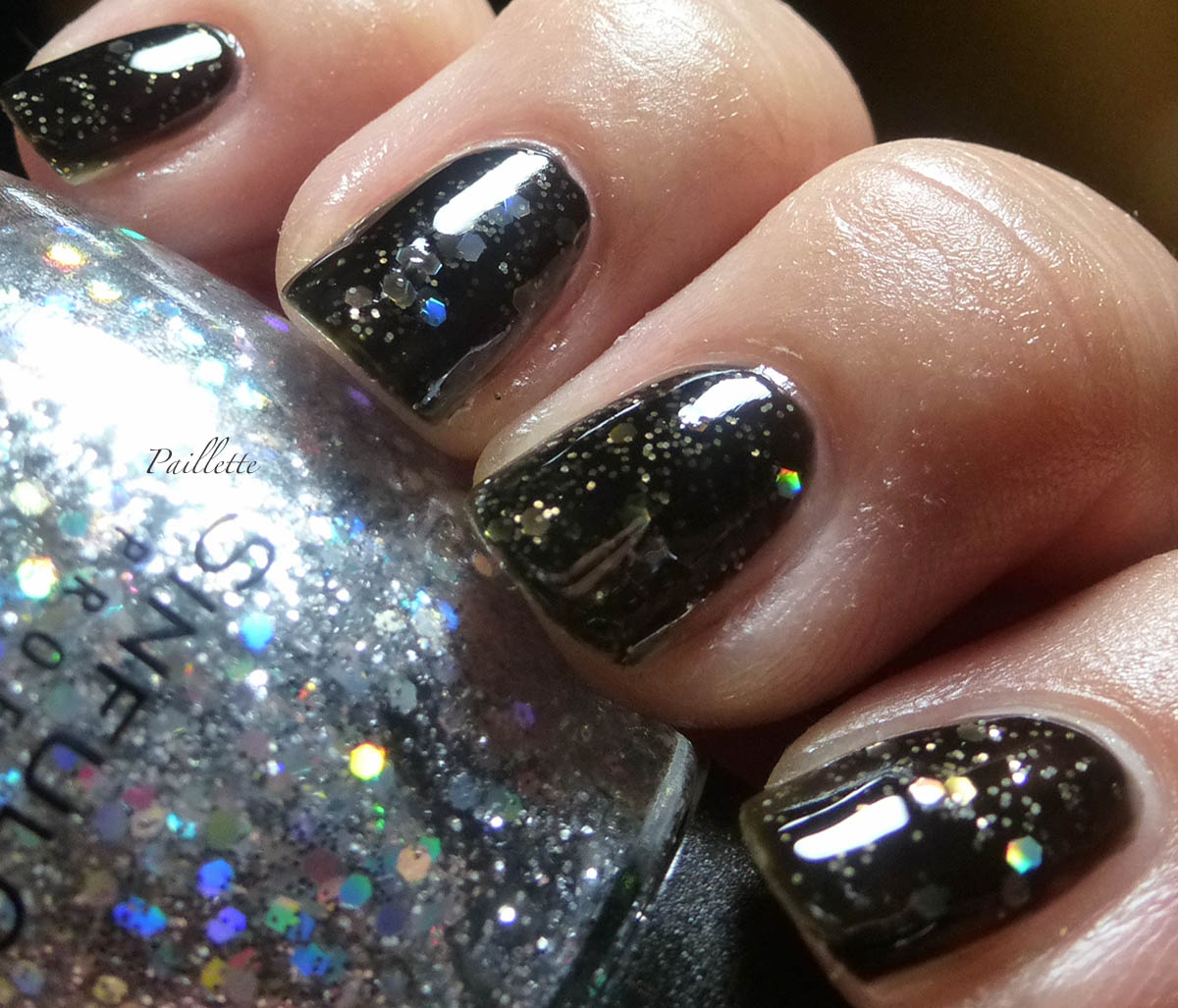
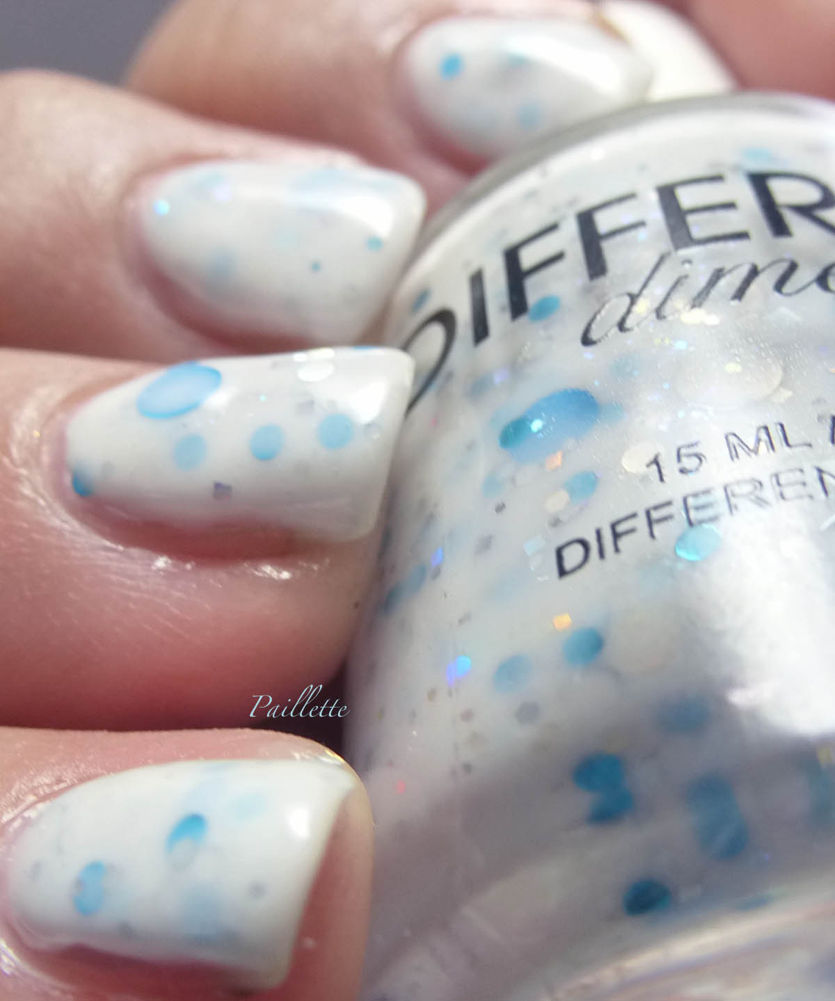
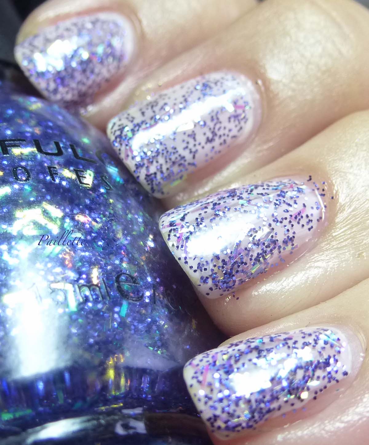
Sally Hansen Complete Salon Manicure Dive Deeper


I thought I had blogged this in the past, but I don't seem to be able to find it. Hmmm.

In the meantime, here is a soft sky blue that does cover the Borghese and yet derives a lot of it's backbone from it at the same time. I've tried to this polish over many things and this turns the corner for me. 

From the 2010 Sally Hansen collaboration with Tracy Reese. This is also shortly after they converted their bottles from the sleek, stylish square Salon bottles into these rather bulbous ones. It was interesting.

This is often shown over nothing and it just seems to fade without something beneath it. This is the something it needed.


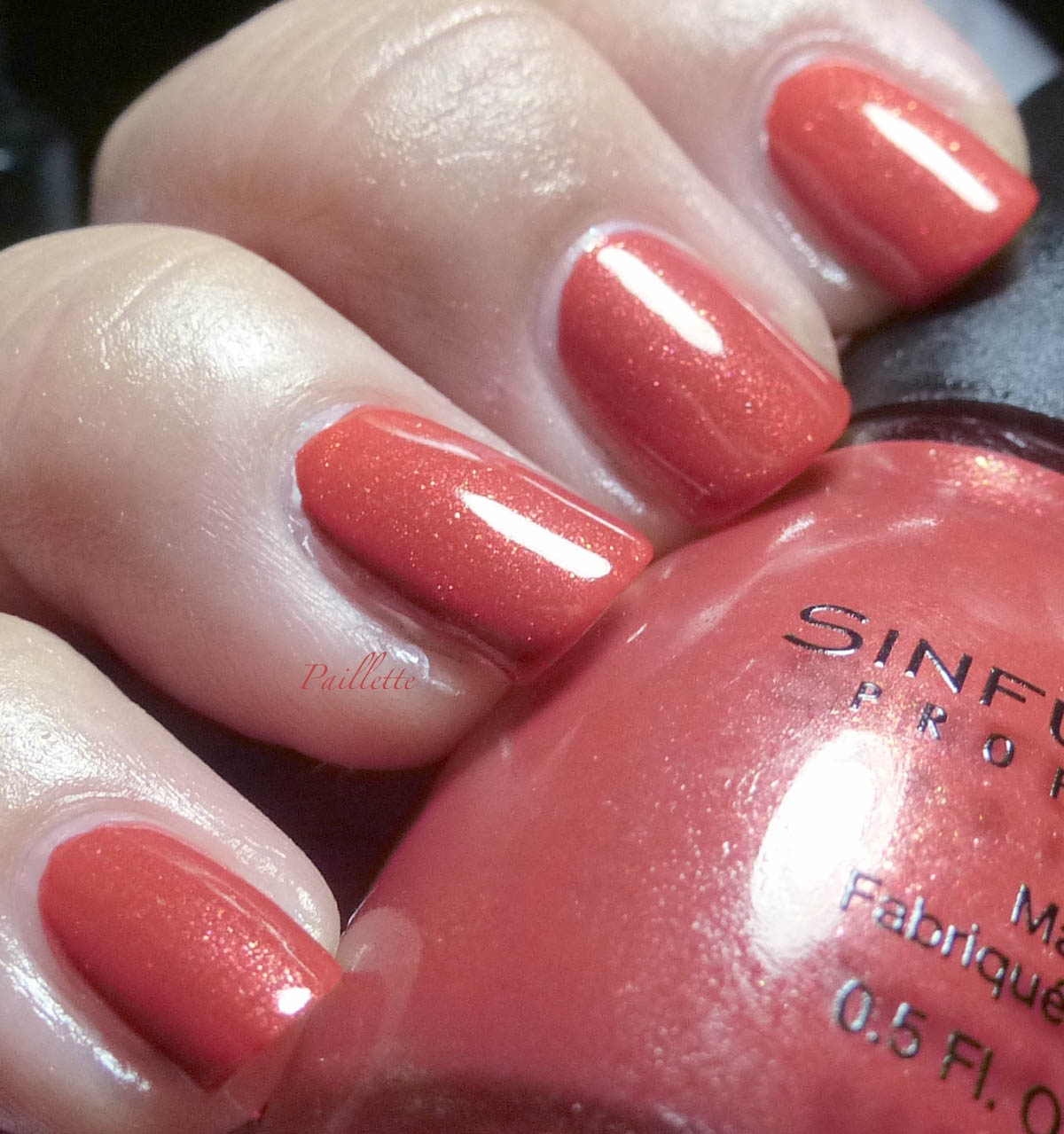
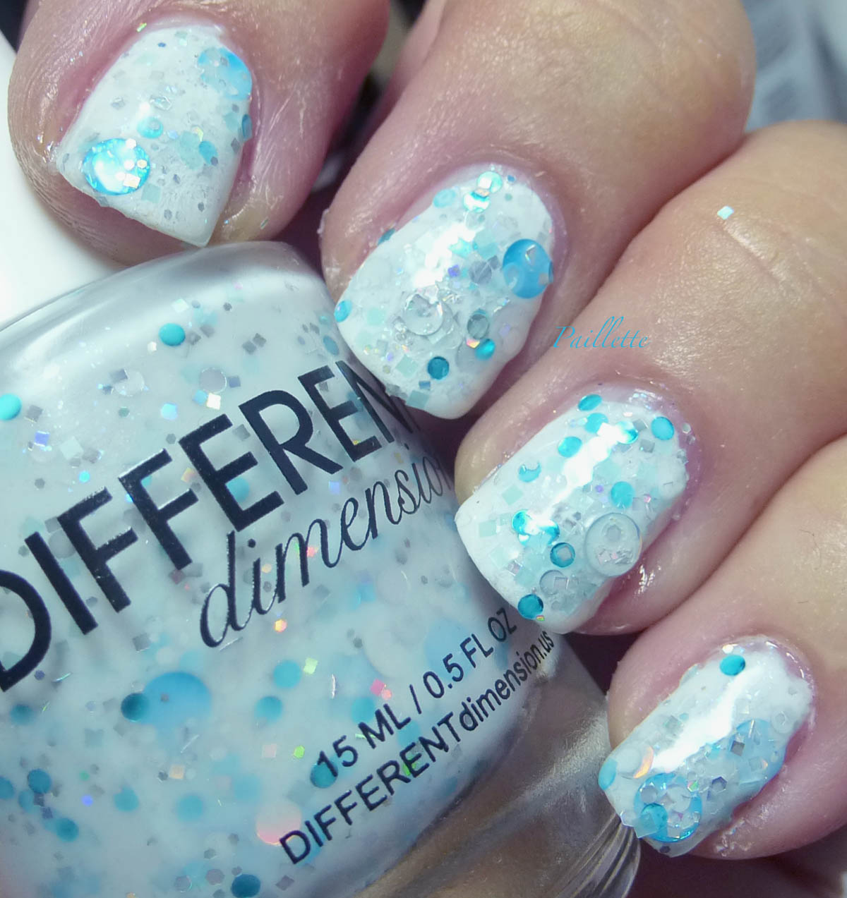
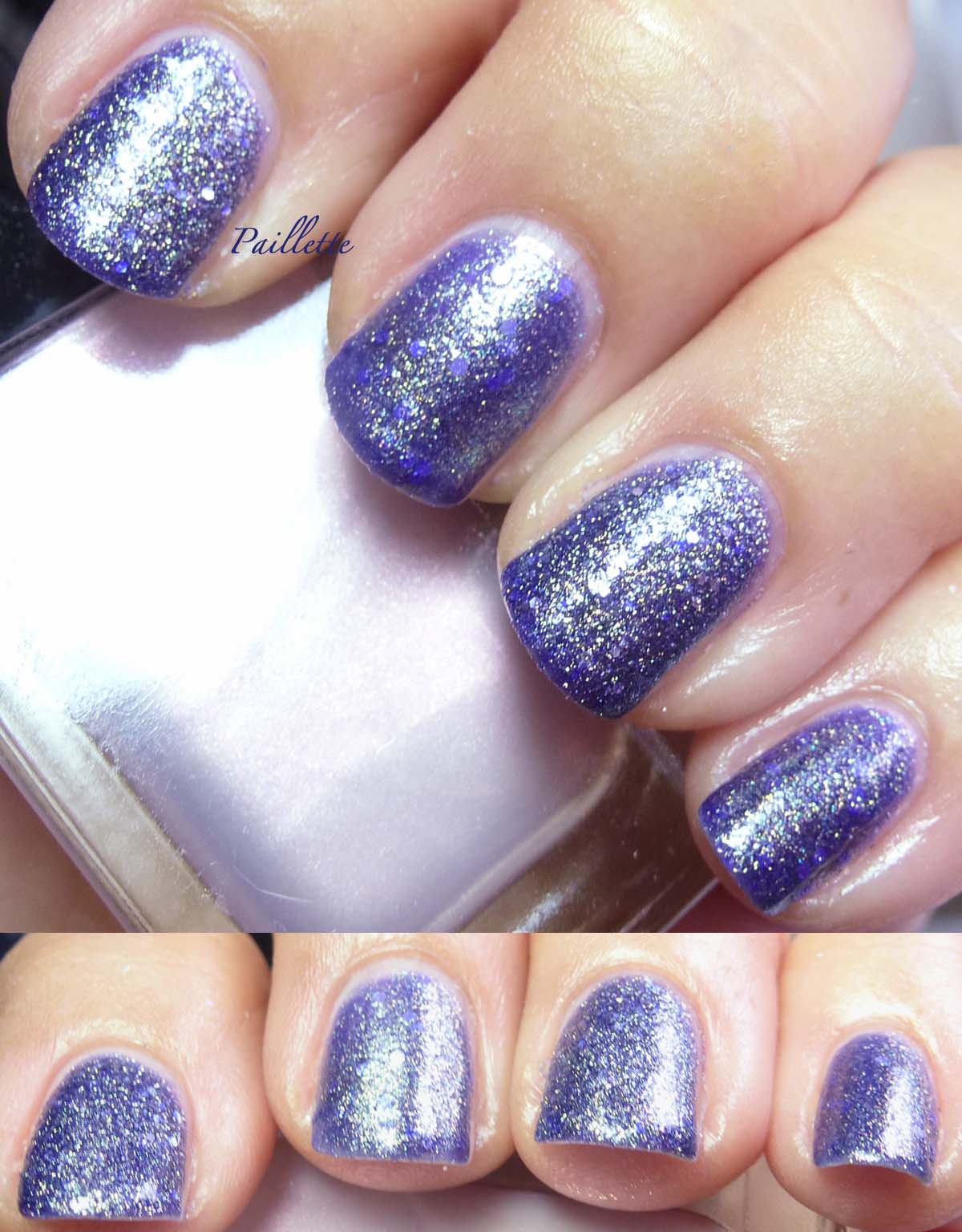
Sally Hansen Complete Salon Manicure Sea and Be Seen


Another from the Tracy Reese collection of the same year, 2010. In retrospect, I should have also grabbed Ring My Shell and Lagoon. Argh!!

This has been blogged before here, and it's very nice as a topper over deeper colors, but to show off its own beauty, I thought a lighter shade would help.


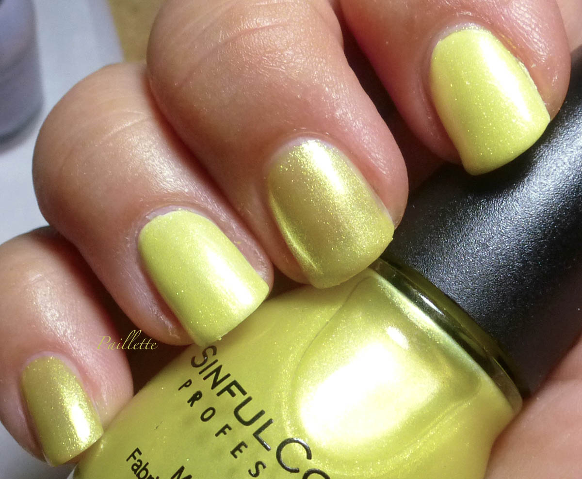
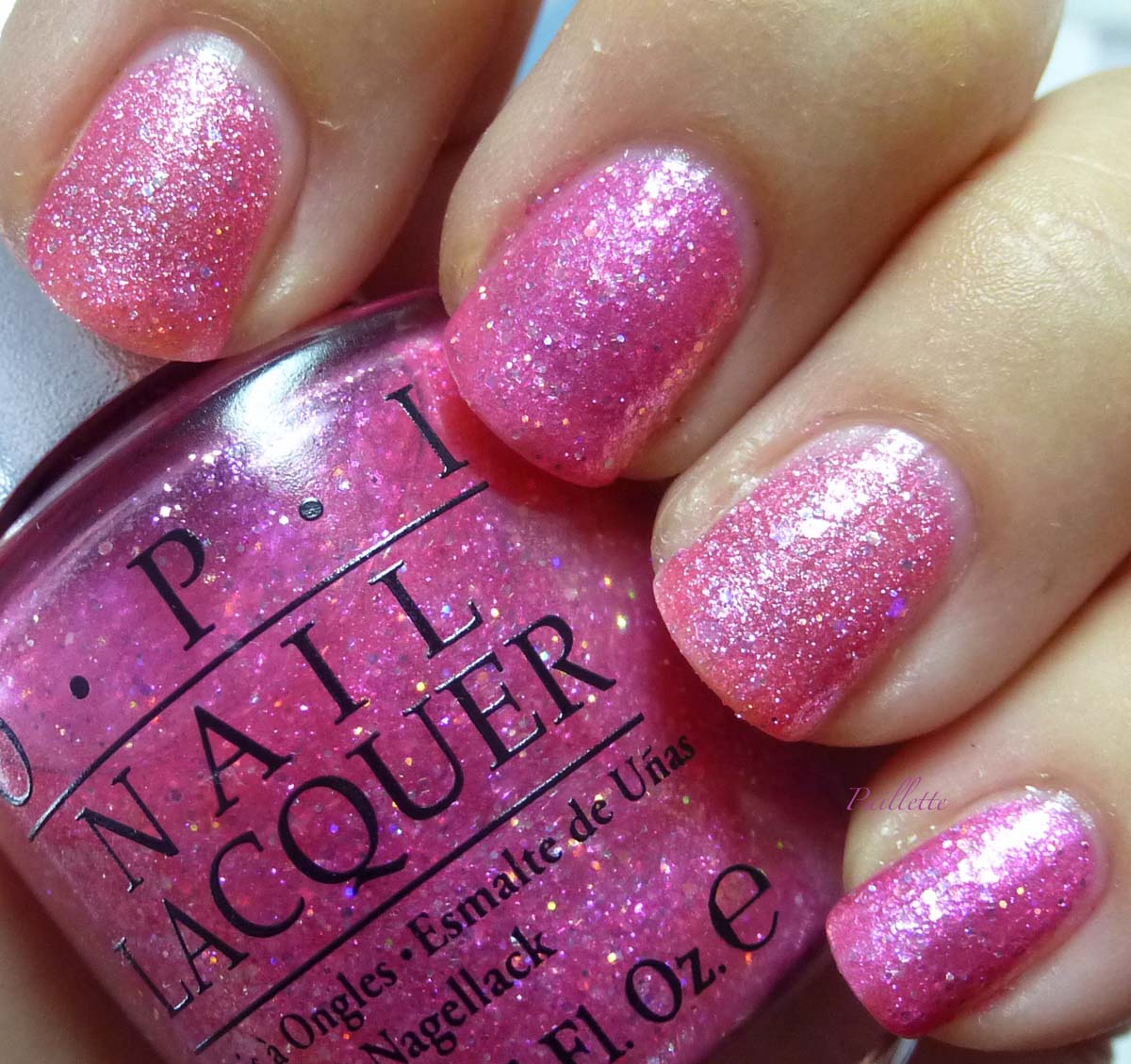
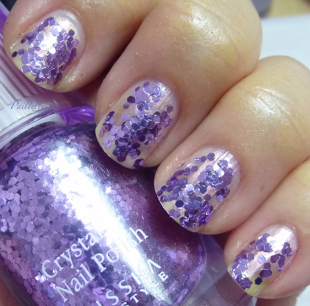
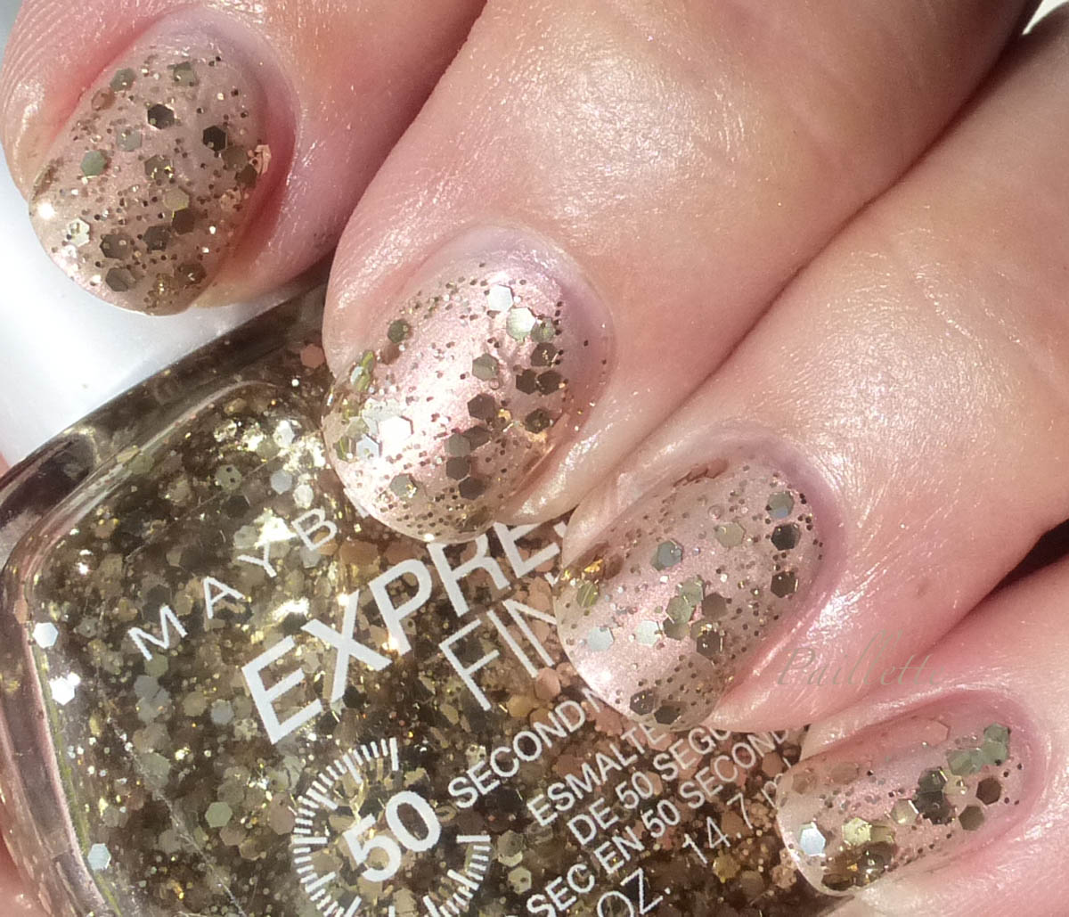
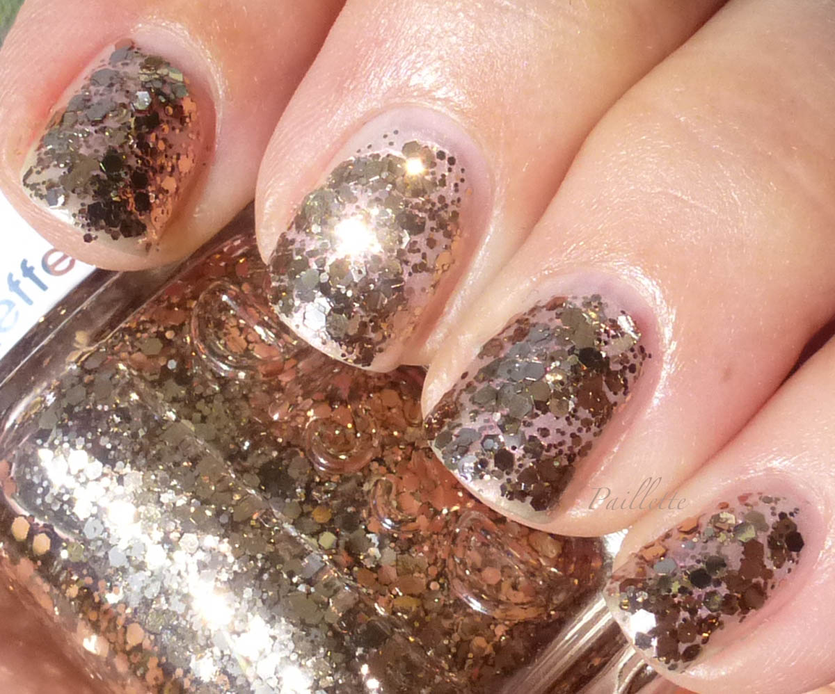
Princessa Tan Gerine


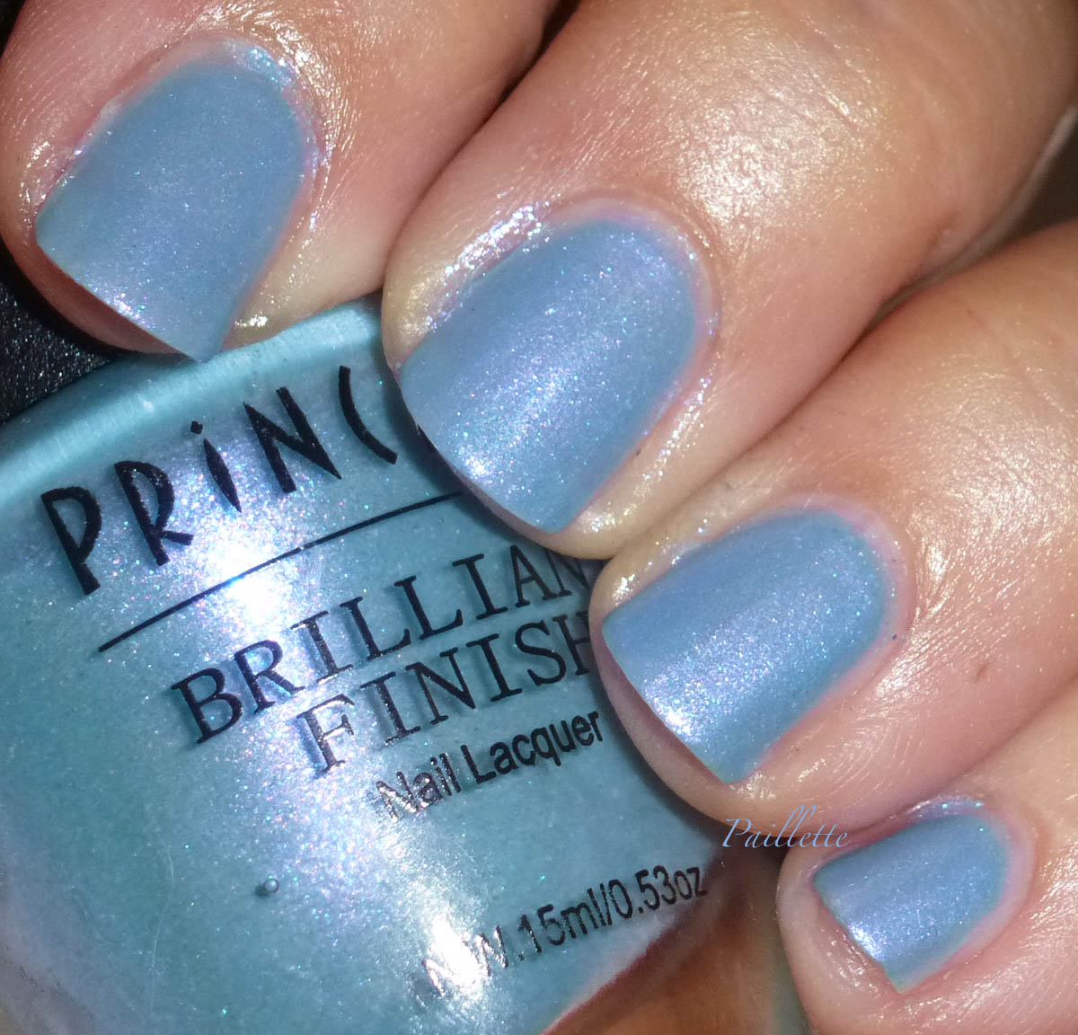
I took this one with a flash, and it corrected it enough to see that the Borghese brought out the lavender undertone. Blogged before here but in need of another outing.
Good luck finding this one, but it's finally showing not just blue, but that purple tinge that is so pretty.


Thanks for reading my little nail polish journal!

Friday, June 26, 2015

China Glaze Rain Storm Revamped

I've blogged China Glaze Rain Storm here and here.

 About two months ago I went to use it again and found it was dried out, I mean completely. I had not tightened the cap and it was toast.

So I thinned it with some thinner, and wore it over a weird Dollar Tree find called Pro10 that has no name:


This is only 2 coats. Nice!! I have been doing a process of evaporating polishes down and re-adding thinner. It's been a mixed success: many have done well, a couple are pretty much toast.

This, though, was a win. I love this color and I love wearing it without duking it out with the sheerness.
Not that it isn't a great sandwich making supply!!

I put it over a dense polish called Pro10:


Found this back in 2009 or 2010. It's a two coater, loaded with pink shimmer in a dusty lavender creme base. Almost a secret shimmer, but not too shy about it.
The first ingredient is toluene and dibutyl phthalate is not far down the list, so I bunged it outside and took the cap off. It evaporated out and I re-thinned.
This polish has never been a true self-leveler, but the color is pretty great.

Both polishes still have a big 3 smell about them, but I've diminished my exposure by evaporating as much as I could away. I think it helps me enjoy the polishes a bit better.

Thanks for reading my little nail polish journal!

Wednesday, June 24, 2015

Blue Water Chrome

Ah....summer.

Here's a deep water blue that reminds me of an evening in the Maldives.


Old Sally Hansen Chrome Nail Makeup for the win! Two coats and no top coat.

Found either at the Dollar Tree or on eBay, not sure which, but a perfect peacock blue. No ridge filler and might as well be a one coater. Love it.


Here it is topped with a L.A. Colors version of OPI's Last Friday Night


This was one of those polishes that was super thick and rather smelly. This Color Craze is 3-free and didn't seem a happy camper.
So, I bunged it out in the sun to evaporate. Fast forward that evening I had both evaporation and the top 1/3rd of the polish had lost all pigmentation. ACK! So I took a Pure Ice blue glass fleck and poured some in as I thinned it out. The result is that it's back in business with the blue, but a thinner more useful formula to layer on glitter.

This is two coats and no top coat. Love the result.


Thank you for reading my little nail polish journal!!

Sunday, June 21, 2015

SinfulColors Street Fusion 2015 - Summer is Here!


Hi folks!

SinfulColors kindly sent me some of their new collection to swatch.

It is called Street Fusion and per my press information has 29 shades in total, though some are re-promotes, the six I have are new. At least to me, the blue might be similar to another in the Flight Patterns collection, but I didn't have that one and I can't be sure. 

Onward!

Five out of six of mine are from the Tokyo Nights collection. The colors are bold, unique and remind me of the fast forward forms, colors and patterns that street fashion provides as a rich matrix that eventually becomes haute couture. I liken it to the organic molecules bathed in heat at our planet's beginnings that soon composed nucleic acids and other long chain building blocks and became life. 
Exciting stuff.

No top coats on any of these guys


SinfulColors Otaku Anime


I was otaku shoujo manga as a kid. Back in the 70's in Japan going into a stationary store was better than Disney, a chocolate sunday, and sleeping late all combined: from the paper to the erasers to the comics to the cute stuff it was endlessly fabulous. Endlessly. Then in 1974, Hello Kitty came along. (mind blown!)

Back to the polish!

This is a sheer bright yellow that feels almost cool and can pull greenish in some light. Not for the faint of heart.

Left to right:
  • Three coats alone
  • Two coats over white
  • Three coats alone
  • Two coats over white
I love it over white. Fresh, unique. I am not sure if it is geared as a layering polish, but it's perfect in that category.


SinfulColors Keira Blu


A bright blue that is also sheer, yet emboldened by the white it really pops, even better than my photo. This one might be similar to the concept of the Flight Patterns collection, however I can't do more than guess, since I didn't get the blue polish in my blog post here

Meanwhile, this is also able to be a topper, and seems to work more to its strength over white.

Left to right:
  • Three coats alone
  • Two coats over white
  • Three coats alone
  • Two coats over white


SinfulColors Sky Tree


Rich teal loaded with blue glass fleck. A real winner.

This has been dimmed a bit in my photo, but I wanted to get the blue glass fleck, a challenge to my camera and my skills I must say.

Three coats, lovely polish, for sure. I did get some staining around the edges of two coats. Putting it over white mitigated the staining. Semi yay because I alternated to see if it made a difference.

I did the same as the others:

Left to right:
  • Three coats alone
  • Two coats over white
  • Three coats alone
  • Two coats over white
I didn't find that the white made much difference at all, so insignificant, that I almost didn't add the fact that I'd layered it.


SinfulColors Pink Ansen over Otaku Anime


Pink Ansen is unusual, it fits right in with the street fashion theme.

There is tiny bar glitter and square glitter. Bar glitter seems to iridesce yellow and the square goes between a pearly pink and yellow. It reminds me of the Japanese cosmetic's company Addiction's latest offerings of pearly, glimmering eye shadows. 

Two coats of Pink Ansen over Otaku Anime (over white). Because the glitters are both translucent and yet still iridesce, they look like texture, but are not. Only normal glitter texture and minor at that.

I am liking the iridescent glitter, but over this light color, I couldn't bring out much shift. Over black it would be a party. I believe this would be better served over a deep jewel tone or black. Even a medium shade, but right here it's got that jagged street fashion feel to it. Disrupting the expected and in your face unusual. 


Fuji Fuji


Pretty silver holographic glitter in a clear base loaded with silver small glitter. This is two coats, I don't know if three coats would have enabled full coverage, the base is thick and it would be a wrestling match to get it to sponge on.

I think if you don't already have a holo glitter, this is a good fundamental. 

I did a jelly sandwich over black with a black jelly I frankened:


Same combination, two coats of Fuji Fuji. 

I will add that Fuji Fuji would be a good addition to a full coverage glitter that is all made up of small glitters. 

Here the jelly makes it more smokey and deeper. 


Maroon Fine


This is the only one that doesn't fall into a Street Fusion collection. It is, however a real favorite. It's a cinnabar that leans terra cotta packed with golden shimmer. A perfect storm of color and finish.

I have to admit it is much more of a spice shade that reminds me of something that would be in the India Street Fusion collection. 

Meanwhile, it's a beauty. No muss, no fuss, three coats and you are on your way!


This was sent to me by SinfulColors and so I didn't buy these myself.

You can see more about these collections at SinfulColors.comhttp://www.sinfulcolors.com


Thanks for reading my little nail polish journal!

Friday, June 19, 2015

Pink Glitter Comparison: NOPI Candy is Dandy and OPI DS Tourmaline

If you recall, back in April I swatched the lovely Nicole by OPI Gumdrops that I had in my possession, missing a couple, but happy with the ones I had. I mentioned that Candy is Dandy is very close in the bottle to OPI Designer Series Tourmaline.

Here's a link to that post.

In fact they not dupes, but seriously similar.


Left to right:

  • NOPI Candy is Dandy
  • OPI DS Tourmaline
  • NOPI Candy is Dandy
  • OPI DS Tourmaline
As you can easily see they are not the same shade, with the NOPI offering a touch more pink and OPI's a touch more raspberry. Additionally, there is more texture in the NOPI and more glitter in OPI DS Tourmaline.


Same order, top to bottom. I'd say that both have texture, just that Candy is Dandy has more of those little texture balls added, where DS Tourmaline is made up of glitter.


Both are three coats, no top coat and are both lovely.

If, however, you only budget for one, either would really do in a pinch.

Thanks for looking at my little nail polish journal!

Wednesday, June 17, 2015

Navy and Light Blue Stamping

Just a quick change of pace from all the glitters.

Back in 2013 Pueen came out with their Sumptuous Gallery plate collection and I was very excited to get it.

As I get a bit better at stamping, it's nice to have Pueen on hand and currently available at their site.

Here is Plate 01


Since it has a lot of full sized nail designs, it's pretty nice, even though there is the half moon design at the bottom, that is a non-issue with short nails like mine.

The image size, as I measure it:
Width: 13mm
Center height: 15mm
Outside height: 17mm

On a good day this is enough length for me. When I'm at maximum length I'm pushing 11-12mm tops. Most of the time I'm about 7-8mm.

Here's the left hand image


I've used Color Club Naughtical Navy as a base and Sally Girl Periwinkle over the top. Still getting my head around stamping, but I love it so much.


Thanks for reading my little nail polish journal!

Monday, June 15, 2015

White Clouds in a Blue Sky

Here are two glitters that needed an outing.


Glitzology Partly Cloudy


A mix of blue and white glitter in a variety of sizes and shapes: white hex (2 sizes), square, and bar, then blue in small square and some lighter blue round as well as a pearly light blue square. Added all into a shimmering luster suspension base.

I got this directly through Glitzology on Etsy as a good will gesture when a polish I did buy didn't look anything like the one in the photo. Meanwhile, this is a freaking win. WIN I tell you!!!

It is dense, full of great shapes and that lovely shimmer base just sings with this glitter combo. It is two coats here over Color Club Take Me To Your Chateau. I wanted to utilize a base color that would show up the white glitters a lot, they are absolutely gorgeous.

Rave, rave, rave for this polish. Sadly Glitzology has closed her Easy shop. Sad because even though that one polish was a miss, this one is such a spicy little number. 

Reminds me of dancing water on the surface of a swimming pool. Dive in.


Different Dimensions Never Grow Up


If my enthusiasm for this one is less than out there, it is because this one is a bear of a polish. This is four coats. Four. Not only did I have to fish for glitter, nothing seemed to settle and level out.


Here you can see the lumpiness, and I have to say this photo mitigated it. My index (most distant) finger, looks like I've buried a small aardvark under my nail polish.

The white base was a bit too dense to enable the glitters to shine though and it seems like it doesn't capitalize on these great glitters.

My thought was to sponge apply the glitter. I'd heard that this was a good method and have tried it a number of times with mixed results.

You could say that my results were mixed:


Now this was a hot mess. While I did get more glitter onto the nail, it seems like I had little control and the mess was really bad around my nails.

I used acetone for clean up and it wreaked havoc on my cuticles. I still wasn't feeling the win on this one. Really frustrating.

Honestly what a mess. I even got glitter on my knuckle! Good grief!


So looking at photos online, it appears to normally have more of a translucent base. And, even worse for me, people make it looks like a great polish. I make it look like a bad franken!

I have mixed feelings. I love these kind of glitters, but I am not feeling the win. Might just thin and retry. We'll see.


Third, bonus....

Smitten Polish Winter Is Coming


I just had to reblog this beauty. No muss, no fuss. I love this baby. Three coats and all that blue glitter.


Thank you for reading my little nail polish journal!

Saturday, June 13, 2015

Bar Glitter, It's a Love-Hate Thing

I have to admit that of all the glitters, bar glitter seems to evoke a reaction that even dime-sized circular glitter, bleeding glitter, or too-scant glitter seem to miss out on.

SinfulColors Faceted


Two coats, no top coat.

Personally, I love it. This one is particularly a nice one. Purple small glitter in a clear base with iridescent bar glitter.

At this angle the glitter appears pink and lavender. In the bottle you can see that it iridesces green and yellow.


Here you can see a bit more of that on the nail, but for me what is so neat is it's shift into magenta as well, that I didn't really see in the bottle. Plus, the yellow green isn't quite as pronounced a this angle.


I love this polish a lot. I did not need to thin it, nor did I have to fish for glitter. Best of all the bar glitter reminds me of Fat Tuesday or something fun like that. It's just a super color combination with the purple.

So, if you think you want to try bar glitter, or like bar glitter, or just love iridescent glitter, this might be a good $2 investment.  

Thank you for reading my little nail polish journal!

Thursday, June 11, 2015

Accidentally Bought Dupes

It is not hard to buy dupes, and I don't mean back ups, but that inadvertent "gotcha" feeling when you get home with a new polish, put it in the "to be filed" drawer, then discover that there is an exact replica, or one with such minor differences you just think "drat!"

Color Club Under Your Spell is from the Seven Deadly Sins collection from autumn 2014.

L'oreal Too Dimensional? is from their Gold Dust collection from autumn 2013.

This is just GREAT! Two polishes that I love. hahahahaahahahahahaahsfasf;!@$#$@!


Meanwhile...here are the bottle comps:


Both are glass fleck of purple and a lot of gold with an addition of some hefty blurple glitter.

It can appear more blue than it is, and it's definitely purple.

Both are textures.


Here they are below:


(yes, because I became so excited by this post, I completely FORGOT to post what THE HECK was what!...eep!)

Left to right:
L'Oreal Too Dimensional?
Color Club Under Your Spell
L'Oreal Too Dimensional?
Color Club Under Your Spell

 Both are three coats, both dry to a glossy finish on me. I've seen blogger photos with more of a  matte look, but mine were both shine. I would say that the L'Oreal had more of an intense gold and stronger texture, but in truth, without knowing which is which, I really just couldn't tell them apart.

So you can see, darn near dupes.

I like both, and am not quite ready to part with them, although textures seem to be on the wane and not taking hold as yet "another finish alternative" like Holo and the newer multi chrome flakes or even flakies themselves.

I found the CC on Head2Toe Beauty's website, still available. L'oreal Too Dimensional? is on eBay and Amazon. I will note on the latter that pricing fluctuates between "shelf pull" reseller pricing and "hey this is VHTF!!!" types of sellers. So if you want that L'Oreal action you may want to snap it up before it does actually become hard to find. 


Meanwhile...thank you so much for reading my little nail polish journal!

Tuesday, June 9, 2015

Purple Glitter Party

Here are four purples that needed an outing.

Quickly:
No top coat, two coats, and over a neutral base (Orly Bon Bon)

Enjoy!


L.A. Girl Glitter Addict Euphoria


This is a soft small blurple glitter packed with larger purple holographic hexes.

This collection came out a few years ago and is still on the L.A. Girl's website. They have changed their formula, so the jury is out on whether these are a win. They've got more of a suspension base now and it's a base-eating monster. This is an older version, so no issues.

Love the color, hard to fault.


Milani Lavender


Found this at the Dollar Tree. It's a lovely mix of darker purple and lavender glitter. I wish it was a bit more dense, but it's not bad. If you see it, if you like purple glitter, this might be a win!


Missha Purple Stone Glitter


A real bear of a polish. First you've got this gorgeous disco ball glitters that are fabulous, next you've got a thick base, and finally you have a brush that really can't deal with it all. It's very hard to get it to spread around well. Well, you can see it's a bit patchy. 

Meanwhile you've got a gorgeous glitter and a quick drying base.  I probably need to try again and see if I can wrestle it into a better wearing.

No longer on the Missha site and not popping up on eBay, but it is on Amazon. Unique bright lavender with a potential for wall to wall coverage. Just have to master it!


L.A. Girl Glitter Addict Eutopia


Got a jones for royal purple glitter? This is a powerhouse.

Two coats, great coverage.  


Thanks for reading my little nail polish journal!

Sunday, June 7, 2015

Gold Glitter and Pearls

Here are four gold glitters that you may enjoy.

I wanted to use a pearl base beneath them, to evoke that luxurious use of gold and pearls that Chanel often uses.

First up is Rimmel Crushed Pearl, once under the lamp, once in the sunshine.


It turns a pretty pink under the sunshine. Quite a pretty thing. I will add that I did not bother with a ridge filler and it would have definitely helped!


On to the glitters!


Maybelline Pot of Gold


I wanted this for a long time and when I finally got it, I never wore it! This is one coat and no top coat.

A bit of a brassy gold that looks nice over the pink shade. I did get a bit of a smudge on the pinkie that I am just now noticing. Doh! I love it when I proof my mistakes AFTER I've edited the photos. *headdesk*


Essie Luxe Effects Summit of Style


This is two coats of a bronze-y gold that just kills! This is from the 2014 additions to their Luxe Effects line. Some call it a rose gold, and I can see that, too. Meanwhile this is quite gorgeous.

No top coat, might need two to really smooth it down, though.


Essie Luxe Effects Rock at the Top


I somehow forgot to put a base on this, but in the comp you can see it with the pearl.

This is two coats and no top coat. I want to add that the base on these Essie's is really quite manageable. Sometimes with glitters you get these thick, viscous, high volume bases and it makes it highly unwieldy to manage the glitters. This really is a good combination.

I hope that Essie does more of these, they are both beautiful and effective.


Milani Gold


Two coats and no top coat.

This is what I had hoped that Maybelline Pot of Gold would be. I think if I'd arranged a third coat, I'd have gotten full coverage. It is a disco inferno, baby!


Here's the comps:


Same order:
  • Maybelline Pot of Gold - 2 coats
  • Essie Summit of Style - 2 coats
  • Essie Rock at the Top - 2 coats
  • Milani Gold - 2 coats

All are over Rimmel Crushed Pearl.


It's nice to have gold glitter, it's a neutral, a staple, if you will.


Thanks for reading my little nail polish journal!

Friday, June 5, 2015

Zoya Blogger Collaboration: Birch Box Limited Edition Trio Spring Summer 2012

If you like jellies and toppers, this collection was a good one.

I have to admit, I follow precious few fashion bloggers. I am a devotee of the Fashion Channel on Youtube as I was a fan of Elsa Klensch when she was on CNN (she is a goddess, let's be honest). I've followed Style Bubble from the start, and that's about it. 

So when Birch Box announce the collaboration with some style bloggers, I was like "who?" Meanwhile, what is birch box?
It's a subscription service to try out samples of various cosmetics, skin, hair, etc brands. This may or may not be your thing.

Not my thing, but polish certainly is, so I grabbed that set when it came out.

I've blogged Coraline here, but wanted to get the whole set done.


Kate by Small Things Blog


Very beautiful red coral that my camera just wouldn't really deal with. Bummer.

This is four coats, sheer, and over Color Club Coastal Creme. No top coat, these are very glossy.

Over a glitter, glass fleck or a similar color creme, it would definitely pop a lot more. Any blogger who makes this look like a creme has an amazing bottle. This is sheer, no doubt about it.


Here is Color Club Coastal Creme, needed a better outing.


Can we give it up for Coastal Creme?
Such a gorgeous creme. 


Coraline by Eleventh Gorgeous


Rich orange, or if you like coral. 
Again for coats and no top coat and over Coastal Creme.

I am keeping sheer jellies like this separate, then if I want to goof around with them, I can either tint with them or find a similar shade to make it a bit easier to wear. This ends up being 9 coats with a base coat (three of Coastal Creme and four of Coraline). 

Here is a demo of the layering of the jellies.


Left to right:
  • 4 coats
  • 3 coats
  • 2 coats
  • 1 coat
This is one coat of Essie Summit of Style and two coats of Coastal Creme.

You can see that this can get super thick by the time you get to three coats of these jellies.

The fourth coat takes away the texture, and none of these have a top coat.

Eep.

I would say, again, these are akin to water polishes on the first coat: slight tint. You need many coats to achieve anything akin to serious coverage.

Over a similar shade, you will get a deeper color.


Belle by Capital Hill Style


Two coats of Belle over Color Club Coastal Creme.

Lovely topper. My favorite of the three next to Kate.


Here is two coats of Belle over Color Club Naughtical Navy. 

Just a quick shot of Naughtical Navy, because who doesn't love to spell Naughtical about 100 times?


Just about my favorite navy. Three coats. Heavenly!


To summarize: I am not sure this collection lived up to the hype.

I had a long paragraph about sheerness, tweaking with base colors, that I already have toppers similar to this, but in general, it's been just a let down for me.


Thank you for reading my little nail polish journal!

Tuesday, June 2, 2015

Apricot Franken

I've noticed, after trying American Apparel Palm Springs, blogged here, that I needed more.

It was really a compilation of some yellow, warm gold, nude, and a healthy dose of glass fleck.

I wanted to feel like a summer afternoon just when the breeze comes up after sunset. No honking bright colors, just relaxed and easy.


Three coats over white.

Wanted the shimmer to be the subtle kind, you know "office ok" type of thing.

Here it is over black, one coat. Not geared for this line of work, it is probably best over light to medium shades.


I know that I squelch one of these "needs undies" sweet little monsters, only to create another.

Well, I liken this polish more to a gossamer sheer chiffon wafting in an evening breeze.


Thanks for reading my little nail polish journal!