Friday, August 30, 2013

Neon Frost

Late summer makes us all think of fall collections. It's still hot during the day and I have summer on my mind even as the days shrink and the nights cool down.

Of course the odd Milani crops up at the Dollar Tree. It's about the only place I pick up polish locally any longer. 

Here is Neon Lites, a now-discontinued shade:


A weird combo of finish and color. 
Pretty greenish neon yellow shot through with gold. It ends up looking more frosty on the nail than it does in the bottle. 

Three coats over a white. I think it's actually a buff white, an old SH french tip. 

This is a wee bit sheer, however the formula was perfect. Hard to find fault except for the sheerness. 

No topcoat.

It's also on eBay as well as the Dollar Tree.

Thanks for reading my little nail polish journal!

Tuesday, August 27, 2013

Revisiting a Summer Polish

When I find a glass fleck that has a good color shift, I want to see what's what.


L'Oreal Blue Marine was blogged here.

I saw it had some chops, but needed to try it again under lower light.


Some kind of wonderful!


Two coats over black.

L'Oreal's formula has been quite a consistent performer.

This was a limited edition back in 2011, but there are a number that are quite affordable on eBay.

Can't deal with a SH twitchy formula? This will satisfy.

Thanks for reading my little nail polish journal!

Thursday, August 22, 2013

Pair of Sally Hansen Nail Prisms

I love Old Sally Hansen Nail Prisms.

No clue as to their original release, however these were some of the first polishes I grabbed at the Dollar Tree around 2008/2009.

Other than that, it's hard to say.

I wax on about the Dollar Tree, but it gives up less goodness over the years, that's for sure!

Lots of photos, duochromes do require it!

I feel I'm getting better at photos, but still not maximizing my lighting and exposure to capture the nuances availed to me in these polishes. I know there are some reblogs in order now that I think about it!

Here we go!

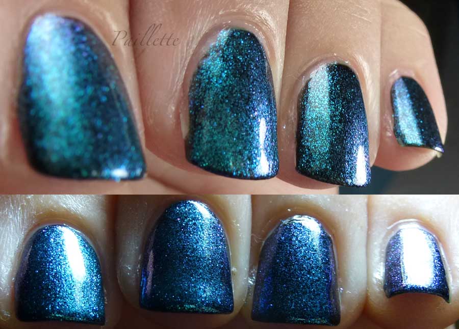
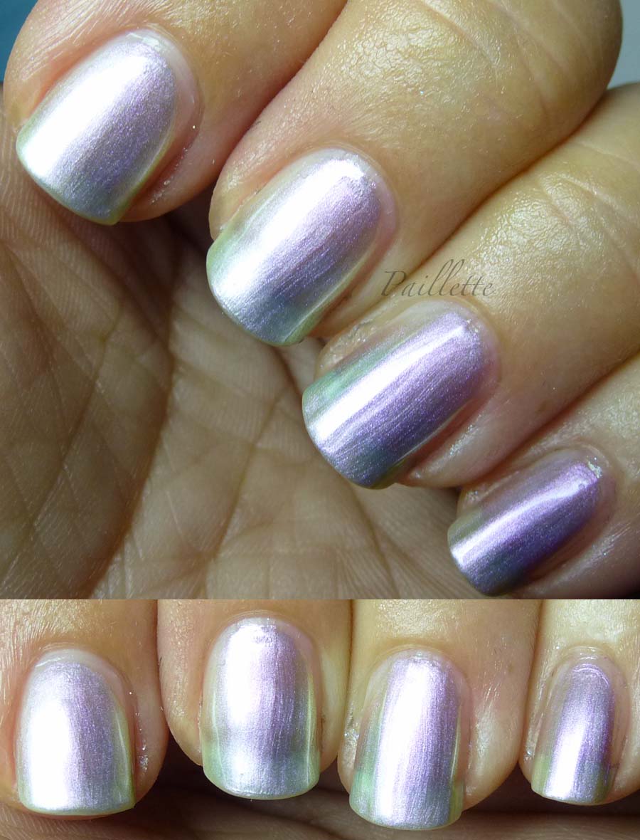
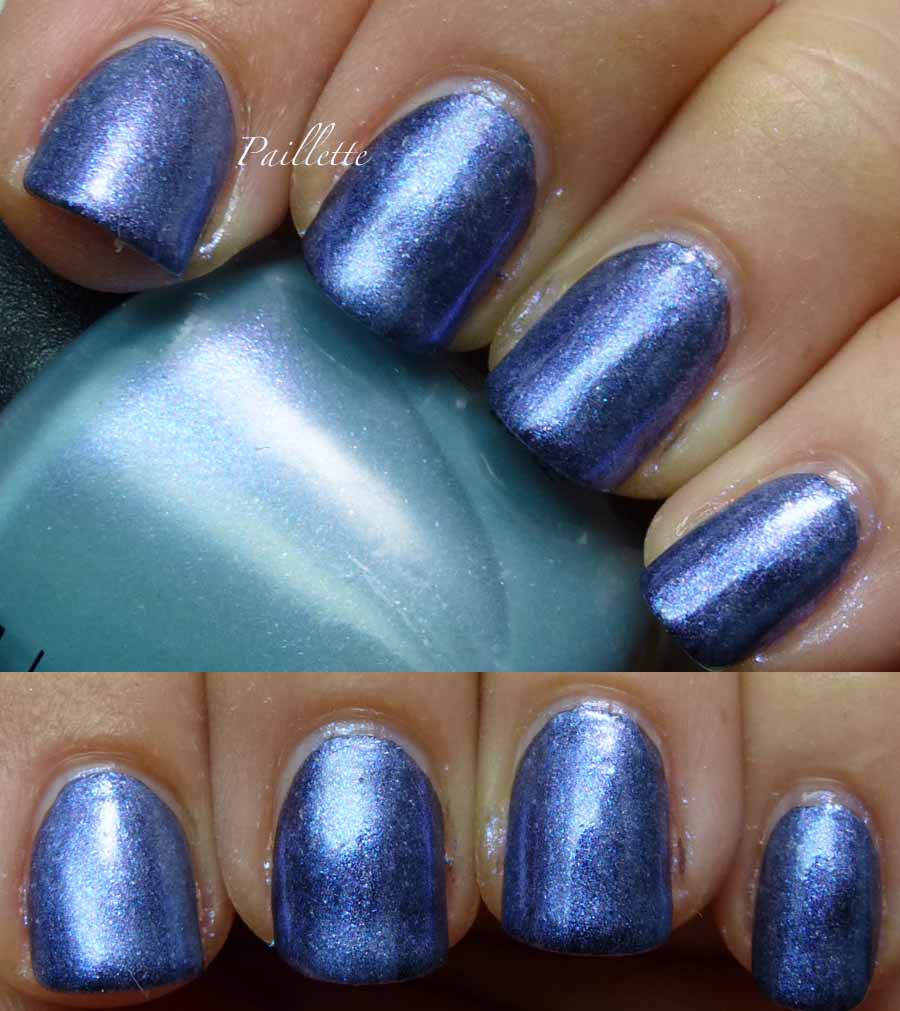
Sally Hansen Lapis Amethyst.

Not a particularly "sought after" shade, in this line of polishes that seems to range up into around 40 different colors, but appealing, nonetheless.


Here it is alone, no black base and three coats.

It looks like a bit of a pearlescent metallic. Silvery with some pale purple around the edges. Kind of ho-hum, but not without its own charm. Pastel metallic or pearl.

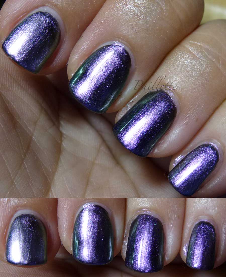
Now here are two coats over black:


More of the same, but enhanced.

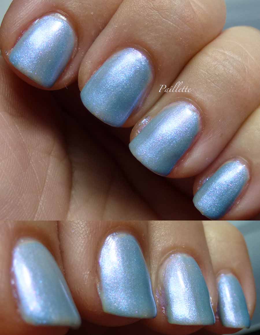
Then it kind of shifts:


Hard not to enjoy this subtle shift into a silvery lavender.

I know that these have a tetchy formula: slowish to dry, show brushstrokes, and somewhat loose (as you can see from my lack of cleanup).

It's on eBay and appears to command a bit of a high price.


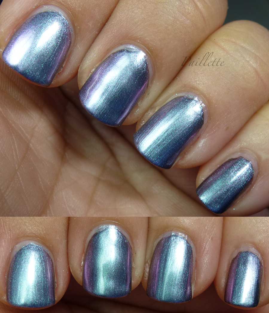
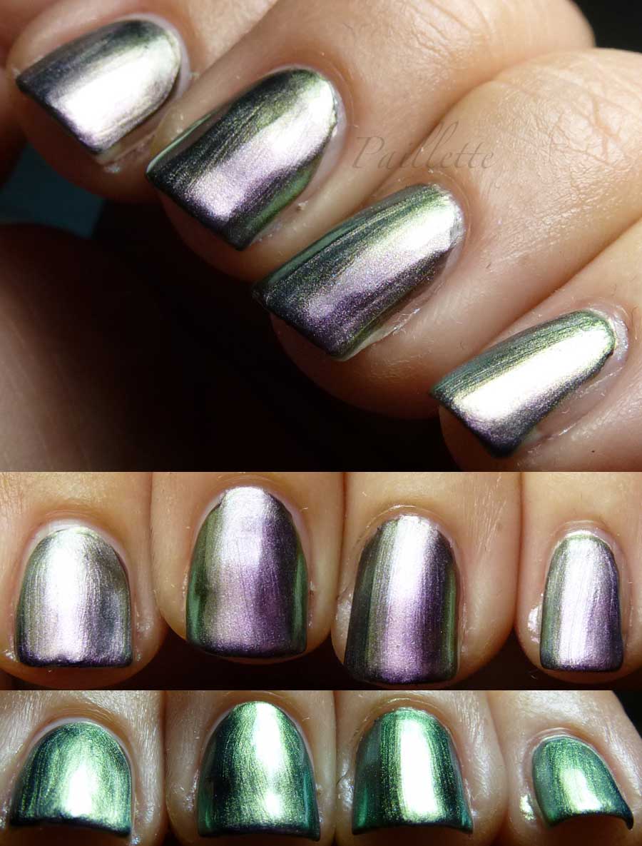
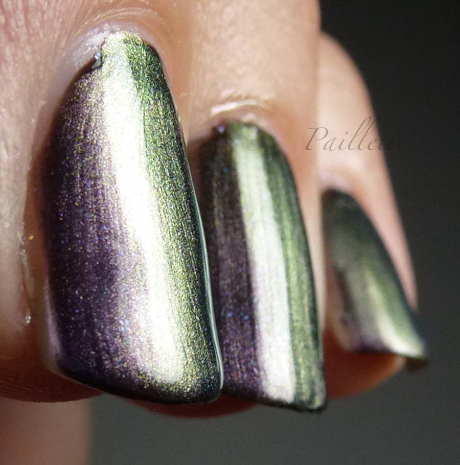
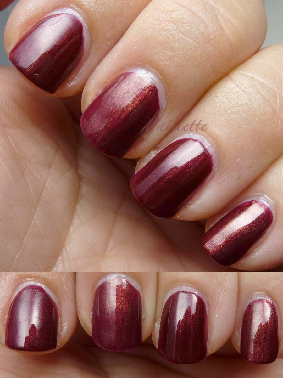
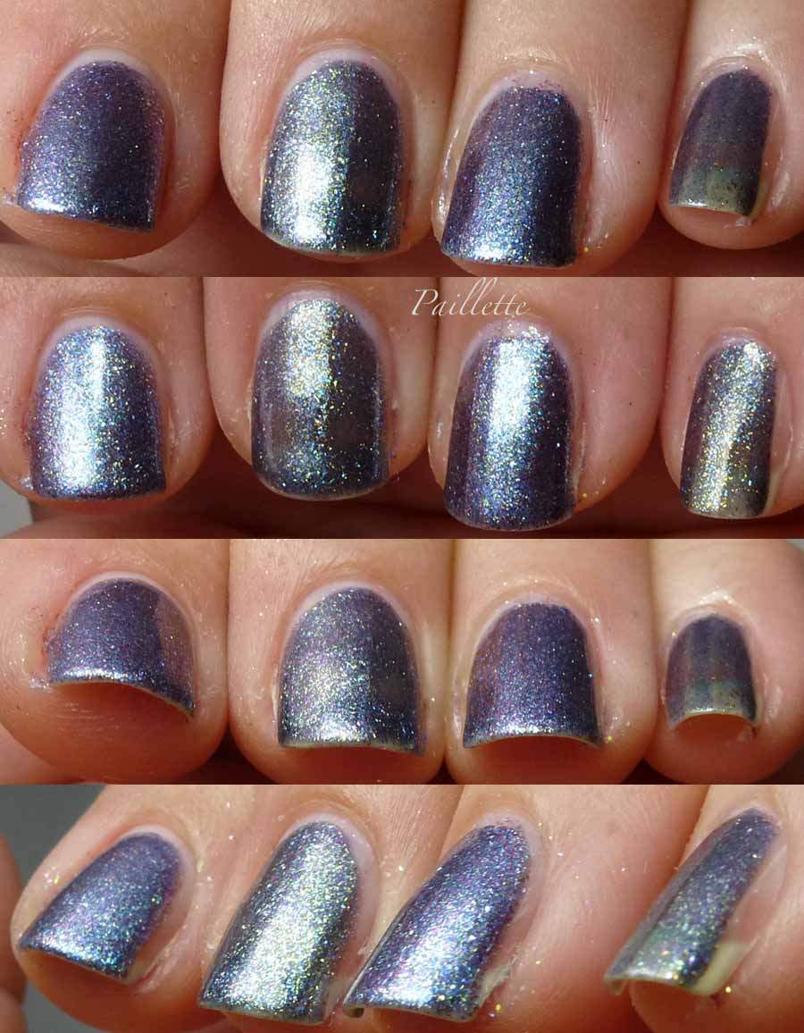
Next up Sally Hansen Lavender Sky


Three coats, no base coat.
Pretty pale orchid that is so translucent that you can see my nail beds where the light doesn't hit it directly to cause a reflection!
Another more underwhelming shade on its own.

Over black, the magic happens!


Purple shimmer now presents itself!
The edges show a bit of a silvery gray.
This is two coats.


Subtle shifts of my hands reveals some excellent green! Silvery khaki and even over into a beetle-y territory!


Devilishly wonderful to see how it shifts from purple to gray into green. Lurve!

This is not an inexpensive polish on eBay. I think it's probably got some kin elsewhere, it is much more of an intense purple than the current crop of duochromes that are coming out in Essie and OPI fall 2013 collections.
Formula same as above. I honestly am very forgiving of these polishes. These kind of duochromes are a metric sh!t tonne more expensive when I buy them from an indie or an importer.

The base black is just a plain old black, can't recall which, probably WnW.

Thanks for reading my little nail polish journal!

Sunday, August 18, 2013

Princessa Redux

As a brand follower, I tend to like the obscure ones, I'll admit it. Princessa was one that showed up at Ross and few other places, it ended up being, for the most part, a pretty decent little brand.

What other brand would ship me back up of my absolutely fave color when it was discontinued? Nice!

Here are a couple I may have done before, or wore before and rejected, but thought I'd finally blog about them.

Tangi My Nite
(what does this mean?)

First a couple coats over black:


Deep blackened green. Almost milky, but not really. Not bad. Better than the last time I blogged it here.

Next up I popped it over a pale nude:


This is three coats.
Surprisingly wonderful!
Soft, luminous sea foam green.
Pearly glass fleck finish. Win!


Next:
Princessa Tangerine
(huh?)


Two coats over black. A generic pale blue in the bottle, it's a wee bit to milky to really bring out anything over black. Future usage will entail layering over lighter colors.

Next over nude:


Pretty, soft and with a gentle glow, three coats, though a fourth would have been more helpful.
Nothing "Tangerine" about this one!

If there is anything that redeems this fairly generic blue polish is this:


Pretty color shift that will reveal itself with a bit of tweaking of light angles.


Not enough of a shift to really call it a muscular duochrome, but enough to move the middling blue into a gentle periwinkle.

These all came out of a pack at Ross, and I never see this iteration of the Richon brand any more. Now they have Richon blister packs that look exactly like L.A. Colors blister packs.
Ebay has little Princessa, I see the same stuff with little change and I understand that the Richon site has  limited access to wholesale customers, so I can't browse the polish.
Ah well, that was then, this is now. Moving along.

Thanks for reading my little nail polish journal!

Friday, August 16, 2013

Faux Taboo and a Comparison

So, I didn't get Chanel Taboo. I felt that I have a lot of great polishes that I can combine to make something that will make me feel that shimmer.

Faux. As it were.
Here's my result:


How did this come about?

Well I was browsing my warm russet berry colors and saw a dupe:


Left: Color Club Dance to the Musique Slow Jam
Right: Haute Browns Black-ish

So, to my eye this is basically the same polish CC Slow Jam has no gold shimmer, however.


A pair of lovely mulberry polishes.
Hello bruddah!


Ok so after that I just decided to see how Color Club Slow Jam would look layered:


Three coats of CC Slow Jam.

A coat each of CND Sapphire Sparkle and CND Amethyst.


This is under diffused light.

Not sure if it's a match, I don't have the Chanel.

The main goal here was to emulate a polish using what I have rather than running out and grabbing a new color. I would next time use CND Crimson, it will pull out the red, which despite the base, doesn't really show up!

Not sure if this is a win. I see one thing when I look at photos of the bottle of Chanel Taboo and quite another when I see photos of it on the nail. Since I don't have it, it's hard to figure how close I actually am in this attempt!

Thanks for reading my little nail polish journal!


Tuesday, August 13, 2013

What Color is This?

I don't have OPI Her Majesty's Secret Service to make it a trio comparison, but I do have the Zoya FeiFei and SinfulColors Winter Wonder.

I still don't know how to classify the color, it is a changeling.

Seriously! At times it's steel blue with gold, then it is mauve and purple and silvery gray. It's a conundrum!

Here's the straight comparison:


Left to right:

  • Zoya FeiFei
  • SinfulColors Winter Wonder
  • Zoya FeiFei
  • SinfulColors Winter Wonder

First off the bat: two coats. SinfulColors is a thin formula, and lacks the duochrome tendencies that are better developed in the Zoya.
I pooh-poohed FeiFei when it first came out in favor of the easy access of Winter Wonder.

Here is are a few more shots:


Same order. And you can really see the FeiFei achieving some great color sift. Great!

Last but not least: bottle shot!


SinfulColors Winter Wonder was a limited edition, no longer out, Zoya's Feifei is still on their site.

Suggestions on where I should store it? I store by color and I can not figure out if it's blue, mauve, purple, or a duochrome?

Help appreciated!

Thanks for reading my nail polish journal!

Saturday, August 10, 2013

Sunny Yellow Redux

I found that I'd really not played around too much with a glitter polish, Cover Girl Ice Slick named  Crystal, and decided to intensify the glitter in a recent no name Richon yellow jelly/glitter combo.

I blogged it here.


As a polish the Richon No Name was great, however the iridescent glitter was buried in the milky base.

Adding Cover Girl Ice Slicks helped bring that iridescence out, front and center.

It's a thick polish and has some of the stinky chemistry of Kleancolor, but it's pretty neat. I think thinning would have helped. My middle finger has a bit of a glob at the end toward the right.

Two coats. No thrills glitter. Some small and some smaller still!

Thanks for reading my little nail polish journal!

Saturday, August 3, 2013

Feeling Floamy

I love how glitter polish has evolved.
It used to be pretty much metallic or iridescent.

Now there are matte glitters that really put color front and central at all angles. Nice!

Here is Ninja Polish's Pinkerbell Floam:


I purchased this through a blog sale, but it is still available through Ninja Polish's website.

This is three coats over a white creme polish base. I love how it lets the colors show very nicely! I also love how it looks like an abstract painting. Fun!

Formula: great. The soft blue and pink mixed in with the yellow are so Easter-y!

Easily one of my favorite glitters.


Next up is the One who started it all, Nail-Venturous Floam:


A delightful aqua blue and neon yellow mix together to form a delicious green.

Three coats over white creme base.

I wasn't of the "floam" generation, but it really love how this taps into that whole goofy early nineties television reference.

Seems like I need to tap into the Floam glitters as well as more of the larger matte glitters.

Thank you for reading my little nail polish journal!