Showing posts with label CND. Show all posts

Thursday, September 15, 2016

Pink Roses

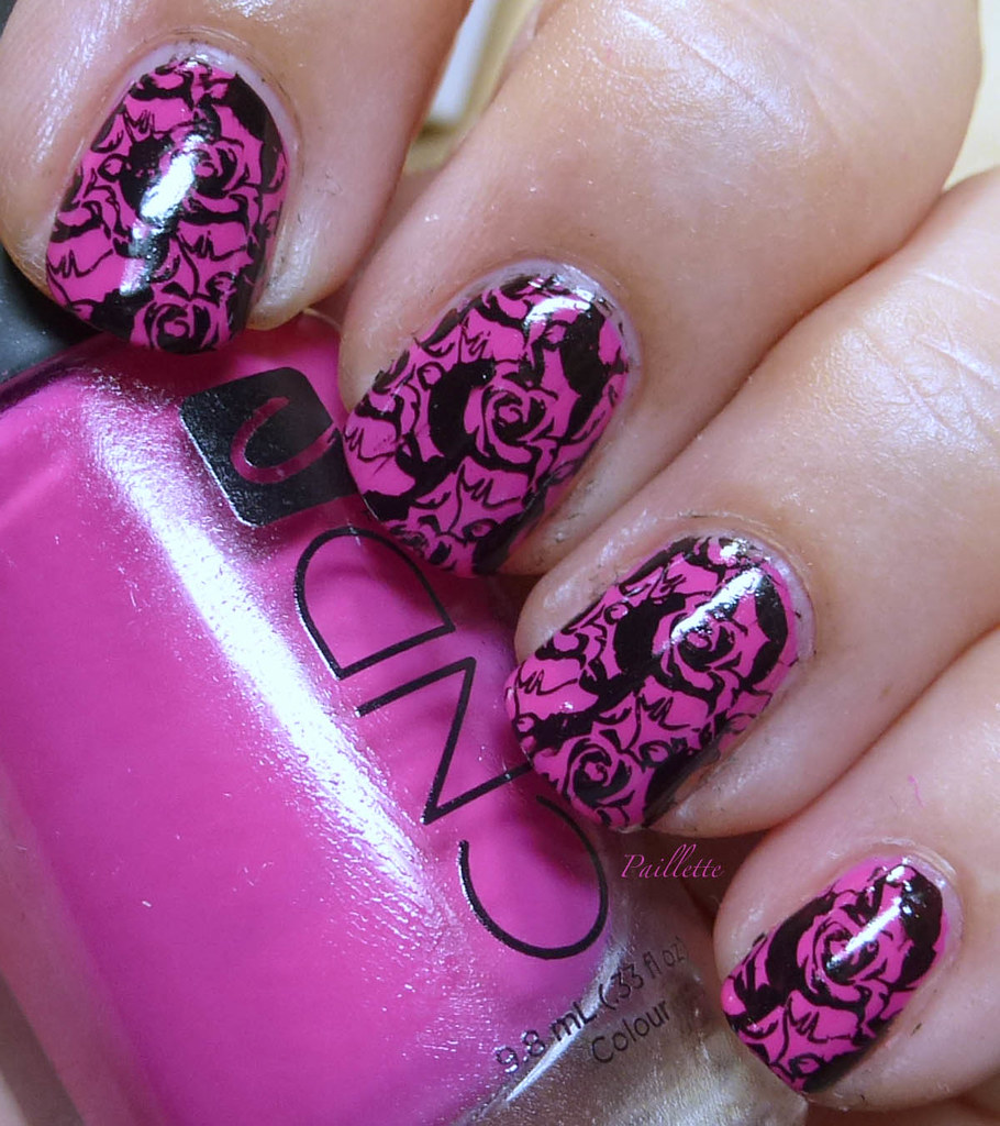
Wanted to reuse a plate I'd posted about here. It's the XY11 plate (still available on eBay with a quick search using XY11 and narrowing down the category)

It was full of interesting things and I thought these negative space roses were super nice!


Good ol' CND Raspberry Pink stamped with WetnWild black creme.

My new stamping polish, for sure!

I love how the roses pop.

Thanks for reading my little nail polish journal!

Sunday, March 13, 2016

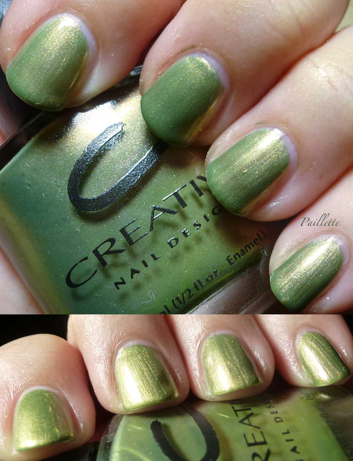
Greens for March: CND Okey Dokey Artichokie

One of those phrases you might have heard your grandmother say to you, but today, it's just not around much.

Neither is my grandmother, but, she has a strong memory for me. Funny, mean as owl sh!t, and feisty. Sentiment, well, it's a mixed bag.

Here's a beautiful duochrome from CND, from when they were putting out some awesome polishes.


Three coats, no top coat.

As a certified 5th gen Californian and Artichoke lover, I love this polish. Packed with some big 3 chemistry, I might evaporate it out and try to revamp it with some OPI thinner., we'll see. This formula is in need of a thin down and it isn't a fast drying polish, either.

 The green shift into amber rocks, though. I love shimmers with a lot of good stuff going on.


I threw it over Borghese Mezzanotte Blue:


Out popped the amber shimmer, leaving the green behind.
You can see a bit on the tip of my index, on the left. I couldn't get a good shift with my lighting, but the green now goes to the background.

I found mine through an online etailer before they were gone, this is occasionally on eBay for a decent price, but often it's a hard to find. I can't think of another green like this in my duochrome/multichrome drawer.

Thanks for reading my little nail polish journal!

Tuesday, March 1, 2016

Greens for March: CND Jaded

Let's start with a big blast of green, shall we?

Here's an old one: CND Jaded.

Found at a blog sale, a lot of it's gone, but it's a glorious emerald shimmer.


Three coats, no top coat.

Back when I was first getting into polish CND had these flat ovoid bottles, these are now discontinued and they only sell extended wear polishes.

Pre-3-free, though as I thin it out to use, I figure some of that will evaporate out. 
Meanwhile, this is very beautiful.

I put it over navy blue to bring up the blue undertones.


This fine, metallic shimmer goes a lot of miles with its beautiful blue/green depths.

Thanks for reading my little nail polish journal!

Monday, January 11, 2016

Gray I Thought I Didn't Want

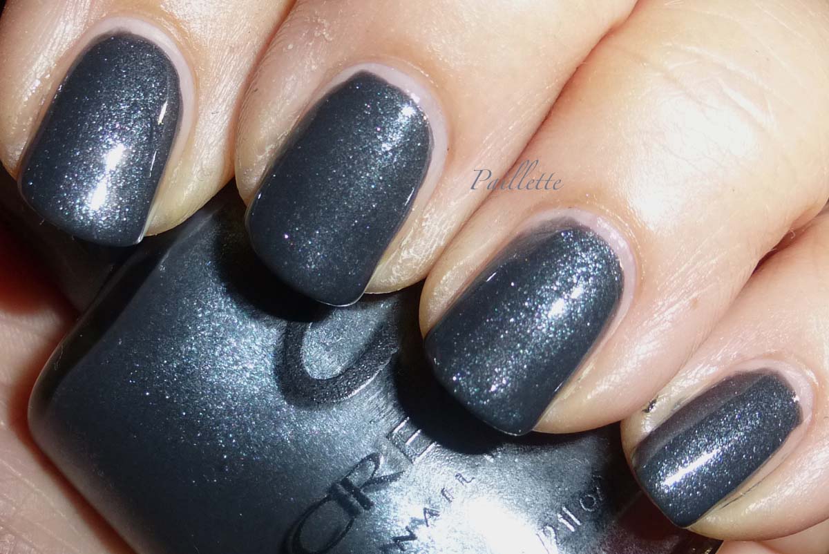
I'd had CND Hyde in the Park up for sale, untried, for quite a while. I thought I'd just pop it on and see if in fact it was a keeper.

It is.


Two coats, no top coat. Taken with flash, so it pulls a bit blue.
My favorite shade of gray. Indeed!

The glass fleck shimmer seems to combine with a with a rich creme base. It's a pretty great combo. I thought, based on the bottle it would be packed with shimmer.

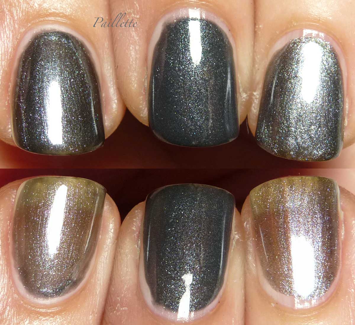
I thought I'd do a quick side by side with some similar shades:


Left to right:
Color Club After Hours
CND Hyde In The Park
Orlane 92

Glad I didn't push it out the door, it's really a beauty.

Edited to add: bottom image in that double shot is the first coat of those three polishes. Apologies for the omission!!


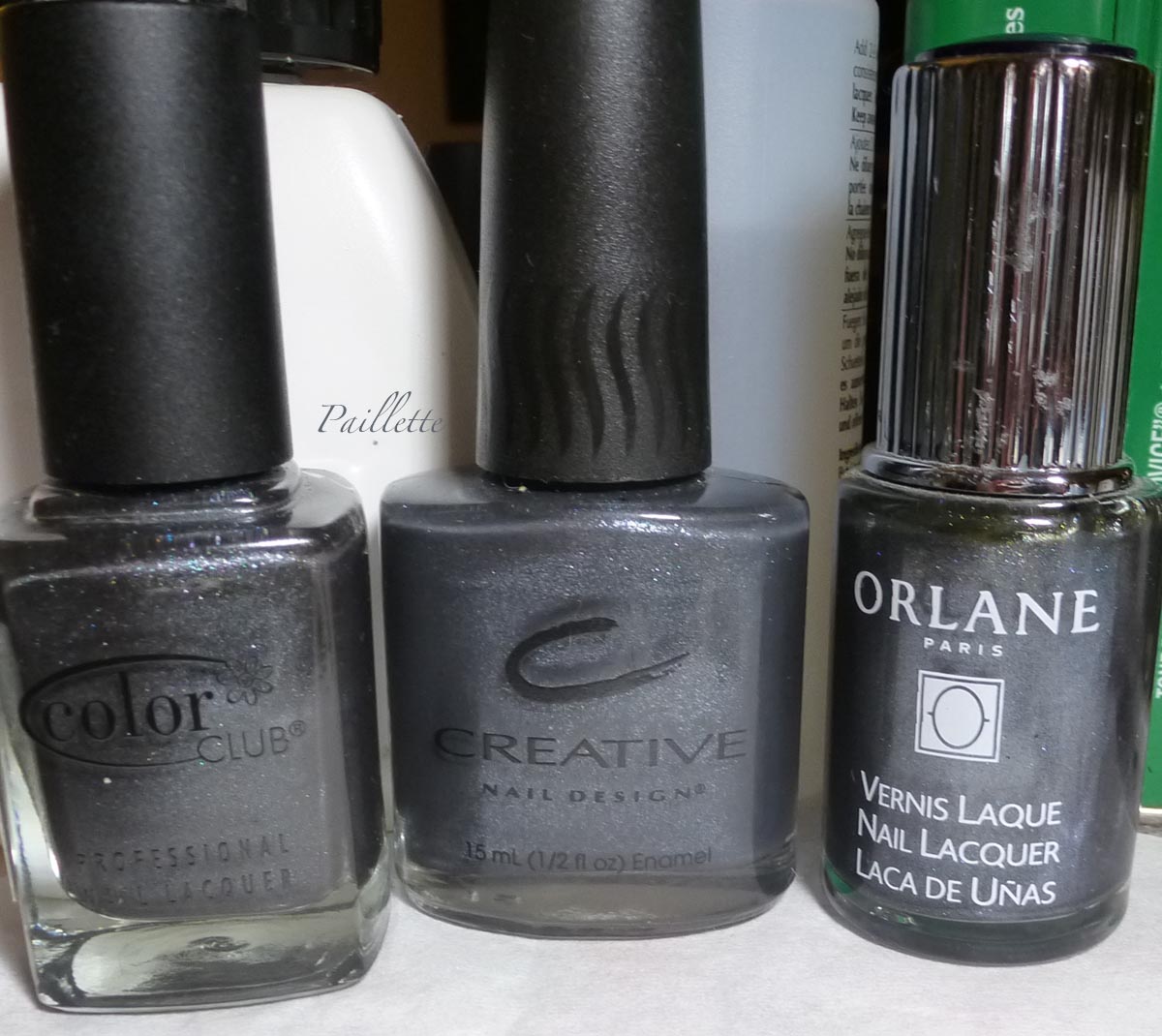
Here are the bottles:


Same order.

The only one that is hard to find online is CND Hyde In The Park. Ah well. There you go. 

Thanks for reading my little nail polish journal!

Wednesday, October 14, 2015

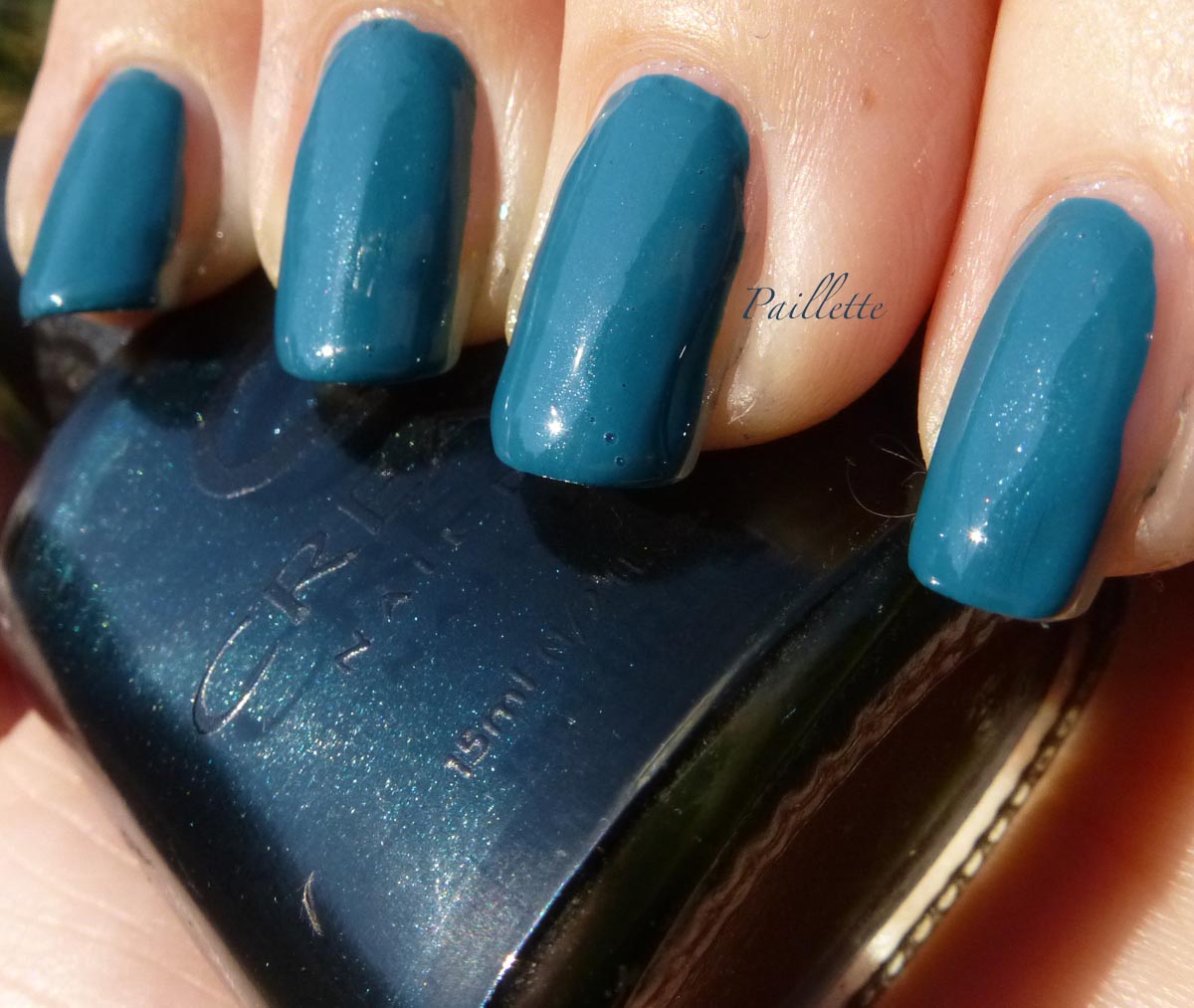
Creative Nail Design NFS

I think that there is really nothing like it.

Oh yes, there are certainly blackened teals, Orly Chateau, Zoya Cynthia, to name two come to mind, but  this one has a shimmer, which, though hard to see, is beautiful.

I put it together with Lurudana Flocado Arco Iris.


I chose this one because when you do enlarge it you can see the shimmer.

I will be honest, I am a bit biased with this one. 

It's three coats here, with two coats of Arco Iris.

Here's the deal: the chemistry did not jibe at all. It would not dry. Period. 
I don't know if it was just the three free versus three unfree (heck I don't know what to call it anymore!), or what, but it was not having it at all.

Much beauty in this lovely flakie. It has a more sparse formula than what I am used to, so it is a bit frustrating that I needed two coats. I will try this again on another polish, hopefully it works out. This was a polish I worked pretty hard to get, this was before international resellers were a dime a dozen.

The jury is out on Ludurana.


Back to CND NFS. 

What does NFS mean? Anyone know the lore behind the name? 

I decided that this polish would just look freaking black no matter how I shot it. So, I decanted some white onto a little piece of silicone from a finger protector (you can get them online, they are for offices and people who turn pages). Then I mixed white and NFS and got the following:


You can see the shimmer in the bottle, love it!  Better still you can see the shimmer in the frankened version. I love the rich teal. Gorgeous.

I have too many backups of this one, sigh, but it's a favorite!

Thanks for reading my little nail polish journal!

Thursday, December 18, 2014

A Pair of Silver Belles

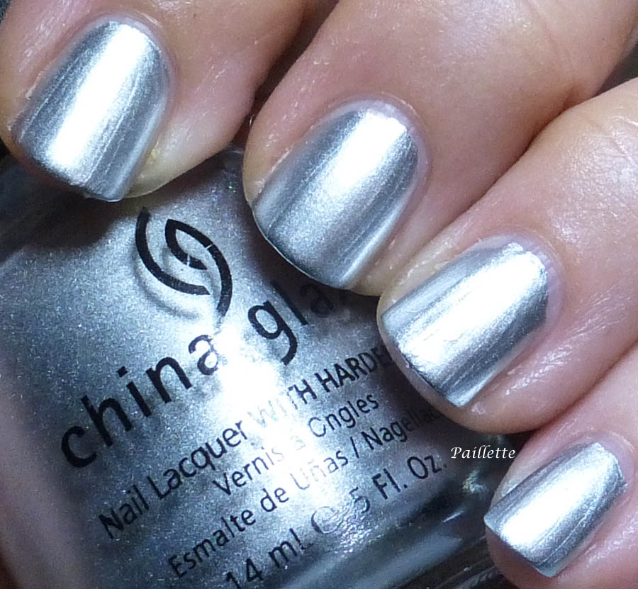
Normally I use foiled silvers on a regular basis, things like the ones I blogged here.

I do have a pair of silver chromes that I wanted to try out and get blogged.

I did use a ridge filling base coat - 2 coats - beneath these. Quite unforgiving on that front.


First up is Creative Nail Design's Time Square:


This is a very old CND polish. Meaning it's a regular polish, not a long wearing one with an old school formula. Stinky, but not bad to use. Some brushstrokes. A bit touchy on try time. Not bad, but not a perfect formula. 

I wanted to try it out for stamping - in the hope that my guess that this would be a great stamping polish. (Despite my skills!)


It was pretty awesome. Laid down perfectly with a very good coverage. I missed a section, it wasn't the polish, it was me.  

This guy has been permanently added to my stamping polishes. 


Next up is China Glaze Millenium: (my autocorrect if duking it out with the China Glaze spelling of this polish)


Three coats. China Glaze did a Krome collection back in 2009 that kicked much butt. It was apparently discontinued, but I still pick up one or two now and again if I find them. This really pops. Love it!

I love this polish. I have Maybelline Mirror Image, which is also great, but this one is really nice, too.

No complaints at all. 

I then used it as a stamping polish.


I found that it adhered to the stamper a bit when I laid down the design onto my nails. I am not sure if this is my stamper (a soft one) or my prep of my nails. It seemed as though it dried very fast and became a little plastic-y, so it was less forgiving. 

I will keep this one as a regular polish for now, mainly because it's quite gorgeous on its own.


Thanks for reading my little nail polish journal!

Sunday, May 4, 2014

Deep Blues Part 2

Continuing the blue theme, I have one who I truly love.

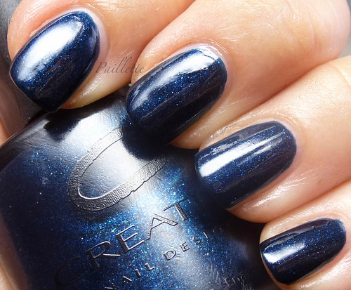
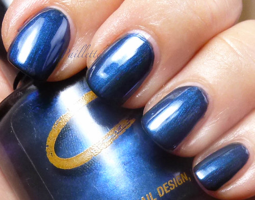
CND Blue Blood


Three coats and no top coat

This is a lovely navy jelly packed with silvery fine glitter. Gorgeous.

Similar to China Glaze Skyscraper, but more refined.

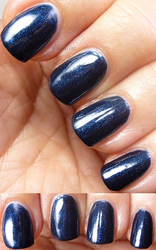
Here's another photo


Old school formula, pretty polish that I found on eBay.

I think in real life it is a tad bit warmer, almost a petrol navy blue. Unique and incredible.

It's quite beautiful and I really love it a lot.

More blues soon!

Thanks for reading my little nail polish journal!

Thursday, May 1, 2014

Deep Blues Part 1

Navy is so fresh and beautiful for spring.

Whenever I wear pink, magenta or fuchsia, I wear navy nails. Kind of mod, kind of retro for the 60's, but I really love the combo. It also reminds me of Indian saris with rich pinks and deep navy.

Here are a pair of shimmers, please enjoy.


Milani Midnight Satin


Three coats and no top coat.

Very beautiful navy shimmer in a black base that almost pushes the blurple realm.


I found this at the Dollar Tree a few months ago when there were quite a number of Milani's and I was glad to find this one. 


CND Nocturnal


Three coats and no top coat again, much more blue and much more of an old school formula. 


More traditional shimmer, and very nice formula. 

I think I purchased this from eBay. 

Both polishes are in a blackened jelly base, which is why I put them together. 

Lovely!


Here are comparisons:


Left to right:
 - Milani Midnight Satin
 - CND Nocturnal
 - Milani Midnight Satin
 - CND Nocturnal

This photo really does show a more accurate depth of the blue. 
Navy is navy, baby!

More blues soon!

Thanks for reading my little nail polish journal!

Friday, October 25, 2013

CND CND CND Why?

I love Creative Nail Design's nail polishes.

A quick browse through their website tells me they aren't even listing nail polish, just shellac (14 day wear) and Vinylux (week long wear). Zero nail polish discussed. Why? You were so good at it!

I commend them for seriously creating top coats or Effects polishes. I guess people just didn't enjoy it enough to buy it.

To be honest I see maaaaaany polishes that could be achieved with a layering technique versus buying one bottle. OTOH, not a lot of people like multiple bottles of polish, hence the demise of the Color and Effects, by my deduction through its absence on their site.

The three categories CND offered was kind of genius: sparkle (glass fleck), shimmer (fine shimmer) and pearl (fine iridescent/pearlescent shimmers). Pretty fabulous and rather useful. Rather!

Back in 2010 they came out with there teal set of Color and Effects called Night Factory, featuring Urban Oasis and Teal Sparkle. It's a constant reminder that I should just buy what I love and not skip it and wait until later. I still rue missing that one.

In fall 2011 I purchased their The Look trio, Midnight Sapphire (navy creme) and Dark Amethyst (deep wine) which came with a topper called 24K Sparkle.

Generic base colors - inasmuch if you have them, you don't need them, but if you don't have them, these are good to have - and a topper that was pretty unique.

Then Essie came out with holiday crazy awesome Luxeffects and As Gold as it Gets was declared a dupe. I picked up all the holiday colors, then just let my CND set languish.

So, thinking As Gold as it Gets was a dupe of 24K Sparkle, I thought, I better examine what I've got!

Let's start with the macro:

Left: Midnight Sapphire, three coats each topper.  Right: Dark Amethyst, one coat each topper.


I did each polish side by side on the same nail.

In every photo on the left side of the nail is CND 24K Sparkle on the right side of the nail is Essie As Gold As It Gets.

They are similar. They do have a similar golden shade, CND appears to impart more of that flakey iridescence. CND's offering is more solid, Essie's more translucent.

\

Here is a one coat of each topper over Dark Amethyst. Again: Left CND, right Essie.

When adding a golden topper, it warms up the Dark Amethyst considerably. It's labeled "warm" on the bottom of the bottle, but definitely in the purple family of vampies rather than the red/brown.
It's deep, but not a near black, which makes it a nice shade on its own.

Essie's big different, is that it has a ton of fine pieces in the mix, whereas CND has fewer, larger pieces.

Here are three coats each over Midnight Sapphire:


On each nail:
Left: CND
Right: Essie.

Essie becomes very dense, and, though CND definitely builds, you can still see the more mosaic effect that these flakes impart.
Midnight Sapphire is a pretty normal navy, not so terribly blackened, but definitely navy. Nothing to suggest a purple, blurple, or grape at all. Just blue. ;D


My personal preference?

Well, I've got the CND filed under "flake" and the Essie filed under "fleck top coat". Although the Essie particles are less uniform than a glass fleck, it's really not vibing a true flakie in my estimation.

They are similar, though, but not entirely dupes.


Here are the bottle shots:


Right now the CND is on Amazon, alone not in a set. A bit expensive at $11.99 plus shipping. Essie As Gold as it Gets is being rereleased with the Luxeffects again pretty soon, so if you missed it, it'll be around. Retail runs $8, but it can be found on etailer sites for less, plus their's Amazon and eBay.

I will say that gold flakies are hard to find, so of you find the CND at a nice price point for your wallet it would be something unique. 
24K Sparkle straddles flake and gold leaf territory and fills that niche nicely.

Thanks for reading my little nail polish journal!
Friday, August 16, 2013

Faux Taboo and a Comparison

So, I didn't get Chanel Taboo. I felt that I have a lot of great polishes that I can combine to make something that will make me feel that shimmer.

Faux. As it were.
Here's my result:


How did this come about?

Well I was browsing my warm russet berry colors and saw a dupe:


Left: Color Club Dance to the Musique Slow Jam
Right: Haute Browns Black-ish

So, to my eye this is basically the same polish CC Slow Jam has no gold shimmer, however.


A pair of lovely mulberry polishes.
Hello bruddah!


Ok so after that I just decided to see how Color Club Slow Jam would look layered:


Three coats of CC Slow Jam.

A coat each of CND Sapphire Sparkle and CND Amethyst.


This is under diffused light.

Not sure if it's a match, I don't have the Chanel.

The main goal here was to emulate a polish using what I have rather than running out and grabbing a new color. I would next time use CND Crimson, it will pull out the red, which despite the base, doesn't really show up!

Not sure if this is a win. I see one thing when I look at photos of the bottle of Chanel Taboo and quite another when I see photos of it on the nail. Since I don't have it, it's hard to figure how close I actually am in this attempt!

Thanks for reading my little nail polish journal!

Sunday, July 21, 2013

Raspberries in the Sun

CND Raspberry Parfait and Sally Hansen Hidden Treasure:


Three coats of CND and two of Sally Hansen's Hidden Treasure.

Quick summer mani for some hot days here on the Palouse!

The light is morning sunshine for a fast snap. Doesn't capture all the shades of green that come out, but the golden orange works great with the hot pink!

Thanks for reading my little nail polish journal!

Friday, February 22, 2013

CND Pink Wishes

Creative Nail Design Pink Wishes released in autumn 2011 for Breast Cancer awareness.

I think I found it on sale at an etailer's site. 

It's a set of two polishes:


Pink Wishes Colour and Pink Wishes Pearl Effect. I like the packaging

A pretty set of a pale buff pink creme and a gorgeous shimmer top coat that is classified as a pearl.

Here is Pink Wishes alone:


Three coats, more out of habit than anything else, it could have been a two-coater. I think I wore if before, it's pretty thick and a little bit heavy, but I love the soft pink.
They call it cool, but I really think of it as a neutral. There is a real sense of demurity about it.
Here is a photo of the Pink Wishes Pearl:


It is much easier to see the shimmer in lower light.

So, in the last shot, to see the the shimmer I dropped the lighting level:


The soft pink shimmer shows up prettily and in a very subtle. I suppose these days with all the "secret shimmers" around it's almost an odd duck, being a two-parter and all. 

I think Pearl Wishes Pearl over black or navy is super fabulous. I didn't do it over black because I wanted to wear this manicure.

So delicate and lovely.

Thanks for reading my little nail polish journal!

Monday, April 9, 2012

A Parfait and a Pearl

I love CND nail polish. For a start, they take layering seriously. I love layering and I love that there are specific polishes designed for just such a purpose.
Job well done!

I have on Raspberry Parfait  - a creme - and Pink Wishes Pearl. The latter came in a set I purchased from Transdesign, the former I received from CND to swatch.

The Effects line currently comes in three categories: Pearls, Shimmer and Sparkle. I confess I love Sparkle all the way.

But I love Pearl for it's subtle nuance:


The blue flash is always a great pleasure. Add a pink/lavender to the mix and I am happy with a layering polish that is all that!

I also like the CND cremes, easy to work with and decent coverage.

I will say that previous to this I wore the Pink Wishes pink from the set and it was a four coater and a little but of a pain to get coverage, but, when I added the Pink Wishes Pearl, I was fine with all the effort. I even received a complement on my pink nails! I always get compliments on colors that I never expect to even get attention!

I will swatch that set and post it, soon. Very springtime, etc.

But, back to Raspberry Parfait.
This is a pretty combo and I love this shade of pink on my skintone, too.

Bottle shot!


The Pink Pearl effects polish is similar to the Sally Hansen Opals, very pretty alone, but over a darker color reveals much gorgeousness.

Thanks for reading my little nail polish journal!

Tuesday, September 13, 2011

CND: Hot Days, Cool Nights

I have a pair of CND, or Creative Nail Design, layering combos I want to share.

CND generously sent me some polishes to review! Yay!

*stumbles around blushing and honored and excited all at once*

Let's get busy!

First up


The perfect coral for any skintone. Balanced just right, not too pink, not too orange.

I have three coats here, and I think it did need three, though the formula was very easy to work with, looking at my pinky, you can see that I didn't do clean up and it really wasn't loosy goosy or heavy. I love this shade of coral for summer: oomph but not neon or too bright. Never dusty, but somewhat demure.

I wanted to catch the sun - it's a late hot summer here - so I added Crimson Sparkle:


A rosy golden top coat that I really love. Glassy particle greatness!

What was even more fun, was that even with my small hands, I could fit the bottle between my fingers and stay outside in the sunshine and apply the top coat. Little demo below:


You can see a bit of the green flash in this top coat, too!


Next, CND Sapphire Sparkle over CND Asphalt Oilslick (sorry, should have jotted it down!!!!):


Wow.
No, really.

Crazy wonderful duochrome.

Asphalt Oilslick is a rich black, a definite two coat, but a very nice formula that was easy to work with.

It was very easy to play with this one, too:


Shifting to purple, and showing it's blue range from royal to icy blue.

You know how I love a duochrome!


This one delivers!

I like the way it gives ample coverage in one topcoat, the black is there, but one coat fills the bill and the glassy particle greatness easily gives up it's charming color change.


Thanks for reading my little nail polish journal.

This product was sent for me for review.