Showing posts with label Pueen. Show all posts

Wednesday, May 4, 2016

Red and Gray, Part 2

Back to the red and gray theme.

I love the combo because it reminds me of the 1950's.


OPI Athletes in Cletes, three coats no top coat.

I love this popping red chock-a-block with silvery shimmer.

Reminds me of a summer day at a triple A game.  I love it. It's a true red so it is very neutral.

Here it is stamped with American Apparel Factory Gray.


I used Pueen Leisure Buffet collection's plate 87.

I love the little bows.

Thanks for reading my little nail polish journal!

Sunday, February 28, 2016

Baroque Stamping Part 2

Of course when word - and images - trickled my way about the Born Pretty Mirror polishes, I had to try it out.

It's a taskmaster: must have a ridge filler, must NOT use a top coat, and a lot of shaking involved.

I did not achieve true mirror, for me it ended up like a normal chrome, but I do believe that with adequate base layer smoothing and no top coat you can get a mirror.

Meanwhilst....

Here is what I did with mine


This is two coats and with a top coat.

I used SinfulColors Endless Blue - a very nice stamping polish.

Plate is Pueen 76 from the Leisure Buffet collection.


I would say that it needs a reblog. 

The Born Pretty set comes with a base coat. I think it's akin to an aqua base.

It's quite affordable, which is good if you missed out on that little run of old Maybelling Mirror Mirror polishes that seemed to percolate around eBay and blog sales, etc.

Thanks for reading my little nail journal!

Friday, February 26, 2016

Baroque Stamping Part 1

As I go through and see which polishes that stamp and don't stamp, I've seen on Youtube from the pre-eminent stampers that they sometimes leave the cap off a non-stamping polish to enhance it's stamping chops. In other words, letting a polish dry out a bit, makes it more of a dense polish, better for stamping!

Nice! I will have to try this on a couple of polishes I thought were just not going to work out. This is one that I want to make more dense, it's a unique color, but not something I really like to wear, but for stamping, it is beautiful.

China Glaze Harvest Moon over no name blue franken


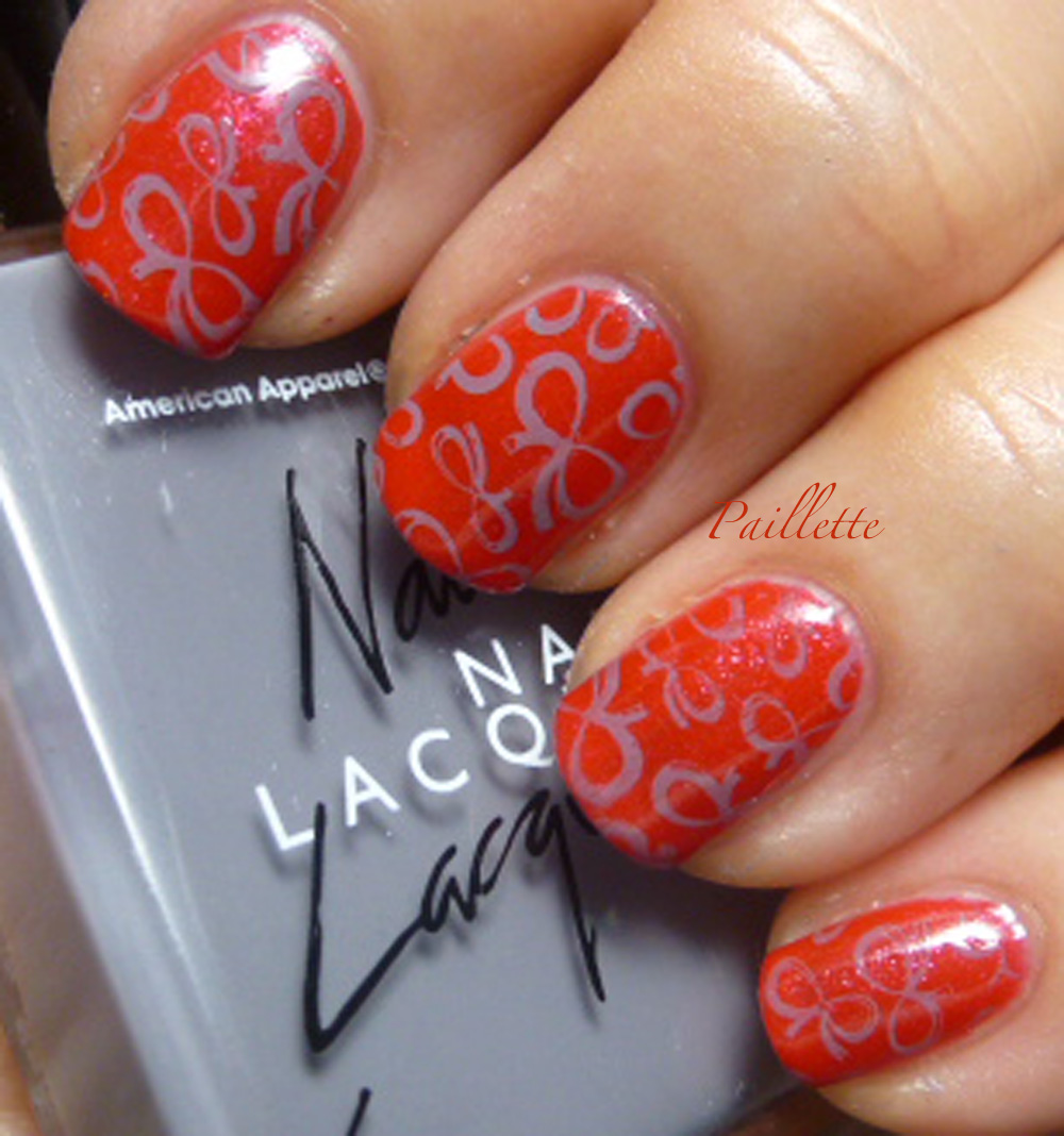
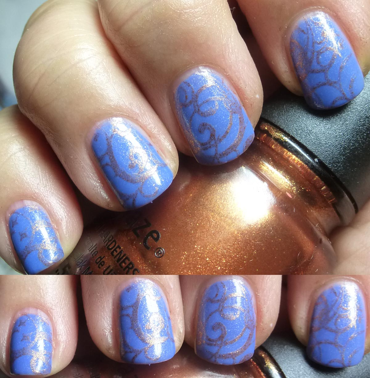
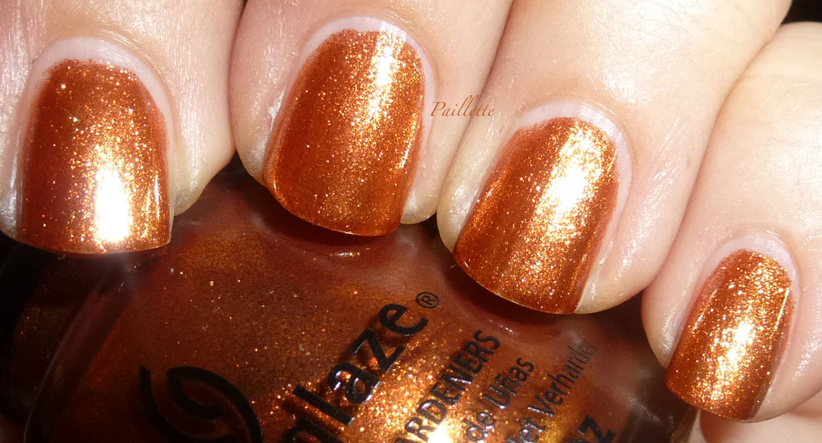
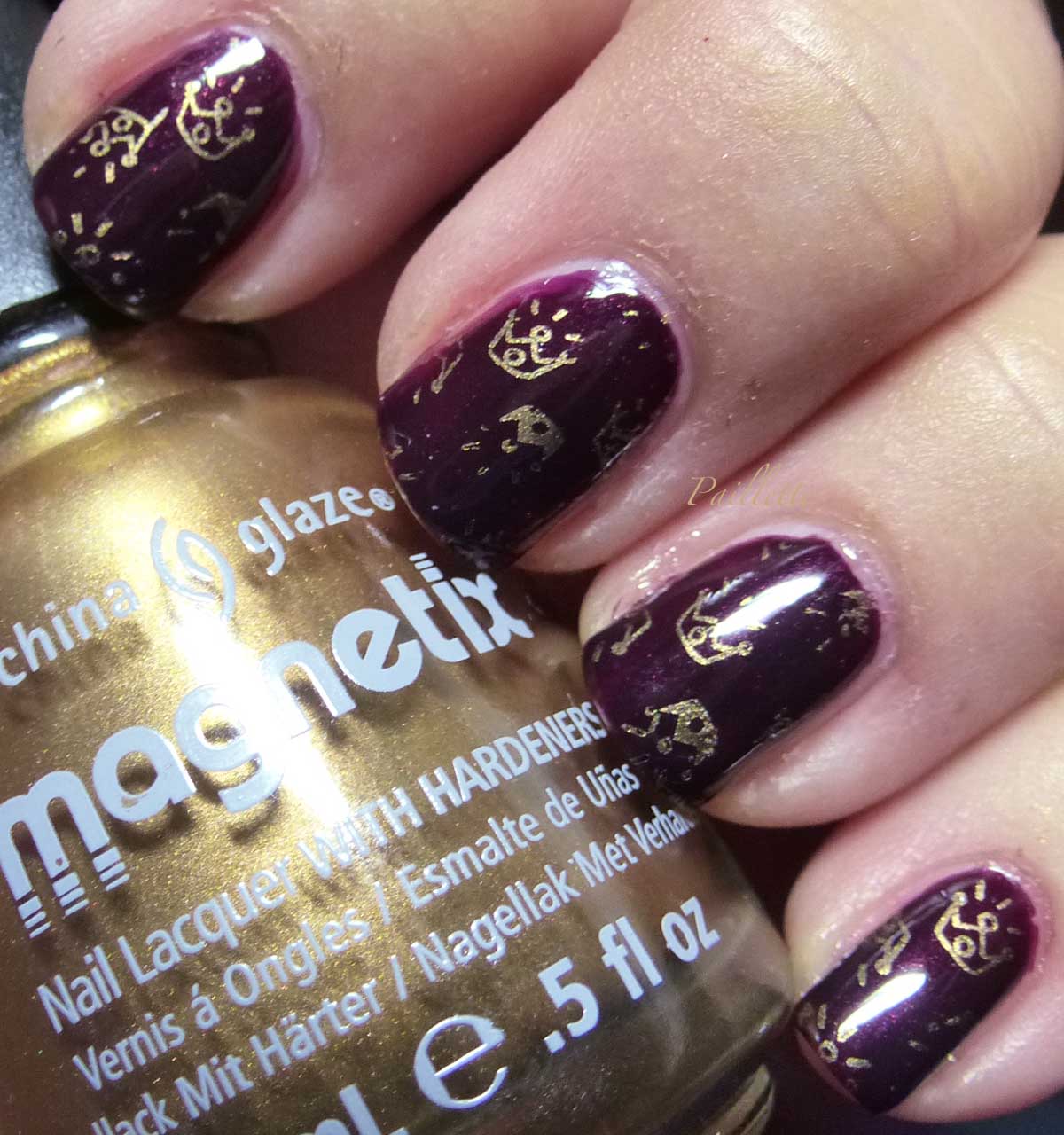
Harvest Moon, a rich molten metal shade, is from the Hunger Games collection that came out a number of years ago. It looses its impact stamped, but does lend a soft copper metallic shimmer when stamped, so I decided to post this after some consideration. I wanted a bright copper metallic, and I should have mined the chrome waters for this, but I wanted to try out Harvest Moon.

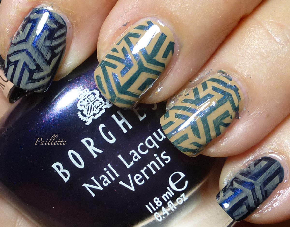
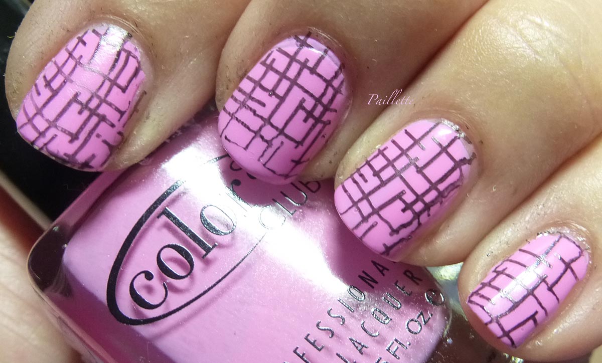
I stamped using Pueen Encore collection plate SE03B.


This collection has four square buffet style plates (buffet style means there are a ton of images all collaged together instead of discrete rectangular nail sized patterns) that are actually double sided yielding 8 separate image plates. I'm just starting to play with these on the blog. 
There were reports of etching issues, and I've seen that Pueen has had some issues, but I've never encountered any problems, particularly with these plates.

I used the encircled section, and you can see the designs are not huge, so instead of a partial curl, I got several! Nice! 

The plates are 10 by 10 centimeters, or roughly 4", though a smallish size, the designs are dense.
Perfect for you folks, like me, with smaller nails. Often with buffet plates it's a trial and error operation to find what works. I know that with Moyou London, they scale stuff down specifically, which is why I am a loyal customer.

I love this set, a lot of variety. I will feature these more in the future, I'm also using the Pueen Buffet Leisure more as well. 

As an aside, stamping is exploding. My take, from the rocky start of my beginning, is that stampers are getting easier to use, those old hard Konad stampers are good for some, but weren't a win for me. 

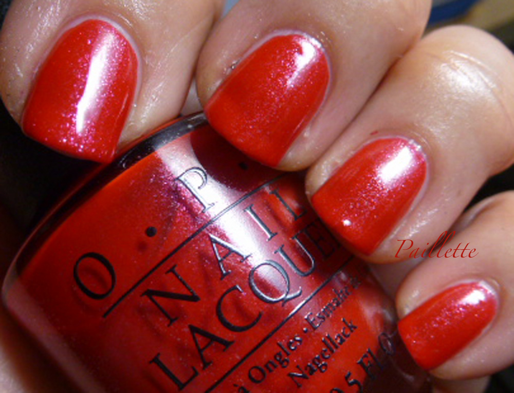
Moving on, here's a little photo of Harvest Moon:


Here are three coats, no top coat. Luminous metallic, those shimmers just adore the light.

I won't say I haven't had a bit of trouble with this polish, it's a little touchy until it's good and dry. I love the warmth of it, a strong autumn color.

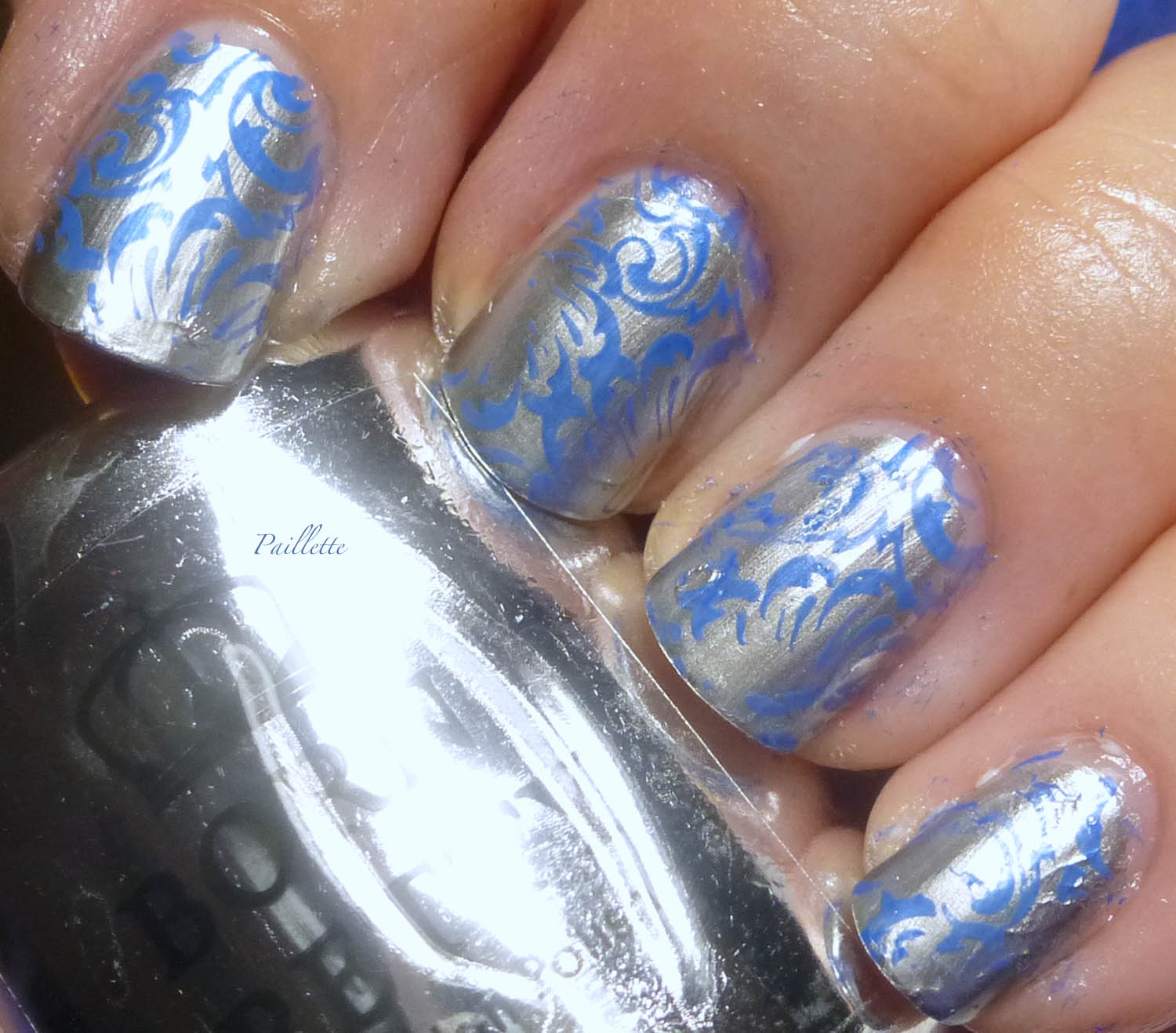
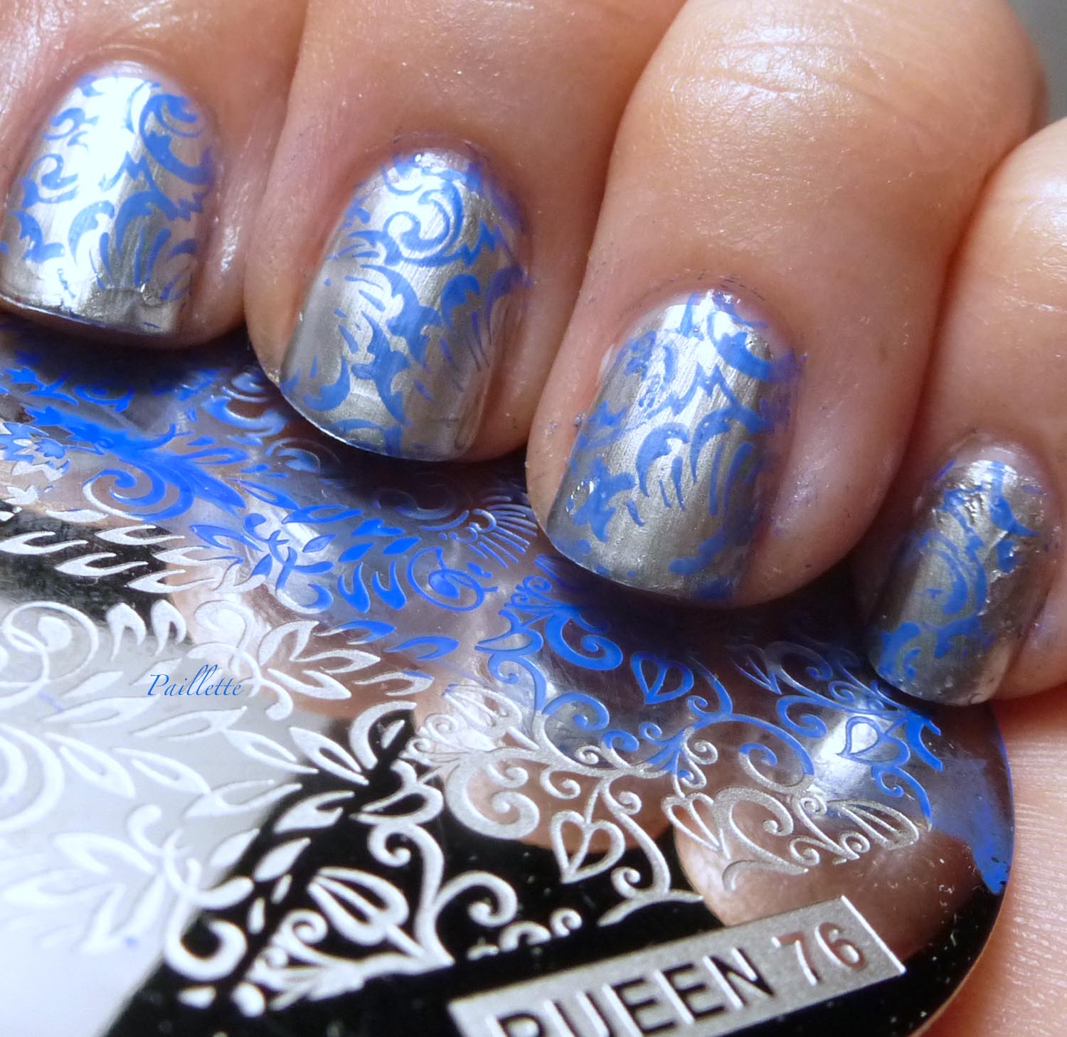
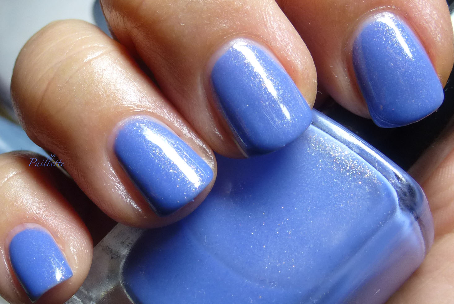
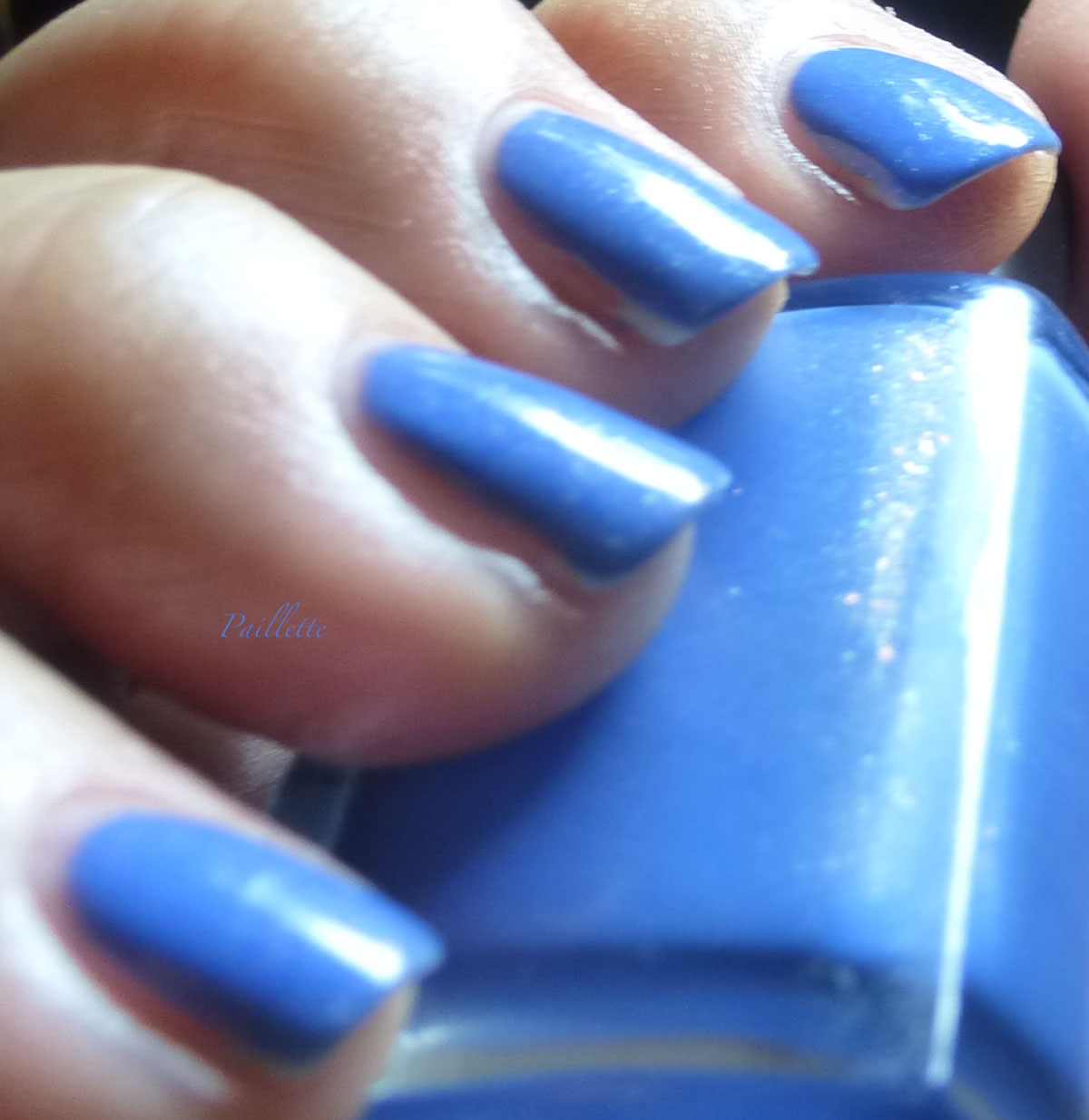
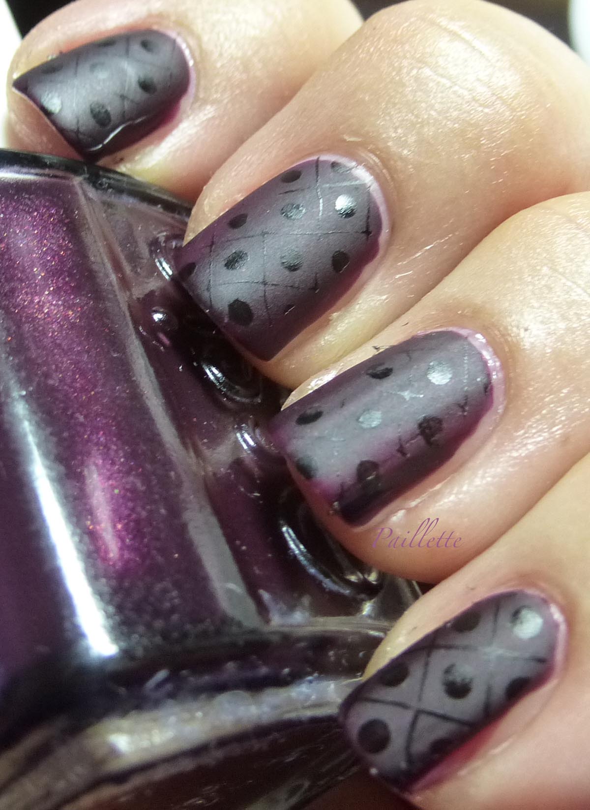
While I wanted this shade to contrast with the blue, but it didn't have enough density.

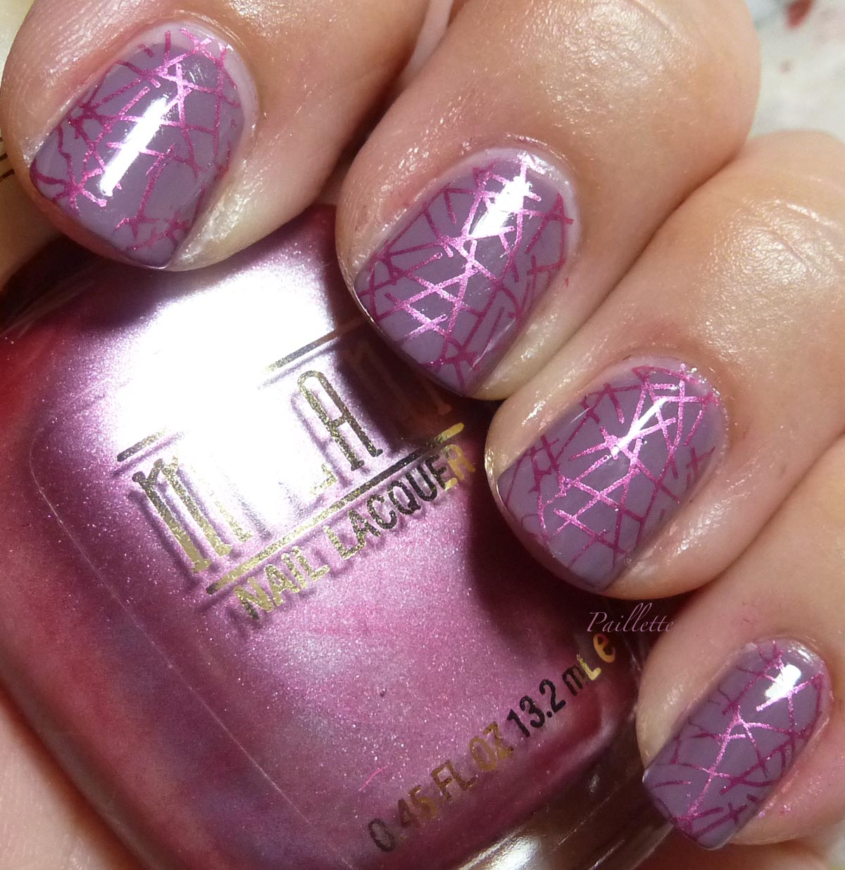
The base is a franken of blues, one of which is Pacific Blue, but I'm not sure what else ended up in the bottle. The other main ingredient is some glass fleck with a green tint. It's hard to see, but it's there.


Gosh, I love a glass fleck! 

Hope you enjoyed!!

Thanks for reading my little nail polish journal!!

Thursday, September 17, 2015

Intarsia or Sometimes You Win, Sometimes You Lose

I wanted to make sure that as I post along on my nail blog and grow into doing more nail art one thing is clear: try and try again.

Using Pueen plate 11 from their Sumptuous Elements collection, I wanted to use the intarsia pattern alternating a navy and tan.


Yes. Well.

Ups and downs. 

I love the pattern, and it reminds me of a knitted sweater. 

I thought Borghese Plumaggio Purple, aka navy, would have enough oomph to cover, but it doesn't. Neither does Sally Hansen's Snappy Creme. 

In the end it falls under learning curve. I think the plate and pattern were very much a win, but the stamping polishes aren't that: stamping polishes. 


Onward!

Thanks for reading my little nail polish journal!

Wednesday, September 9, 2015

Thrift Shop Memories

Back in the early 90's in Seattle, I used to hit the thrift stores as rigorously as I hit the latte stand or Three Girls Bakery.
This was well before eBay and its affect on great finds and good prices, plus it was fun to find old 60's cashmere coats, brocade kitten heels, or - my fave - sweater sets. 

Here's a stamping that reminds me of vintage sweater labels. They were always black with gold thread and goofy names. I've unloaded a lot of those sweaters, but still have a couple of old cashmere cardigans. I think my favorite, is a hand knit sweater in deep blueberry with rhinestone buttons. It's too big, but occasionally I wear it belted. I always wonder who made it and who just discarded such a great sweater. (of course who discards their pets at shelters? unfathomable. They are family.)

Back to the polish...


I can't recall the base, but I reused China Glaze Magnetix Gold Fusion, dense and working into a wonderful stamping polish!

The plate is Pueen Sumptuous Elements 03. Go Pueen! 

This pattern is almost too big for my nails, but I liked they little crowns.

Thanks for reading my little nail polish journal!

Saturday, September 5, 2015

Shiny

There. I admit it. I just binge watched Firefly. Kind of wonder if it was a bit ahead of its time. I am sure if it had not been on the Fox network, that the internet tv, Netflix, Hulu, etc, would have offered a home for its gallows humor and intense characterization. You finish wanting more. Rare, since I'm a cinephile and not really into TV much at all.

Meanwhile, I wanted to usher in some autumnal manis and wanted to pay homage to a blogger who no longer blogs, but left a big wake of beautiful manis.

Chloe's Nails as a blog is now inactive, but there were some genius matte/shiny nail art I wanted to try. Try I did.

Here's a link to one post that has, unfortunately, had the photo stolen and is frequently seen on eBay (that's why I don't suggest ever buying from sellers who used stolen photos, scum)

My efforts aren't quite as perfect, but here's a shot:


The base is a no name Markwin's polish I found at Ross back in 2009 or '10. It's been rebottled into an old Essie, but make no mistake, it's just as good. Three coats. On my ring finger you can see a bit more of the deep plum.

I mattified it with New York Color matte top coat. Cheap and effective.

I then stamped it with Pueen Sumptuous Elements plate 02. I used Milani black nail striping polish, which doesn't an ok job, but I think I am learning to mellow on the scraping intensity, too. 

Hope you enjoyed! And definitely take a peek at Chloe's blog, she is an artisan and hope picks it up again.

Thanks for reading my little nail polish journal!

Wednesday, August 26, 2015

Mid Mod Stamping

I came of age just as the last gasps of this aesthetic were easing on down the road.

At it's best it's clean Danish design, at its worst it was shag rugs and "Big Eyes."


Three coats of Color Club High Society, a beautiful mousy taupe, topped with Milani Hot Orchid.

Stamped with Pueen Sumptuous Elements plate 05.

I blogged High Society back here, and found it at Ross back in the Color Club hey day.
This was part of the Rebel Debutante collection by Color Club.

Milani Hot Orchid is part of their discontinued line, I found mine at the dollar tree and it is currently on eBay as well as some other locations around the interwebz. As a stamping polish, this has to be a top ten: great color, great coverage and a pretty metallic finish. Much win.

This shade combination reminds me of those 1950's dresses with piping accents.


Three coats of Color Club Yachty Yachty Yadda topped with Pueen plate 04.

The stamping polish is a Milani striping polish, which isn't bad, but I think could be deeper black.

This is Pueen Sumptuous Elements Plate 04.

YYY by Color Club is quite a nice pink: cool to medium leaning and in three coats smooths out very well. I blogged it here.

Love the sharp, mod colors of this one.


Thanks for reading my little nail polish journal!