Showing posts with label blue. Show all posts

Tuesday, June 7, 2022

Blooming Blue

Night Owl Lacquer has been a steady performer in the indie polish world. 

And like many indies, polish shades and collections come and go.

Here is a beauty from the still-available Blooming collection.


A beautiful bright periwinkle. Due to the shifty blue to purple pigment, it has such a range.  Here it is with a nice two coats and a bright "vibrant" (to use their description) blue that softens with a bit of blurple leaning action.


The shift her is delightful. Muted and soft like morning on a lavender farm. 


Finally you get this:


This is so bright and zingy without being anything less than that periwinkle, purple tinged blue.


Delightful!!!


Thanks for reading my little nail polish journal!


Thursday, May 19, 2022

Chateau Stamping

As you know, or mayn't, I am pulling photos from my old stash of "to be posted" along with some new polishes. Kind of mixing it up as I get back into the stream of posting on a regular basis.

Here is one that I almost passed on posting, but it keeps catching my eye.

Sally Hansen Silver Lining (a 2010 Tracy Reese collection original!) topped with Color Club's Take Me to Your Chateau:


 I love the combination!

Silver Lining has a faint blue sparkle built in and my photo doesn't do it justice at all.


I did not write down the plate number, so I don't have any idea what it could be, but I think it's a Pueen.


thanks for reading my little nail polish journal!

Friday, May 13, 2022

Grape Hyacinth, By Black Dahlia Lacquer

 An irresistible glitter polish from Black Dahlia Lacquer.


This is where Sinful Colors Hottie got left in the dust. 

Three gorgeous coats of periwinkle leaning royal blue saturated with iridescent and holo glitters.


This is no longer available on their site, but the good news is they have a host of gorgeous polishes.


Wore like a champ and was even more delightful in person.


Thanks for reading my little nail polish journal!


Wednesday, June 23, 2021

Zingy Zoya Zuza

 What can I say, a simple seaside shade suited for summer.

They call it a turquoise, but there is a green shimmer in it that really moves it out of the blue into the seafoam green category. And yet it's not that pale kind of shade, but a rich fresh pop of green/blue.

Zoya's description (It's still available on their site) says there is gold and silver shimmer, well the gold certainly yeets the blue out of the turquoise.


Here's my swatch:


Three coats, no top coat.


Simple, easy and perfect for these hot days of summer. 


Thanks for reading my little nail polish journal!

Thursday, August 13, 2020

Bright Polish, Gothic Name

 Pahlish is one of my early indie loves. 

Thankfully she's still swinging it out of the park.


Here is one of the early ones for me: Your Bright Shadow.


Set in a beautiful violet leaning periwinkle swim some seafoam and pearl white glitters of various shapes. 

Three coats, no top coat.

Pahlish, as is the indie way, only made this for a short time. You may be able to find this gem in a blog sale or perhaps in a facebook sale. Otherwise, it's page out of the nail polish history book.


Meanwhile, this is an old photo from May, so I am playing catch up and trying to post more often with photos that I think are worth posting.


Still polygel free for now.


Take care and thanks so much for reading my little nail polish journal.

Sunday, May 10, 2020

Blue Skies are G.O.A.T., Too

I have to admit, I often take photos and then discard them because something just doesn't do the polish justice. My personal way of officially "swatching" a polish is posting it here on the blog (and Instaspam, too, since, I figured out how to do it on a regular computer, thus accessing files, versus playing games with emails...bzzzzzt you don't want to read this).

When I get a great polish shot, it's very satisfying. 

Here is Music City Beauty Capricorns are G.O.A.T.:


This is two coats and no top coat at this point. 

What I love most about this polish is how flipping rich the blue is, but doesn't sacrifice the glass fleck-osity that I crave in shimmer polishes. Plus it has a delightful pink cast, moving this into that rare "intense periwinkle" family. 

This is from Polish Pickup January 2020. As I lean more toward indies, it is not inexpensive, so trying to decide which limited edition polishes to buy is almost heartbreaking at times. These days PPU is well over 100 polishes, wax melts, soaps, cuticle oils, jewelry, and many other things from stamping plates to cat toys. I think this is quite a success story. 

Here is another photo of it while I was out at the barn:


This is a few days later and I am very prone to tip wear due to my motto of "tools, oops, I mean jewels, dammit" when I use my hands. 

This was taken in February and the sun was out, and unlike last February it was extremely nice outside. 

I am lucky to have blue skies and open vistas where I live. 

If you can find this polish on a blog sale or a facespace sale, I recommend picking it up: it's dense and rich and you don't have to fight with it, heaven knows I am not the clean-up queen and I feel like it's just a gem in my collection.

Thanks for reading my little nail polish journal!

Friday, April 17, 2020

Sheltering

Sheltering in place right now.

Staying inside is a luxury I am grateful for.

Here is to everyone who is fighting this. 

Essie Shelter Island


Three coats, a top coat, too.

A classic and a beautiful blue. No longer in the Essie line-up, it came out as a trio. Then Essie was sold off to L'Oreal and L'Oreal duped it. Go figure.

When I was first getting into polish, this was a hot set. To me, while it is beautiful, it is not a drop dead gorgeous blue.

But it is pretty and soft and though it needed a solid three coats, what isn't to like about it's preppy vibe.

Take care and thanks so much for reading my little nail polish journal!

Wednesday, September 4, 2019

Blue Deco

I wanted to get started again and I thought I should just dig in and do it.

Here is a stamping project from at least April perhaps even March. It's all been a blur.


The break down...

Base: China Glaze Secret Periwinkle
Stamping: China Glaze Agent Lavender
Topper: Orly Precious Metal
Plate: UberChic Art Deco Flair

I like this combination and it feels right.

I figured out to post on Instagram from my computer desktop, so it's much easier to use than playing the "edit, email, post" game I was playing before.

I will post a link to my Instagram on the side bar, but it's paillettepolishjournal, but how the address works with your device, who knows. Later on I will do a java/html link, but until I backup, I'll just do a link. I love the blog, as it lets me write much more and feels more like home. But some people want images more than words, plus Instaworld is more in the mix with people rather than the lone cowboy on the range feeling of running a blog. (though at heart, perhaps I am a bit of a cowboy)

This photo shows me in polygel, which I was not unhappy with at all, but right now I have set it aside again.

I think this time of year there is too much water and more lifting. I did have another nail that I didn't know was lifting (thumb) and saw that it smelled a bit, so I removed them. All I need is some micro creature making his home there.

In a couple months I'll go back. We'll see. 

Thanks for reading my little nail polish journal.
I appreciate it!

Tuesday, May 21, 2019

Soft Spring Blue Comparison

Spring is a baby: turning on the tears on moment, mellow and smiling the next. You never quite know what to expect, so you prepare for it all.

Here are three blues I have had for a while and wanted to compare long ago, but never seemed to manage.


Here are Secret Periwinkle, Butter London Sprog, and Color Club Hydrangea Kiss


I love them in the same order that I have them on, actually!
Formula for Butter London is really excellent, it is more opaque and easier to use.

I found Color Club a little bit more subdued and less intense, but still a very pretty blue.

Here is another shot:


Three coats, no top coat. 
In person Sprog is very close to Secret Periwinkle.

Thanks for reading my little nail polish journal!

Wednesday, May 15, 2019

Pop Diaphanous

Pop Polish is an Etsy based seller with a wonderful stable of amazing polishes.

I always try to browse and there are many inspired collections.

Here is Diaphanous:


This is over a teal gray frankinpolish, but it covered very well and it just sings.

I can barely take my eyes off of it.

I wore this for about 4 days over the earlier polish, which had been on for two, and experienced wonderful toughness.

My top coat is currently an old Borghese called Brilliante and it's nothing more than a basic quick dry top coat. Nothing fancy, never had a reputation, just a Ross find.

I think this is a great topper polish, but will look gorgeous alone, though there is sheerness.

I don't capture the blue shift, so I can't compare to the Pop Polish Etsy photos, but this polish just wins so hard.

Thanks for reading my little nail polish journal!

Wednesday, May 1, 2019

Vintage Blue

As with all things, what is old is definitely new.

Here is Urban Decay Graffiti:


This was discontinued when I first got into nail polish, and I think I found it on a blog sale. I love the soft blue base and the delightful lilac/pink shimmer that really pops.

This does have a clear base when it all separates that has turned slightly yellow (this can be a problem with oldies) so I am planning to use a dropper to decant the base and replace over time. It's not hard to do, just have a tiny bowl of thinner ready to clean the dropper so it won't stop up.

The reason I mention this is that because of that yellowing, the blue can go a bit warm and muddy. Not a win for me.

This is in the Hard To Find category and so you may want to poke around a blog sale to see what's what.


Speaking of blog sale, I've got to get another one started. I've been purging a lot because I really just have too many polishes, so keep your eyes peeled!


Thanks for reading my little nail polish journal!

Tuesday, February 12, 2019

Portal Referenced Pahlish

I love Pahlish, an indie if you are not familiar with the brand, and so I will happily accept the polish names that have so little that relate to my life and understanding.

All I know is that this one, Material Emancipation Grill, refers to a game called Portal.

I think I heard about it years ago, but, truthfully, forgot.

My gaming tastes are more to Backgammon (I play on a phone app, and so far have maintained my own, a top 25 player) and Oxyd (you can find a dos emulator, and it is a very tricky game, that is so simple).

Here's Material Emancipation Grill


This is a favorite. It is from the October Polish Pickup Pack and I kind of wish I had a backup!

Delightful.

Three easy coats, not top coat. Look at that pink shimmer!

The deep hydrangea blue shifts a bit, and I couldn't catch it.


A side note: I am really just fed up with looking like an Oompa Loompa in my photos. I am not that orange!!

Thanks for reading my little nail polish journal!

Tuesday, January 15, 2019

Up With Up Colors

Digging around through my holos and found a couple I think I partially blogged (here), but didn't really show the polish alone. A nice stamping holo, due to the fact that it's not scant on the nail after you've stamped it.

Up Colors is a Brazilian brand that I managed to get when holos were still not a thing again here in the US.

Seems like it has old "big 3" and is pretty smelly, but it is a scattered holo and there is a good density.

All are without a top coat.

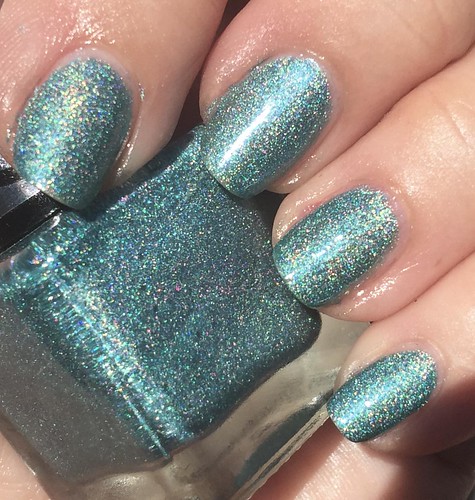
Azul Disco


Beautiful peacock blue with lots of holo scattered about.

Two coats. Very good coverage.


Here is another photo:


This is more subdued, but it's a beautiful shade.


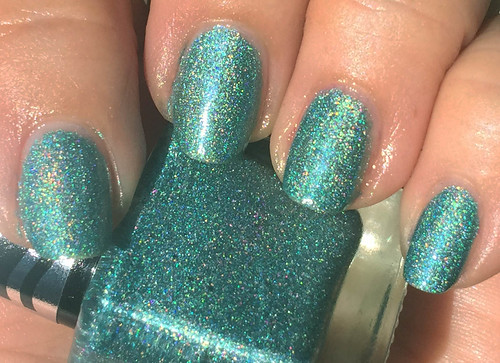
Verde 350 Degrees


Very amazing.

Almost a flame. This is two coats, too.

Another shot:


This is more of a washed out image, it's such a great shade of green.


I couldn't find any Up Colors anything, even translating into Portuguese and finding some Pinterest pages didn't really yield much.

I know they weren't cheap for me, and I think I've tried to blog sale them, but now I am keeping them for stamping.

Well the green one is a standout!

Thanks for reading my little nail polish journal!


Thursday, October 18, 2018

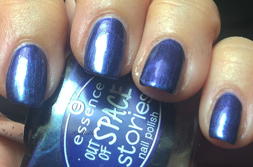
More Essence Out of Space Stories

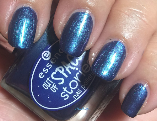
Essence put out this little tasty tidbit and I have another one of the little delicacies for you.

Intergalactic Adventure


Two coats of this pretty little metallic shimmer and you think you are fine and dandy.

But no!


It's got a soft shift into indigo that really pulls itself off with a gentle "hello" that you really aren't expecting.

Of course these are better duochromes but this one really has a delightful formula and covers so well.

Might be available around the interwebz if you poke around.

Thanks so much for reading my little nail polish journal!

Monday, October 1, 2018

Reboot, Reblog, Blues for Autumn

Autumnal blues are complex. They are the seaside shutting down after tourist season. They are the long shadows and deep even longer evenings.

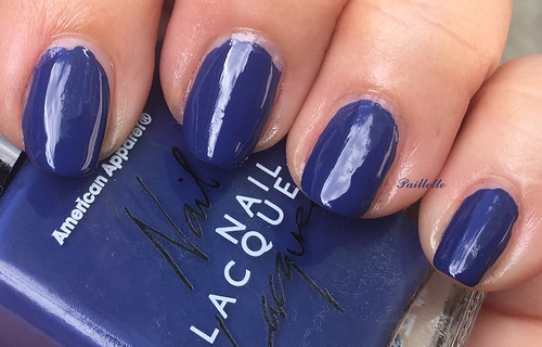
Here is a blue that is just so perfect for fall, American Apparel Mount Royal


Three coats, a shiny, but non-self-leveling finish, this pretty deep cobalt feels moody and pensive like a storm about to slip over the mountains.

Gone the way of the dodo, the American Apparel brand seems to be defunct. This is available on eBay, so not completely extinct!

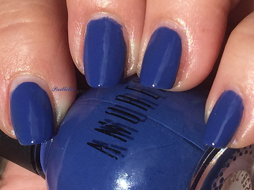
Here is a reboot of Amoresse Cool In The Pool.


Hard to fault. Defiantly blue sky in the late afternoon. Perfection.

Might be so rare that my earlier blog post (here) is coming up on the search! Hilarious!


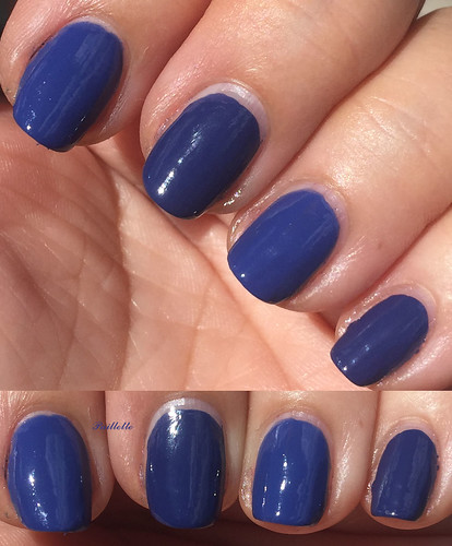
A quick comparison:


Left to right:

Amoresse
AA
Amoresse
AA

Warm afternoons, cool nights, shorter days. A pair of pretties to enjoy the crisp days of autumn.


Thanks so much for reading my little nail polish journal!


Thursday, September 13, 2018

Milani 3D Holographic

I think these came out in late 2009 or early 2010.

There are six polishes in this sweet little scattered holographic collection. A few months ago I did swatch one of them and though, DANG! I need to do the rest!!


Here we go! (No top coats, btw!)


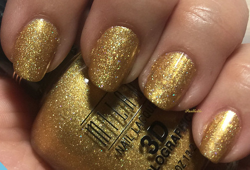
Milani 3D 510


Two coats of Solid Gold Dancer loveliness.

A combination of lamp and flash brings out the sparkle and some scant holographic.

If you love gold, and I confess I do, this one is a treat.


Milani Cyberspace 512


Beautiful watery aqua blue. Love the coverage but was three coats this time. No worries. The payoff is beautiful.

Perhaps my favorite!


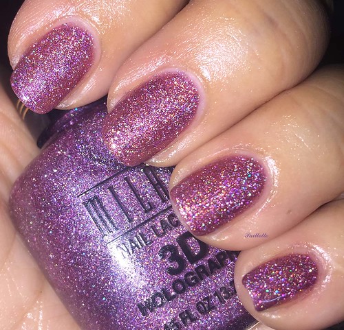
Milani Hi-Res 514


Plum purple that pulls warmer on my nails.

Three necessary coats, but the job was done. Nice!


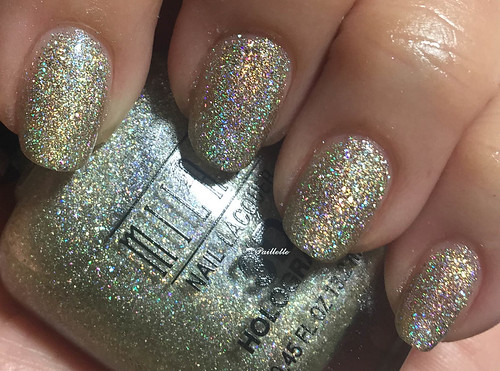
Milani HD 513


Three coats and just divine. This is under lamp and flash, but at an angle to really pick up the holo.

I love this one so much.

Unlike the rest, this seems to have large holo and some smaller holo, so it has a little bit more of a flash.


Milani Hi-Tech 511


This delightful peridot is a three coater and shot with a flash, strong flash.

I love it and it was such a nice one to wear.


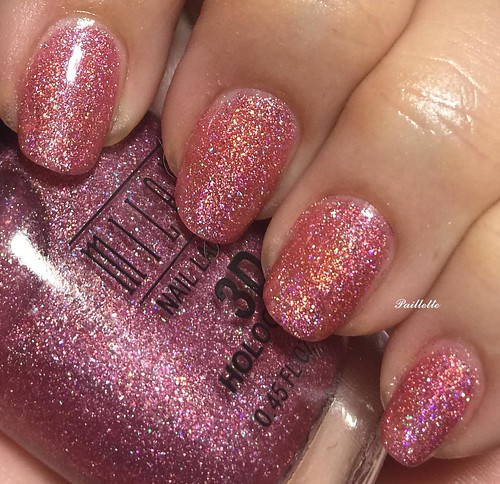
Milani Digital 513


Three coats, but really a bit more sheer than I'd have liked.

This pink coral warmed up on my fingers, but didn't disappoint in the soft scattered flash department.


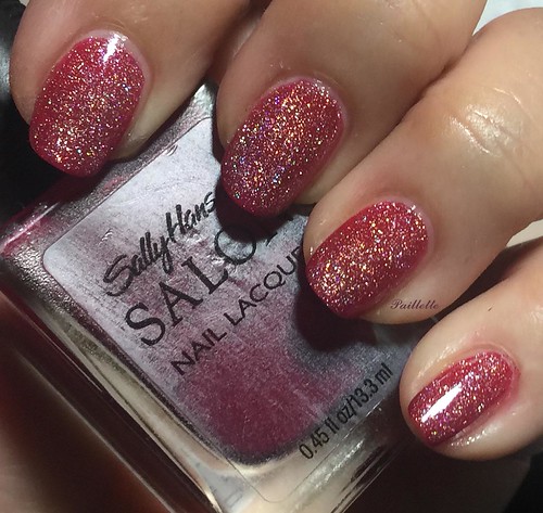
I tried it as a topper over Sally Hansen Sultry Fuchsia


Sultry Fuchsia is a bit deeper and ranges more into the berry shade, but you can see the base in the Milani is sheer and virtually vanishes and the holo particles just scatter around and behave like a holo topper.


There you have it, a set of very well considered holos.

These are available on eBay and Big South American River, and fairly affordable.

They were the beginnings of holo after a hiatus and so everyone was excited.

For my part I'd say I love some more than others, but they all do a nice job for scatters.


Wanted to add a side note: during the summer my nails grew very long and I was so happy that a lot of the damage from Polygel had grown out.

Sadly I had a big break, and discovered that at their longest (back in the CbL Marilyn post) they were too weak to support the length and were subject to flipping backwards (the nails-on-a-chalkboard feeling for me).

I then discovered a smile crack that ran through the lower 1/3rd of my middle finger, so I knew I bent something forward, but I also didn't realize I'd cracked the nail in the bed so far down. Yikes.

Where am I going? Well, last night I reapplied the Polygel. Muscle memory kicked in and it wasn't super hard to apply, even with my non-dominant hand.

The support is just something I will use for a while and it does make things more 'firm' in my nail, so it's less mobile.

Next steps of course: work on filing, work on less thickness, and work on maintaining a length that feels good.

Thanks for reading my little nail polish journal!

Tuesday, July 24, 2018

Moonstruck

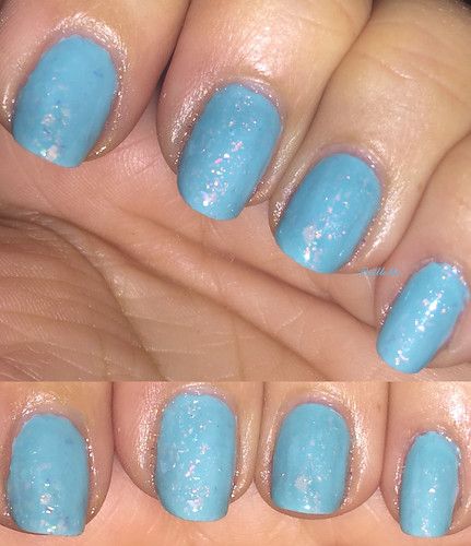
Illyrian Moonchild is a delightful flakie rich sheer polish that is Tiffany blue.

I put it over SinfulColors Mint2BCool, a blue mint creme with a small blue glass fleck running through it.

They complement each other well.

Here's the combo:


The pink and blue opalescence of the flakies is best under a focused light like flash, halogen or good ol' sunshine.

I am crazy about it!

Here you can see that it is more subtle if the pink iridescence doesn't pick up:


I am a little star struck by this brand, so it's hard to be biased. 

My only real bias is that I love translucent or light flakies and I am not going to blog too many contrasting flakies, but I have a ton I need to layer, so just shut up, right?

Meanwhile, the shop is re-opening the 27th of July, so you may enjoy this fairy tale of a shade.
Not affiliated, just a fan.

Thanks for reading my little nail polish journal.

Monday, May 28, 2018

Two Blues, Two Simple Blues, Two Inexpensive Blues

Blue creme. I am feeling it this late spring. I have a lot of this shade and I never find fault with the color.

I rarely purge it, you probably will only ever see a handful on the blog sale, and even the most fussy formulation will give me only a patient sigh. Unless it won't dry. I just can't make the impossible possible.

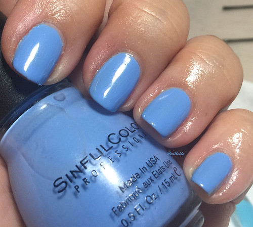
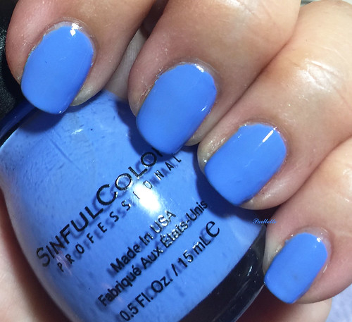
So here is a pair of SinfulColors blues. No comparison, just a random couple of manis that were highly successful

Hip to be Square


Three coats, a secret shimmer and a summery fresh blue. It is soft and neutral, if you can imagine vintage 60's pure color as neutrals.

I thought it would be too sheer, the first coat was a bit of an "oh sigh" moment, but it built fine.

I love this shade a lot. Delightful!


Blue La La


A more intense blue, more hinting at a cobalt sky if compared to the soft blue.

More dense than Hip to be Square, it needed two coats and was fine.

I am very partial to this shade.


I can't find these shades at the SC website, so I don't know if they are relabeled, or just off for the season. I don't follow the brand that closely, but it seems like I see Blue La La a lot.

At the price, approximately $2 a bottle, it's always a nice surprise!


Thanks for reading my little nail polish journal!


Wednesday, May 9, 2018

Prim and Proper

Bye and bye I knew that Zoya would produce a blue that I would love so much.

Prim is just that shade.


Prim is a beautiful metallic "velvet" blue according to Zoya. I call it a dusty cornflower, or muted periwinkle.

Metallic is a tough finish. The particles are super fine, so it can show brushstrokes, which mine definitely does. It also shows flaws, so in a lot of ways it's like a chrome. I think this is why I love foils, because you get the metal, but a highly forgiving finish!

I think it shows my old nail damage too much, so I tossed on a couple coats of Sally Hansen Hard as Nails Watermelon Crystal, a sheer glass fleck.

Prim would be wonderful for stamping, it just covers so well.


Zoya has been kicking up the colors. For me they've replaced OPI as my "go-to" for exciting collections and interesting salon brand finishes.

Their sales - which seem to be at least two big ones a year at this point - bring their price point much lower than most drug store brands, save just a few. I will say that they are worth a look. I buy through the sales and though turnaround is often a product of high volume, I get the loot and life is good.


I will be stamping more, it's just that my nails are a really wonky and weird, so I am just pushing through until things grow out more.


Thanks for reading my little nail polish journal!

Thursday, April 5, 2018

Jump In!
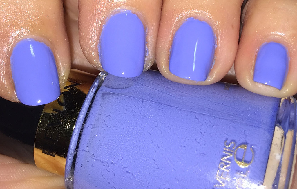
Splash of spring blue!

Revlon Irresistible


Regular gold-ring'd bottles. Three coats. Delightful shade.

Not an impossible formula. Sometimes Revlon can be slow to dry, but this wasn't a huge problem. 

Here's another shot:


I have a LOT of this kind of shade and this one moves to the leader of the pack.

The formula is a wee bit loose, but it does build and though I didn't do clean up, a decent cleanup job would have probably made this pop.

Normally Revlon isn't my most compatible formula, but I love this one.

Thankfully it's easily obtainable through online and drug stores.

Thanks so much for reading my little nail polish journal!