Showing posts with label Essie. Show all posts

Wednesday, March 24, 2021

Essie Off Tropic

I realize that Off Tropic looks not dissimilar to Revlon Gel Envy High Stakes, but I wanted to toss a post up as I have a couple more to go and don't want to miss them!

Essie Off Tropic:


Two coats, no top coat, and a luscious rich formula. 

I did do some cleanup, I have small nail beds, so it's pretty hard with the wider brushes these days.


I see some yellow at the bottom of the bottle, so clearly it needed a touch more shaking, but I will say, truly a gorgeous neutral green. 


Thanks for reading my little nail polish journal!

Friday, April 17, 2020

Sheltering

Sheltering in place right now.

Staying inside is a luxury I am grateful for.

Here is to everyone who is fighting this. 

Essie Shelter Island


Three coats, a top coat, too.

A classic and a beautiful blue. No longer in the Essie line-up, it came out as a trio. Then Essie was sold off to L'Oreal and L'Oreal duped it. Go figure.

When I was first getting into polish, this was a hot set. To me, while it is beautiful, it is not a drop dead gorgeous blue.

But it is pretty and soft and though it needed a solid three coats, what isn't to like about it's preppy vibe.

Take care and thanks so much for reading my little nail polish journal!

Thursday, September 27, 2018

Turning Spring into Autumn

It's starting to turn, later, drier, and more colorful. The leaves I mean. They are tired from the summer and want to sleep. As they do in Bambi, the book by Felix Salten, they do their duty and crackle and warn animals of hunters approaching. Stay safe animals, it's hunting season.


Here is a sweet pink coral called Bump Up the Pumps by Essie


Though it did need the three coats, I really love this soft rosy coral shade. The formula worked well, despite my application issues.

I topped it with a gorgeous glass fleck polish, Milani Gold Rush.

Love how it transformed.


The red/orange jelly of Gold Rush just turned it all juicy and delightful.

I have enough gold flash to make it pop.

Now that I'm looking at it, the only thing that would make it better would be a coat of flakies or some holo! I love when layering improves a polish.


Thanks for reading my little nail polish journal!

Wednesday, May 16, 2018

OPI Sheer Tint: Don't Violet Me Down

Here's one from the archive. I had a bunch of photos in February that I took shortly before removing the Polygel enhancements. My nails look weird in comparison to now, but I did like the length, if not the process.

Meanwhile, here is Essie Ignite the Night


From a 2013 collection of "encrusted" polishes in the height of the wave of the texture polish trend, Ignite the Night is a delightful warm gray glitter.

I have 3 coats, but two would do. 

I love the shade and it is a small glitter with lots of texture. 

I have no top coat here.


Later I added OPI Don't Violet Me Down:


This is a tint from a 2013 collection that OPI came out with that included about 4 shades. I picked mine up at TJ Maxx, and they are really sheer. This one is the only one with a bit of oomph.

The three coats here did a nice job. I like how it adds to the candy shell. I did play with how it covers:
Left to right:
4 coats
3 coats
2 coats
1 coat

As you can see it's ideal in 3-4 coats. I felt that the tips dragged a bit and didn't get enough color, but that could easily be my application.

I want to play around with these some more, they are very cool.

Both can be found online with ease. OPI still carries the tint collection.


You can see the polygel growout, it was due for a fill. Jury is still out on whether I will take this up again. :)

Thanks for reading my little nail polish journal!

Wednesday, July 12, 2017

Battle of the Old Essie's (And a Dark Horse)

I think I've had Essie Viva La Vespa for a long time now. I've never worn it really and never compared it.

I always had a throwaway thought that it was a dupe of Essie Sexy Divide. I thought I better get busy on this action and do a comparison!

Here my nails are longer. I attribute a few things to this: round edges and no real horse activity. The minute I start really using my hands I got a break very low (below the quick) and they all went. Sigh. It was a nice month!

The photos are all taken with my telephone, so bear with me on that front!


Essie Viva La Vespa


A gorgeous deep plum base with a strong purple shimmer. It's got depth and complexity. It is also rather stinky (pre-3-free) and a bit loose.

Three coats, no clean up and no top coat. 

I was pleasantly surprised!

This is a very hard to find polish. I did have it listed on eBay, but after trying it, I am keeping my back up. I love the depth.


Essie Sexy Divide


Very similar, but the base is a dark vamp with a similar purple shimmer.

I see that it's the base that makes or breaks this polish.

Three coats, no top coat or clean up and a lot of loosie-goosie-ness.

Generic and kind of a middle runner for a dupe.


Here's a comparison:


Left to right:
Essie Viva La Vespa
Essie Sexy Divide
Essie Viva La Vespa
Essie Sexy Divide

I will say that though on the surface there are similarities, if you like the more complex type of polish you probably need to rustle up Essie Viva La Vespa or go in another direction because Sexy Divide is not merely generic, it's pretty pedestrian by comparison.


Bottle shots of the two in the same order:


Int he bottle you can see the plum better around the edges of Viva La Vespa


Here's a dark horse, Guppy 59 :


Two coats and a formula that is pure heaven!!!!!

Look at that glow!

The actual warmth is in the shimmer, not the base, so it isn't a dupe, but it's a surprisingly beautiful alternative.

Now the point is't to find this polish (...it's long gone) but to consider things like indies or other brands like Duri, IBD, Seche, etc because frankly the formula on Essie's is really astonishingly thin and drippy.

Here's a comparison of the three:


Left to right:
Essie Viva La Vespa
Essie Sexy Divide
Guppy 59

Of the three, VLV is really quite the beauty, my favorite.

However, I think the Guppy is a close contender and I wouldn't miss VLV if I didn't have it.


Thanks for reading my little nail polish journal!

Monday, December 12, 2016

Green Tree, Gold Garland

I've since let go of my old WetnWild Craze collection from back in 2009, but I did keep Morbid.

It's deep shimmer reminds me of the PNW coastal forests that are so deep and dark and full of beauty.  Recycle if you can, there is so much clear-cutting out there that it's just unsustainable.

Back to the polish...
I topped it with Essie Rock At The Top from their Luxeffects collections.


Three coats of Morbid, then one of Essie RATT.

It's topped with one coat of top coat, but it is lumpy, so it just goes with the territory. I think if I added a few more coats, or had a specific glitter topper, it would be more glassy.

Thanks for reading my little nail polish journal!

Tuesday, October 11, 2016

When Rare Is Not So Rare Anymore

Back in 2009 OPI came out with a pretty epic collection, Holiday Wishes, that set a lot of nail polish fans in a lather over several of the polishes.

Sapphire in the Snow was one stand out, a deep, vamped out blurple.


It's a gorgeous polish. Here are three coats with no top coat.

This polish has become a classic favorite and still garners quite a price on eBay at this writing. It is no longer carried by OPI, so your options are limited.


Can't find it? One popular option is Essie No More Film


Left to right:
Essie NMF
OPI SitS
Essie NMF
OPI SitS

Personally I prefer the Essie, but dupes they are not, that's for sure.
I'd say that they have the similar blurple thing going on, but SitS is more purple leaning.
Essie No More Film is still readily available, which is good. It's even at Rite Aid and other drug stores. Win!


You could try Zoya Pinta


Left to right:
Zoya Pinta
OPI SitS
Zoya Pinta
OPI SitS

I find that these are super close. Pinta is a bit less dark, but not by a whole lot.
Not only is it readily available at Zoya, they frequently run sales so it's often as little as $3.50 - $5.00 per bottle. Not bad.


In more recent collections, from the Euro Centrale Vant To Bite My Neck?


Left to right:
OPI VtBmN?
OPI SitS
OPI VtBmN?
OPI SitS

OPI VtBmN? is somewhat more flat, perhaps a bit deeper and more violet than blurple, but it's fairly similar, though I won't call it a dupe.

I can't find this shade nor can I find the collection on the OPI website, so this must have been phased out, though it's readily available online. Nice!


Of the bunch, I have to say SitS isn't the true irreplacable dame of center stage I thought it was. I have it and (crazily enough) a back up, and it's odd that it's held such an iconic status in my collection when it has got a fair bit of stand up competition.

Of the bunch my personal favorite for the shade is Essie No More Film. The one I would not buy again would be Zoya Pinta: the formula is bit thick and unwieldy and for some reason it just isn't as hearty for wear on me. Though I will try it again with my Seche Vive gel top coat again to give it another break.


Final note: all are three coats, no top coat and I pretty much passed on clean up.

Thank you for reading my little nail polish journal!

Tuesday, June 28, 2016

Lavender and Pink

Here are three polishes, two new to the blog, one a reblog for a comparison. Enjoy!

Here is SinfulColors Zeus:


It's basically their Lavender polish loaded with a pink shimmer.
Three two coats.  A lot of win with that shimmer.

I then compared it to Nicole by OPI's Back to Reality...TV


Left to right:
SC Zeus
NOPI BTR..TV
SC Zeus
NOPI BTR..TV

I am kind of surprised how little oomph the NOPI has with regard to shimmer within the creme base. SC kills and NOPI just sits there.

I think that SC is a thicker polish and two coats versus a necessary three on the NOPI.

Plus and minus is that NOPI is a little bit easier to manage and control, but I really don't think it's a big deal.  For me the color payoff with the shimmer up front and ready is more important.


I threw in Essie Using My Maiden Name, but not to really compare.


Of the trio, I love UMMN a lot. The brighter, less muddy lavender that peeps into purple is perfect for spring.

I've got three coats on here, but no complaints on the formula.

I've heard, and now witness, that the shimmer is hard to find on the nail. This angle only barely revealed it. That is the one failing of a very pretty polish.

Where to buy
Essie UMMN is easily available on line. UMMN was all over TJ Maxx for awhile, so it's readily out there on eBay, etc.
NOPI BTR...TV is harder to find because that was a limited edition collection a couple years ago. It's not inexpensive, but of the pair, much harder to find.
SinfulColors Zeus was part of a 2012 Castaway collection  (Thank you Nouveau Cheap for your excellent blog on drugstore items, a great resource in the polish world!)

Of the trio, I think Zeus is the most challenging to find, as I don't think it's out there in their main line, and much harder to find. I had little luck.

My personal favorite is Zeus, but Essie UMMN has a great bright hue and the shimmer is ok for me, I can always goof around with toppers.

Thanks for reading my little nail polish journal!

Saturday, June 25, 2016

Reds That Seem Pink

Who doesn't love them?

Here is Revlon Jelly


Three coats and no top coat.

I found this at Big Lots! and really do adore it.

It's head and shoulders above my "no name" Essie (one labeled as a top coat)


Left to right:
Essie no name
Revlon Jelly
Essie no name
Revlon Jelly

Both are three coats, but there isn't enough coverage to the Essie.


Here's the Essie alone:


Pretty, but a little bit sheer.


Here is another one that I love and just wanted to reblog: Color Club Regatta Red


My photo is a wee bit dark, but this is a lovely polish: sheer, but pigmented enough to cover well. I think it's a similar shade to OPI Dutch Tulips, but I don't have that one to compare.

Of the three: Revlon is more unique, but I love color club's formula.

Thanks for reading my little nail polish journal!

Thursday, May 12, 2016

Mauve Pinks

Here are a pair that I haven't worn in a long time and when I took this photo my nails were nice and long.

I think a mauve pink creme is so pretty and ladylike.

I think I blogged these before, but needed a little bit of a redo.

Here's Essie Neo Whimsical


It's one of my favorites from the Essie Art of Spring collection from about 2010.

It's a three coater for sure and was pretty a soft lavender rose creme.

I feel like I need a teacup and a crumpet when I wear it.

Not hard to find online, which is good. It's a soft mauve staple.


Orly Lollipop


A bit more coverage and a bit more of lavender leaning. Three coats again.

Pretty easy to find online, too!

Of the two, I definitely recommend the Orly. Better formula and for the price you get more polish!

Thanks for reading my little nail polish journal!

Saturday, April 2, 2016

Baby Cakes and Blue

Here's Chick Polish Baby Cakes and Essie Stroke of Brilliance.


It's a yellow that hints at green, but truly is yellow. It can range from egg yolk to pale yellow, depending on the light.

Three coats are necessary, but it does finish out pretty well.

Found this on the Llarowe site during one of her sales, back when she was selling multiple indie brands. Ah, the day!

I went to Chick polish website, but it's gone. I think they are out of business. The indie game is a tough one, and unless you sell holos out your kazoo, it's hard to build a following.

Sadly, and I'm guilty of this too, when I think of a creme I think of a major brand. When I think of innovation with glitter or shimmer or holo, I go straight to indie. Shame on me.

This is a nice yellow. Shucks.

Stroke of Brilliance, by Essie is from their LuxEffects line. It's a pretty blue, soft and yet metallic. I find, though that I have a little bit of glitter bleed, so I'm a little frustrated with that. I love glitters, but glitter bleed sucks the joy out of having them around! I have a whole Ikea Helmer full of glitter. Seriously fearing this trend.

Meanwhile, if this was a matte glitter, in this soft water blue, I'd be very pleased. It's not bad though.

Essie Stroke of Brilliance is available online, which is nice.

Thanks for reading my little nail polish journal!

Thursday, March 3, 2016

Greens for March: Glitter Gradient

Essie Sew Psyched is a green, but layered it dons the neutral mantle. This is a great feature in a polish.

Here is Essie Sew Psyched with OPI Servin' Up Sparkle and Pure Ice Heart Breaker.


Three coats of Sew Psyched topped with Pure Ice Heartbreaker and a bit of OPI SUS as a tip gradient.

OPI Servin' Up Sparkle is from the epic OPI and Serena Williams collaboration. Frankly, one of my favorites. I could be bias, I'm a big fan of Serena, she rules. No, putting bias aside, that was packed with great duos.
It's holo glitter and it's not super unusual, but it does have a good density for coverage, one coat did enough so I didn't have to fiddle around with it.

I think Pure Ice Heartbreaker is just epic. It's a shifty little luminous green that pulls blue at certain angles. I rarely check out Pure Ice, my Walmartland is like it's run by the Soviet Empire: dingy lighting, no end caps with special collections, and a polish selection that looks like it was in a bread line for freaking days: spent, tried, burnt out, and just depressing. Come on Walmart, get your shinola together. It's not like you don't have the budget!


Here is Essie Sew Psyched alone. It is green, but softer, more gray. 


A soft lichen green, it has a silvery white shimmer that really makes it like a "frost creme", which is kind of crazy, but very cool.

I really love this kind of polish because it works as both a green and a neutral. Wow!

Thank you for reading my little nail polish journal!

Sunday, November 8, 2015

Franken Pretty

Essie Sittin' Pretty is a very close dupe of the famed Illamasqua Jo'mina. It's a bit more red, it's also a bit more sheer. Since the Morgan Taylor dupe was discovered, blogged here, I thought, I could goof around with Sittin' Pretty.

I added a bit of holo to it, and I will probably add more, I just (at this writing) found more spectra flair in my stash, so in it will go.

Here's the work in progress.


Three coats and no top coat.

It's a perfect polish for this since it's sheer enough to enable to holo to stand out.

Easy franken, too. I find that it's hard to franken bright colors like this, so I didn't want to squash the beautiful orchid that just pops with any gray, blue, or black.

This is in the sunshine; holos are made for sunshine.

Thanks for reading my little nail polish journal!

Sunday, June 7, 2015

Gold Glitter and Pearls

Here are four gold glitters that you may enjoy.

I wanted to use a pearl base beneath them, to evoke that luxurious use of gold and pearls that Chanel often uses.

First up is Rimmel Crushed Pearl, once under the lamp, once in the sunshine.


It turns a pretty pink under the sunshine. Quite a pretty thing. I will add that I did not bother with a ridge filler and it would have definitely helped!


On to the glitters!


Maybelline Pot of Gold


I wanted this for a long time and when I finally got it, I never wore it! This is one coat and no top coat.

A bit of a brassy gold that looks nice over the pink shade. I did get a bit of a smudge on the pinkie that I am just now noticing. Doh! I love it when I proof my mistakes AFTER I've edited the photos. *headdesk*


Essie Luxe Effects Summit of Style


This is two coats of a bronze-y gold that just kills! This is from the 2014 additions to their Luxe Effects line. Some call it a rose gold, and I can see that, too. Meanwhile this is quite gorgeous.

No top coat, might need two to really smooth it down, though.


Essie Luxe Effects Rock at the Top


I somehow forgot to put a base on this, but in the comp you can see it with the pearl.

This is two coats and no top coat. I want to add that the base on these Essie's is really quite manageable. Sometimes with glitters you get these thick, viscous, high volume bases and it makes it highly unwieldy to manage the glitters. This really is a good combination.

I hope that Essie does more of these, they are both beautiful and effective.


Milani Gold


Two coats and no top coat.

This is what I had hoped that Maybelline Pot of Gold would be. I think if I'd arranged a third coat, I'd have gotten full coverage. It is a disco inferno, baby!


Here's the comps:


Same order:
  • Maybelline Pot of Gold - 2 coats
  • Essie Summit of Style - 2 coats
  • Essie Rock at the Top - 2 coats
  • Milani Gold - 2 coats

All are over Rimmel Crushed Pearl.


It's nice to have gold glitter, it's a neutral, a staple, if you will.


Thanks for reading my little nail polish journal!

Friday, June 5, 2015

Zoya Blogger Collaboration: Birch Box Limited Edition Trio Spring Summer 2012

If you like jellies and toppers, this collection was a good one.

I have to admit, I follow precious few fashion bloggers. I am a devotee of the Fashion Channel on Youtube as I was a fan of Elsa Klensch when she was on CNN (she is a goddess, let's be honest). I've followed Style Bubble from the start, and that's about it. 

So when Birch Box announce the collaboration with some style bloggers, I was like "who?" Meanwhile, what is birch box?
It's a subscription service to try out samples of various cosmetics, skin, hair, etc brands. This may or may not be your thing.

Not my thing, but polish certainly is, so I grabbed that set when it came out.

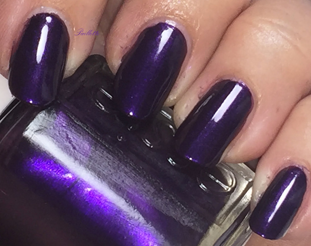
I've blogged Coraline here, but wanted to get the whole set done.


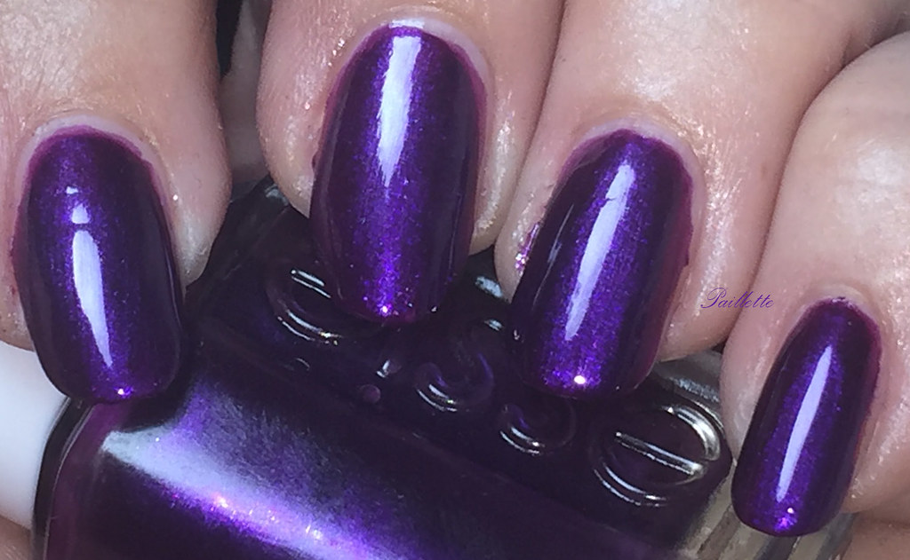
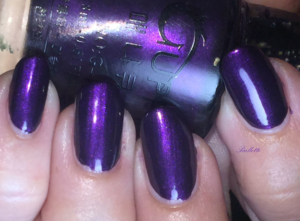
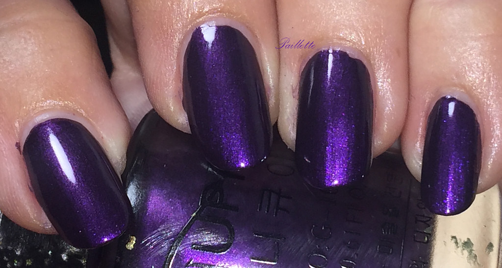
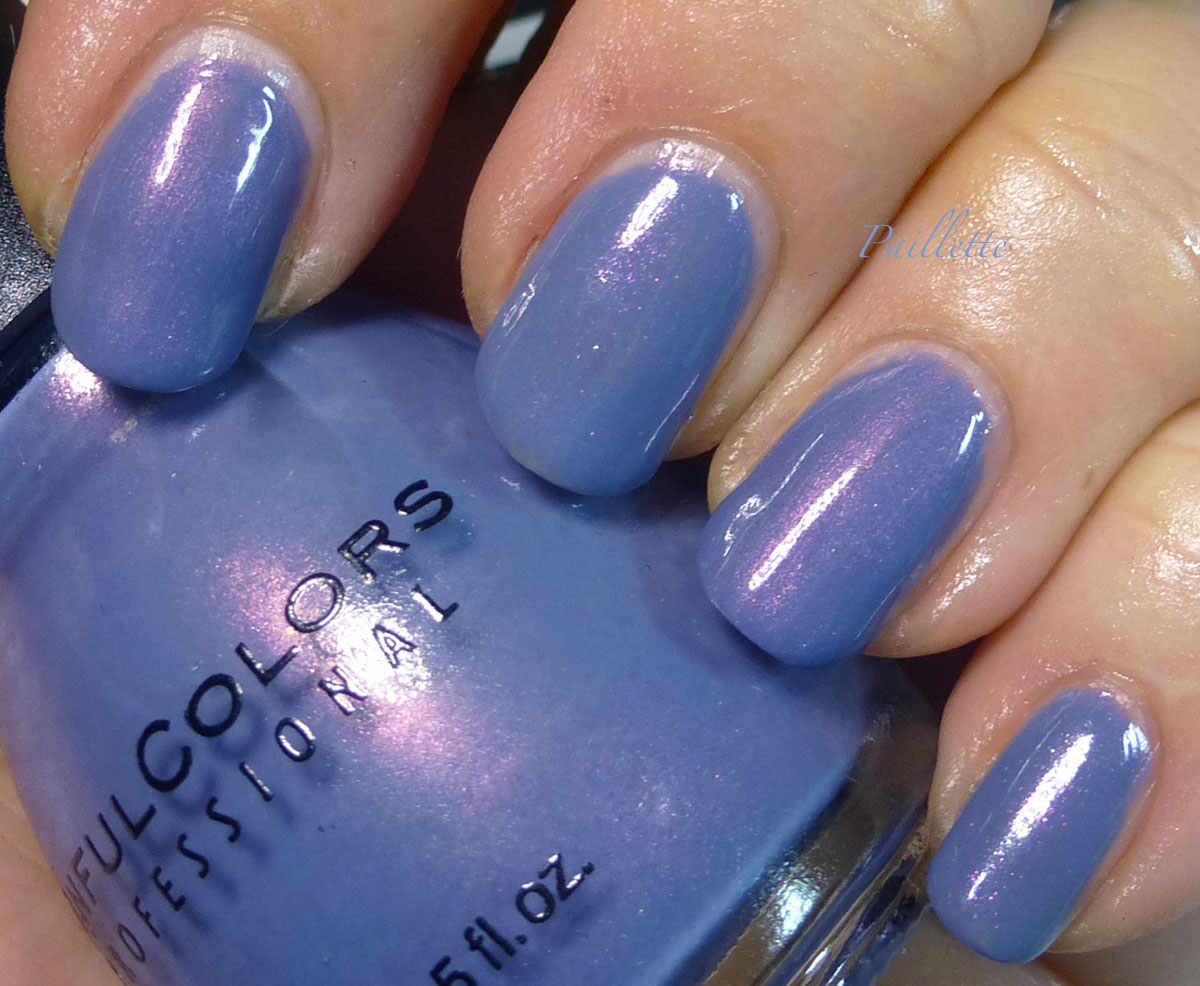
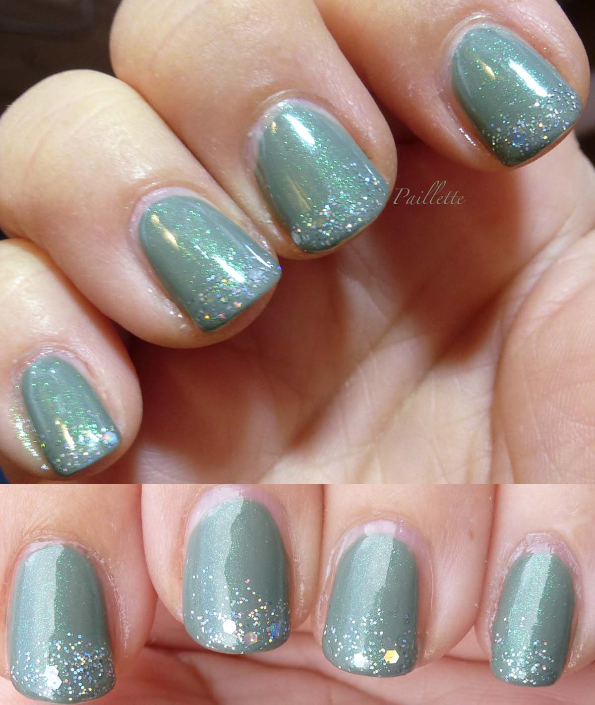
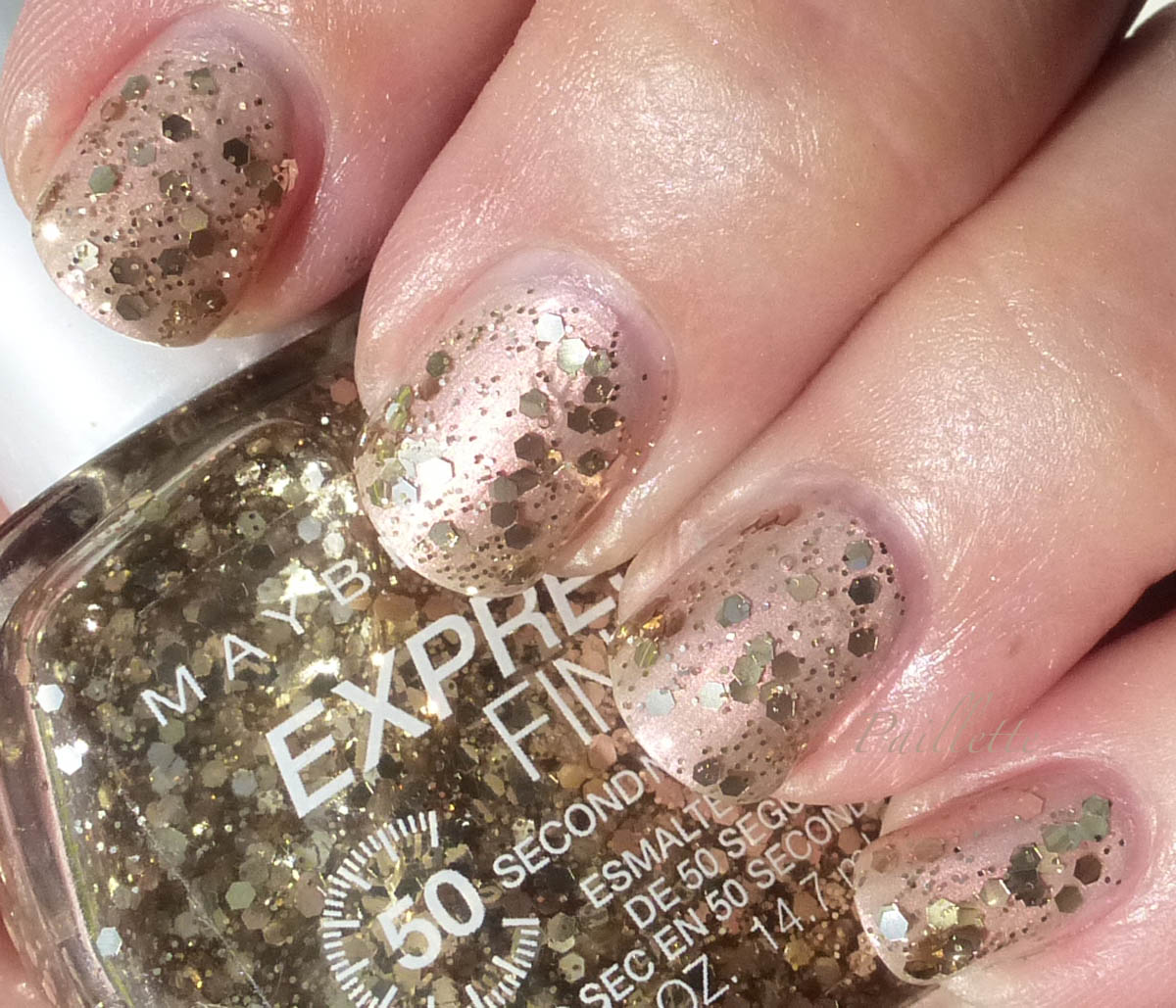
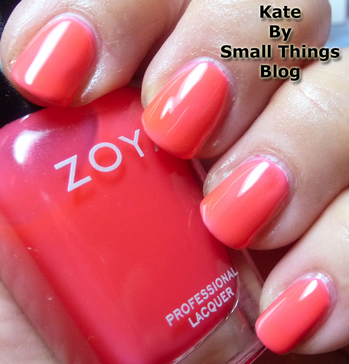
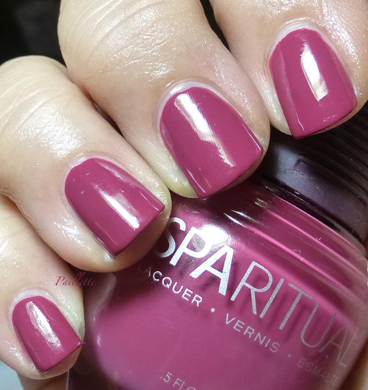
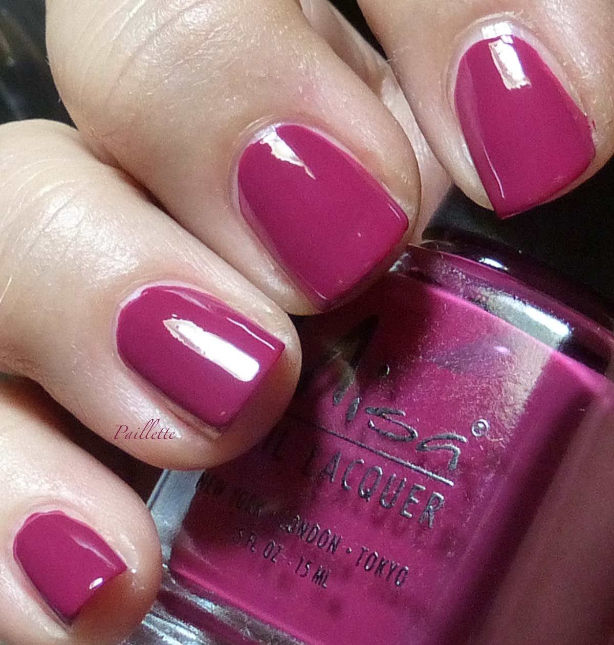
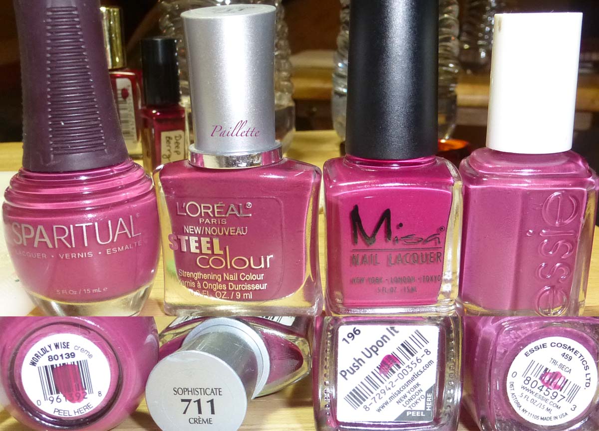
Kate by Small Things Blog


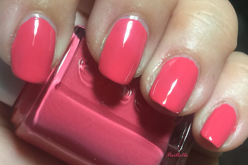
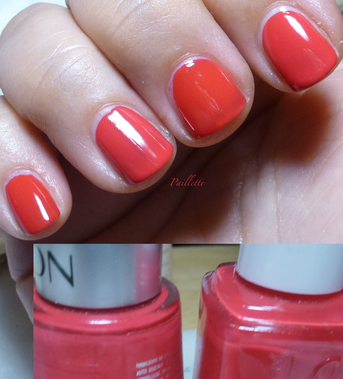
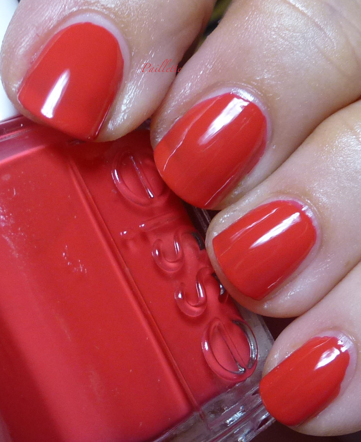
Very beautiful red coral that my camera just wouldn't really deal with. Bummer.

This is four coats, sheer, and over Color Club Coastal Creme. No top coat, these are very glossy.

Over a glitter, glass fleck or a similar color creme, it would definitely pop a lot more. Any blogger who makes this look like a creme has an amazing bottle. This is sheer, no doubt about it.


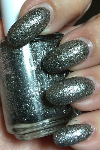
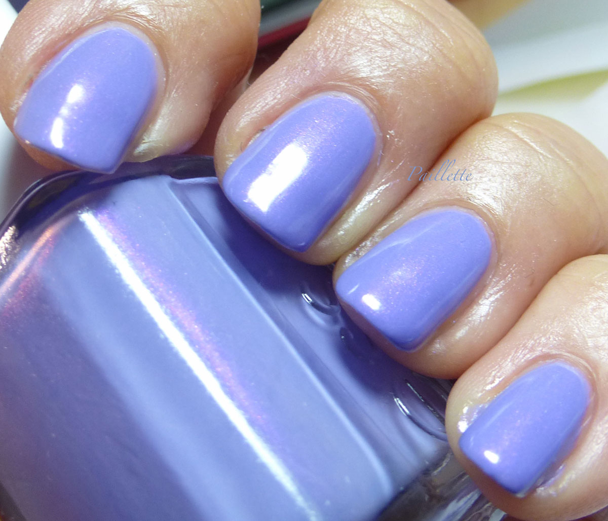
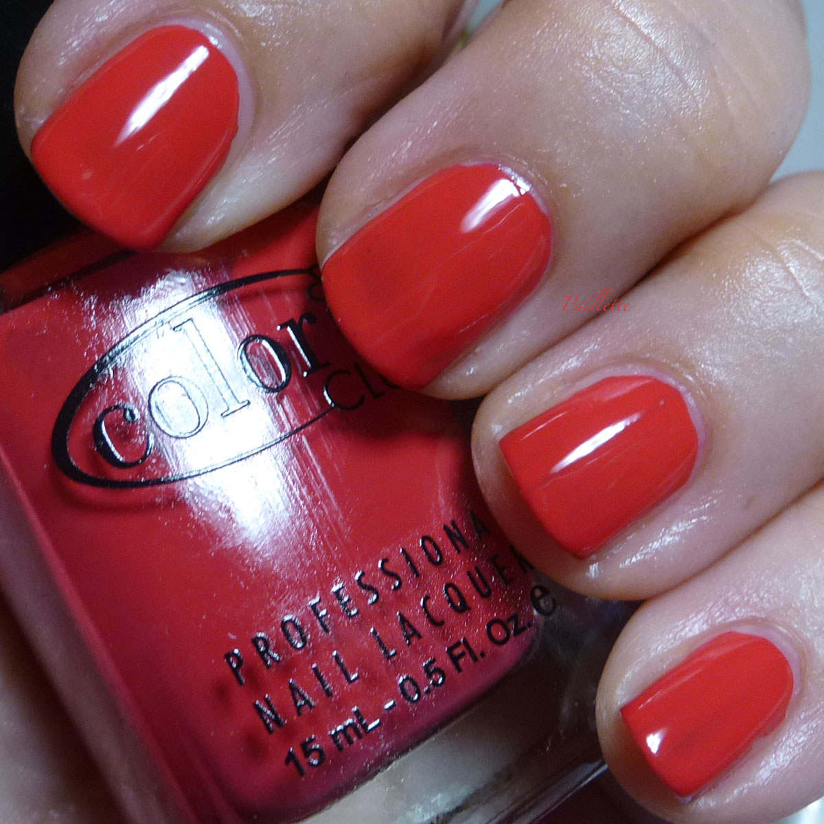
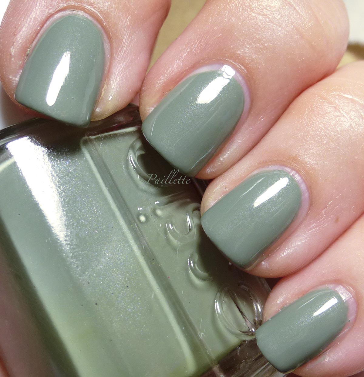
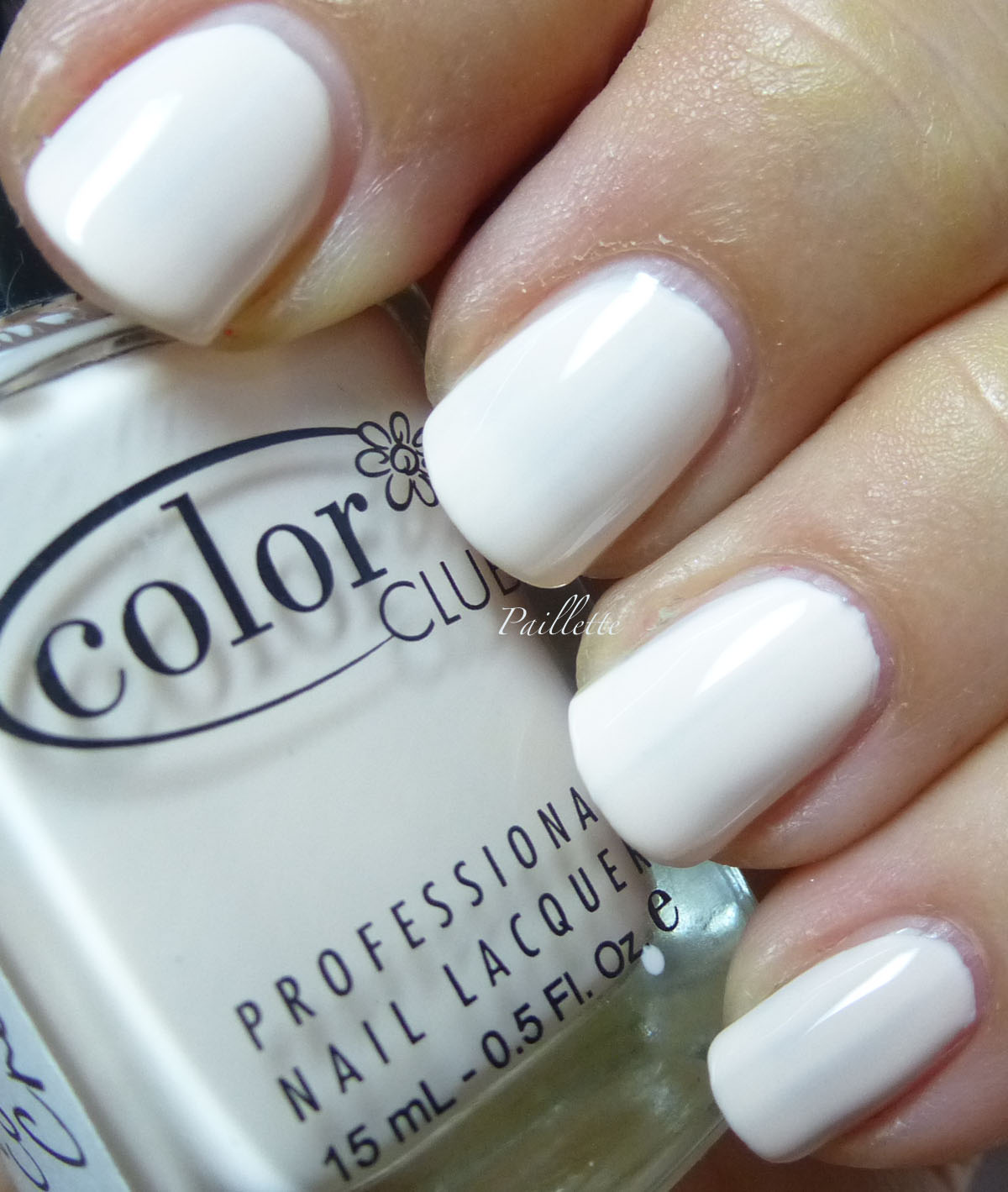
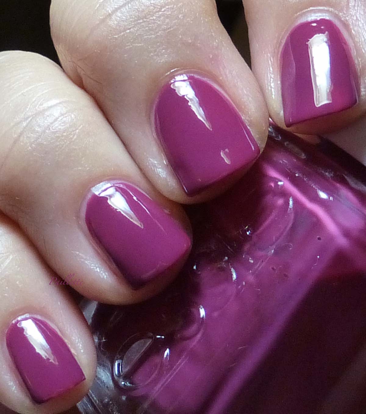
Here is Color Club Coastal Creme, needed a better outing.


Can we give it up for Coastal Creme?
Such a gorgeous creme. 


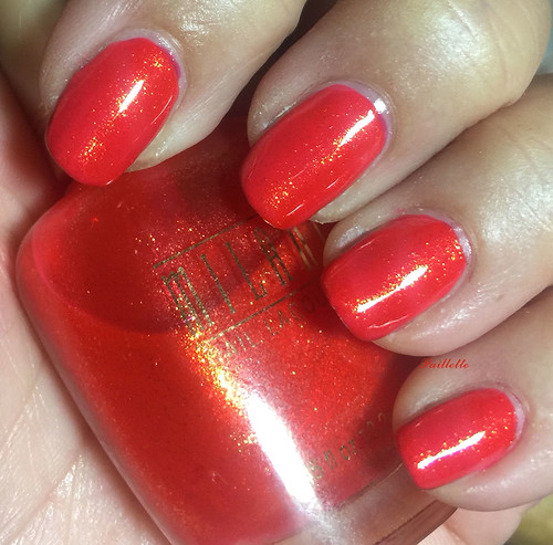
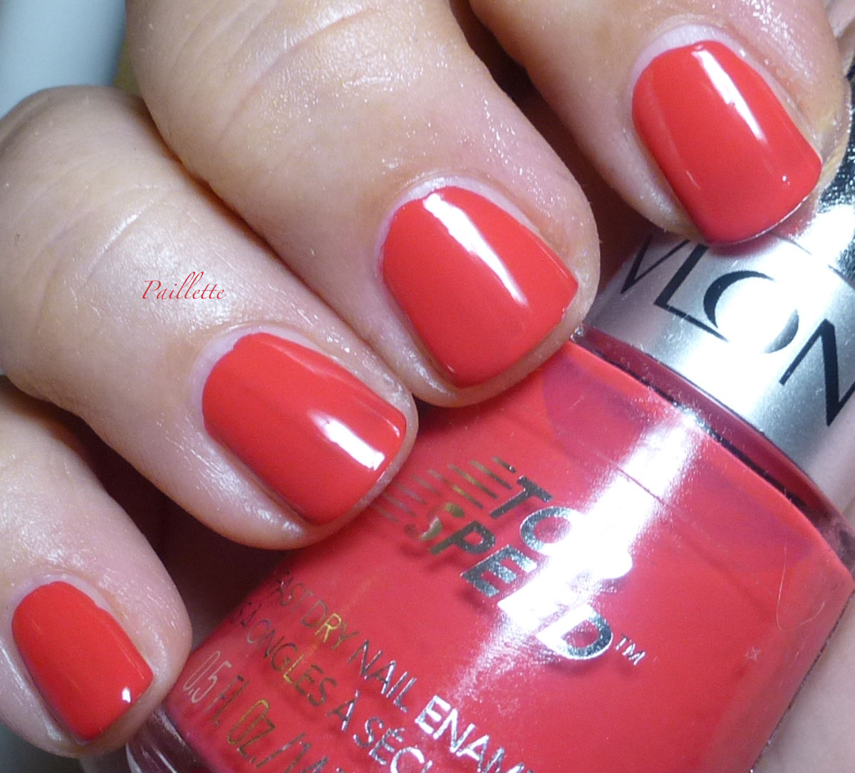
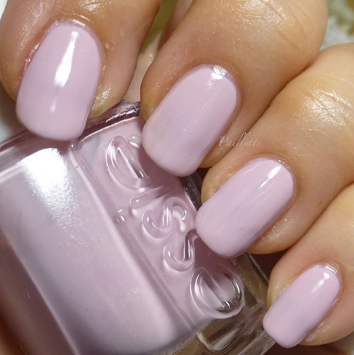
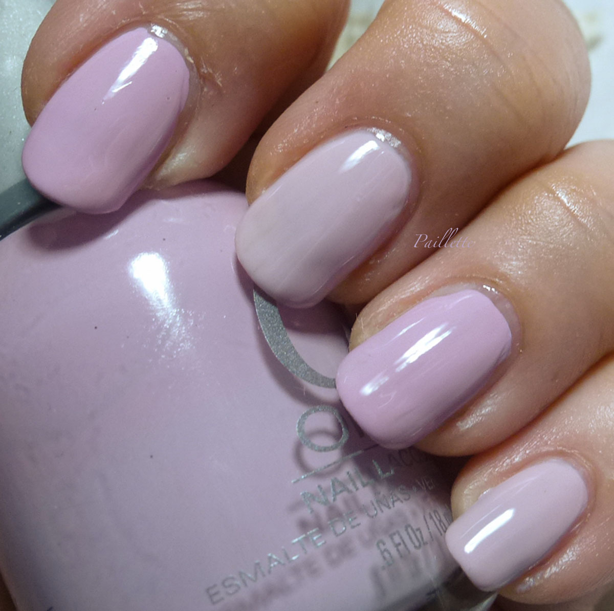
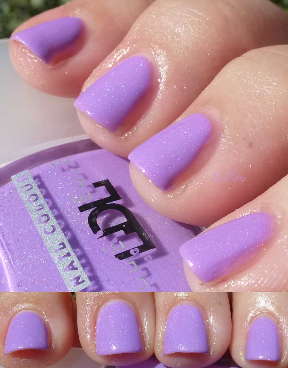
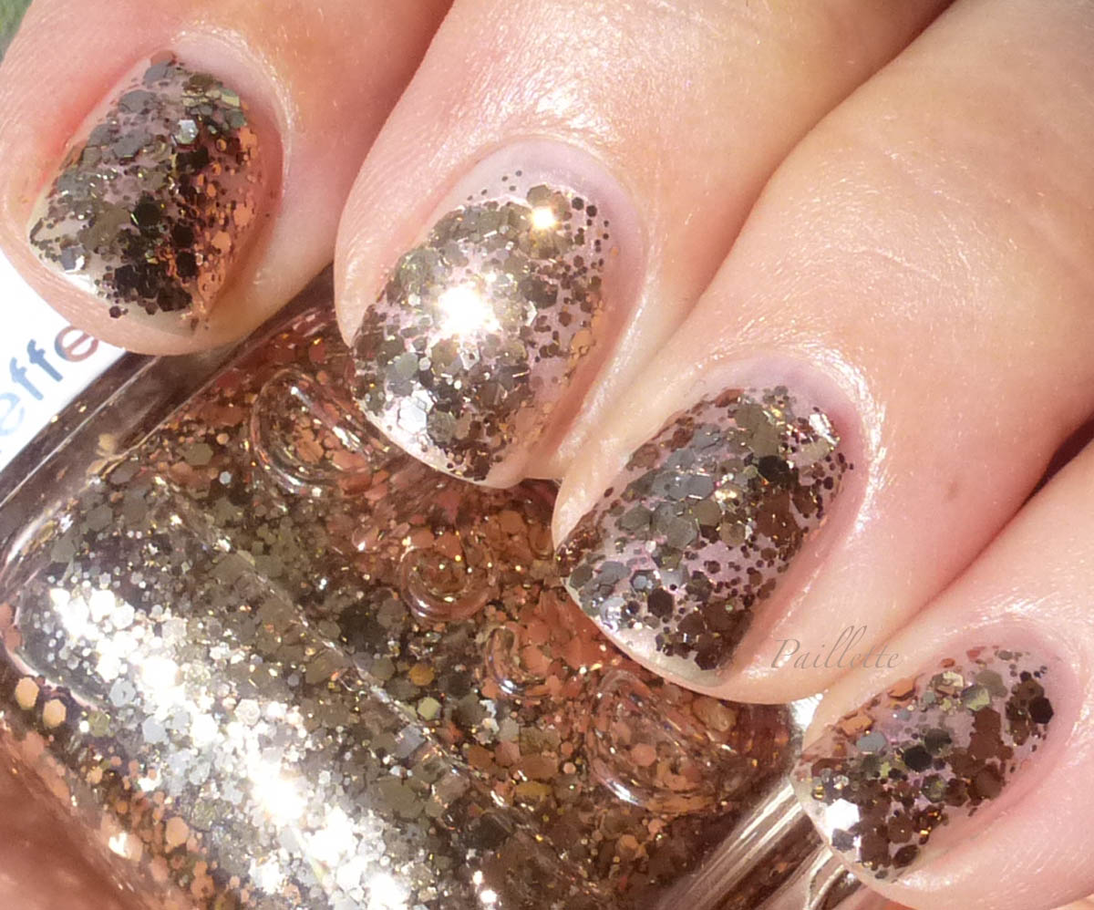
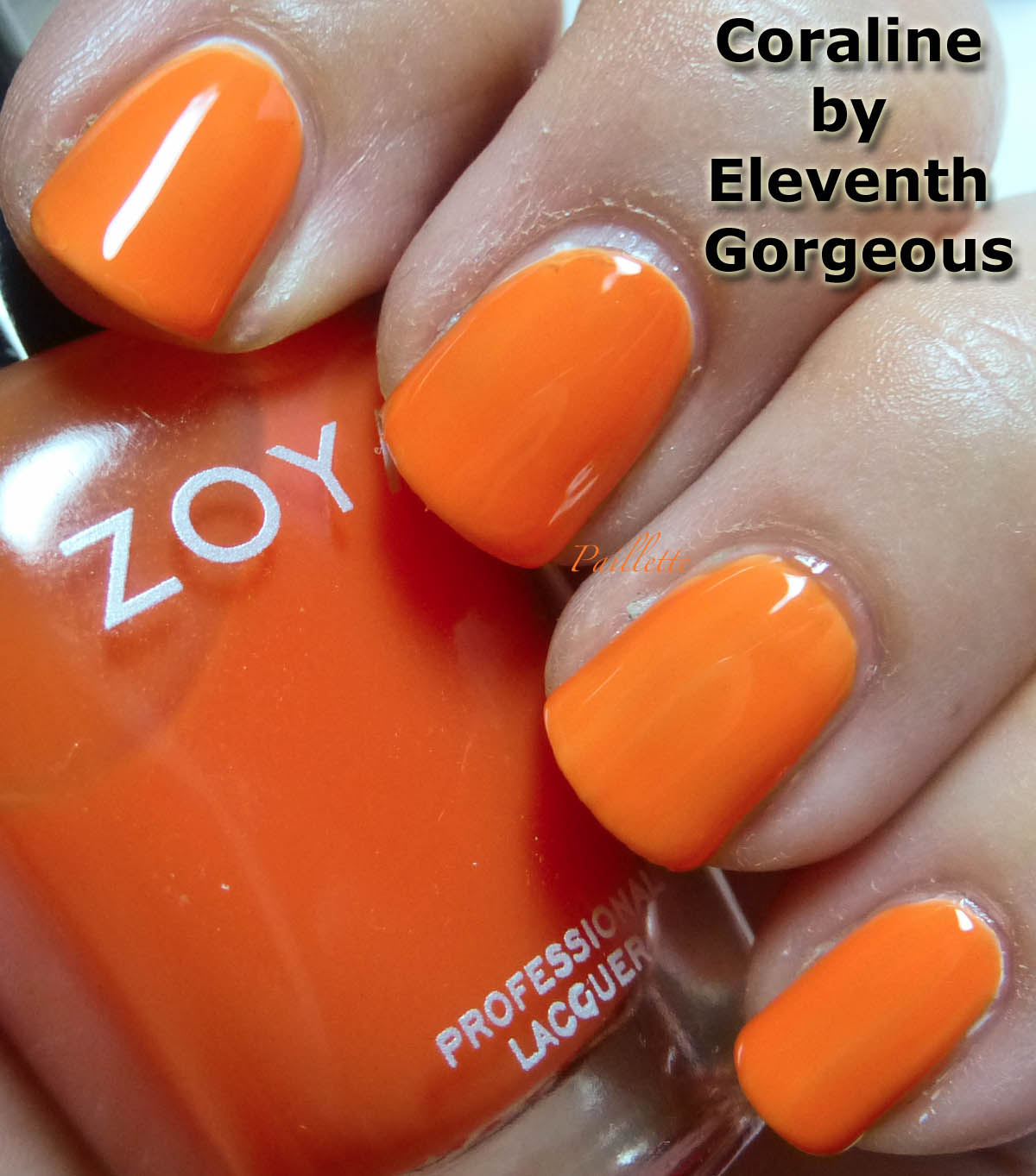
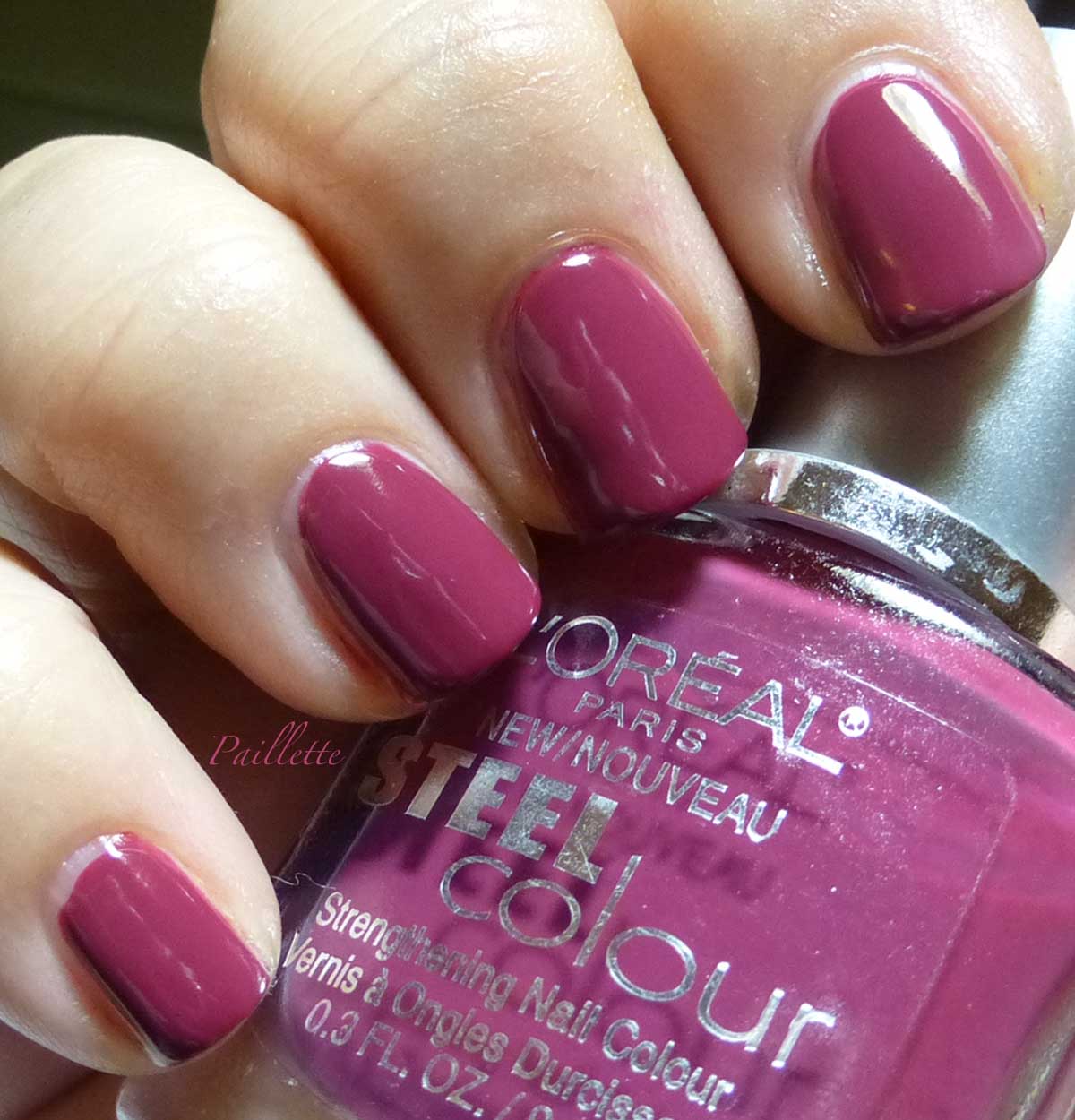
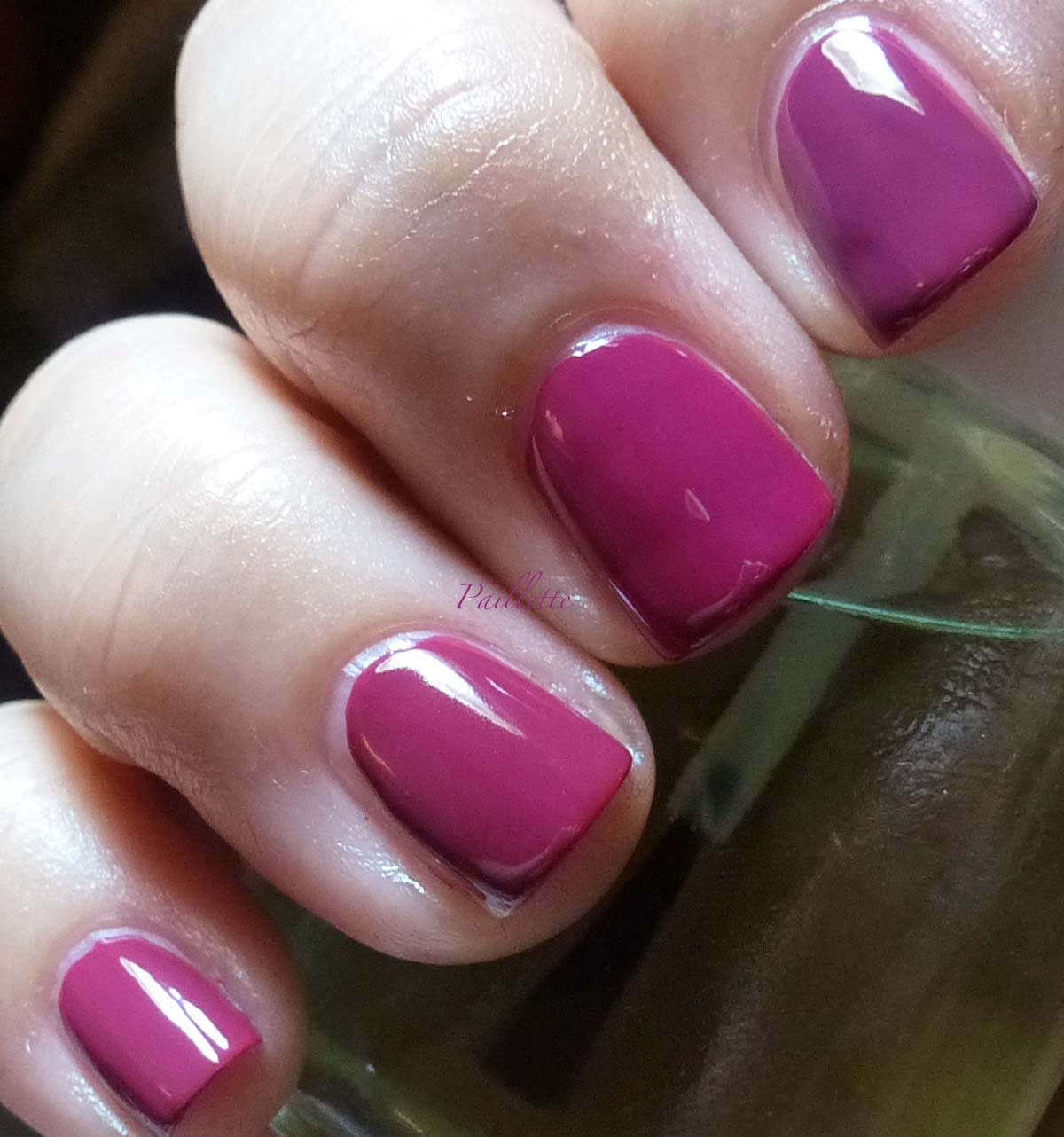
Coraline by Eleventh Gorgeous


Rich orange, or if you like coral. 
Again for coats and no top coat and over Coastal Creme.

I am keeping sheer jellies like this separate, then if I want to goof around with them, I can either tint with them or find a similar shade to make it a bit easier to wear. This ends up being 9 coats with a base coat (three of Coastal Creme and four of Coraline). 

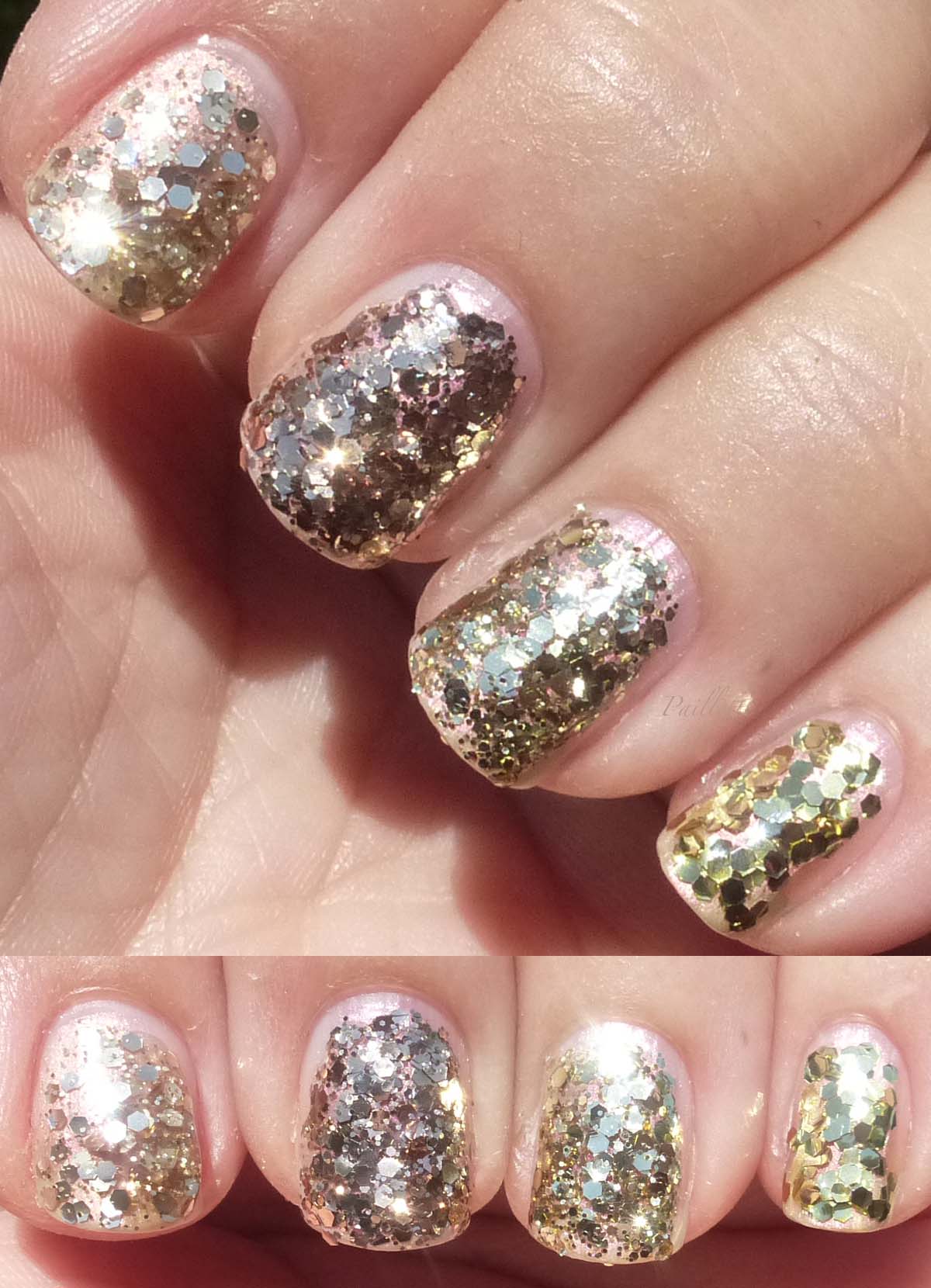
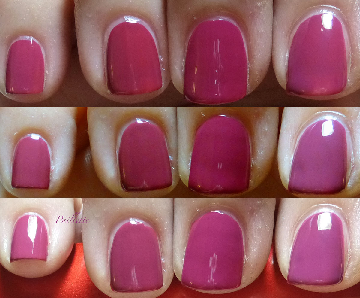
Here is a demo of the layering of the jellies.


Left to right:
  • 4 coats
  • 3 coats
  • 2 coats
  • 1 coat
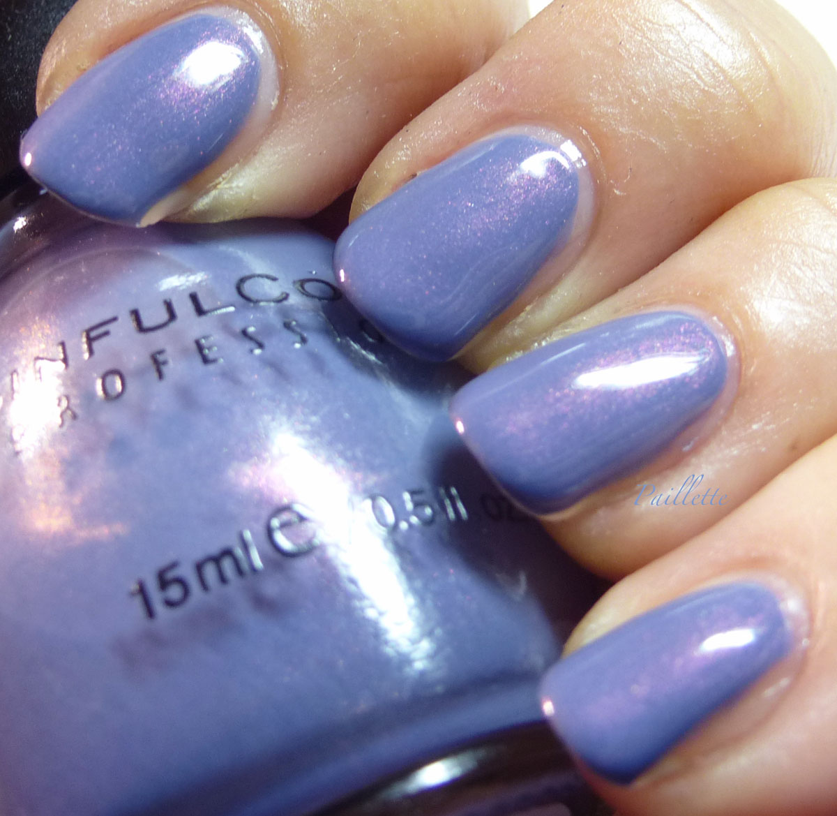
This is one coat of Essie Summit of Style and two coats of Coastal Creme.

You can see that this can get super thick by the time you get to three coats of these jellies.

The fourth coat takes away the texture, and none of these have a top coat.

Eep.

I would say, again, these are akin to water polishes on the first coat: slight tint. You need many coats to achieve anything akin to serious coverage.

Over a similar shade, you will get a deeper color.


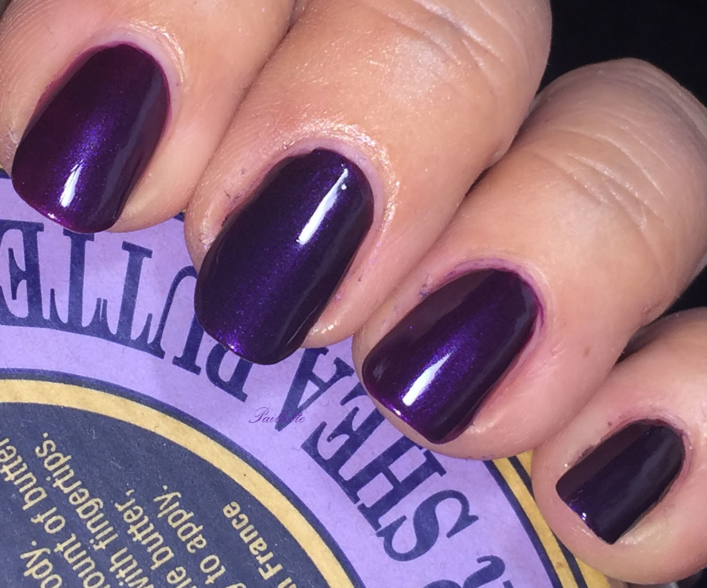
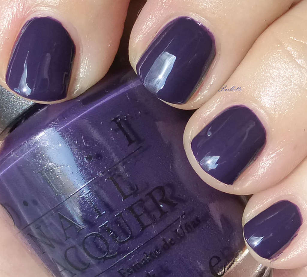
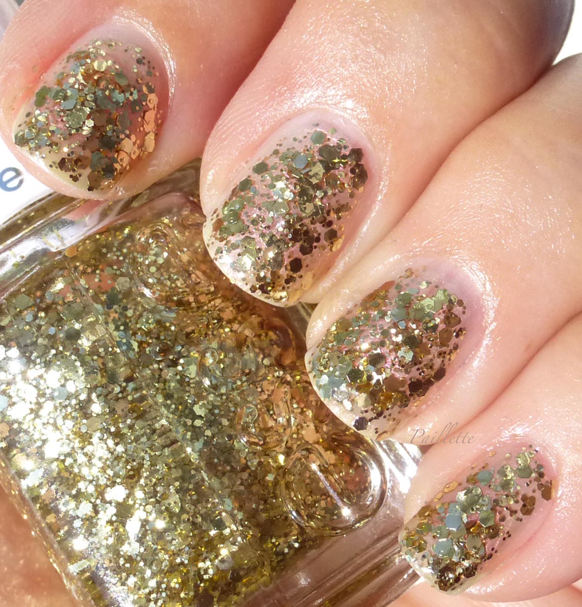
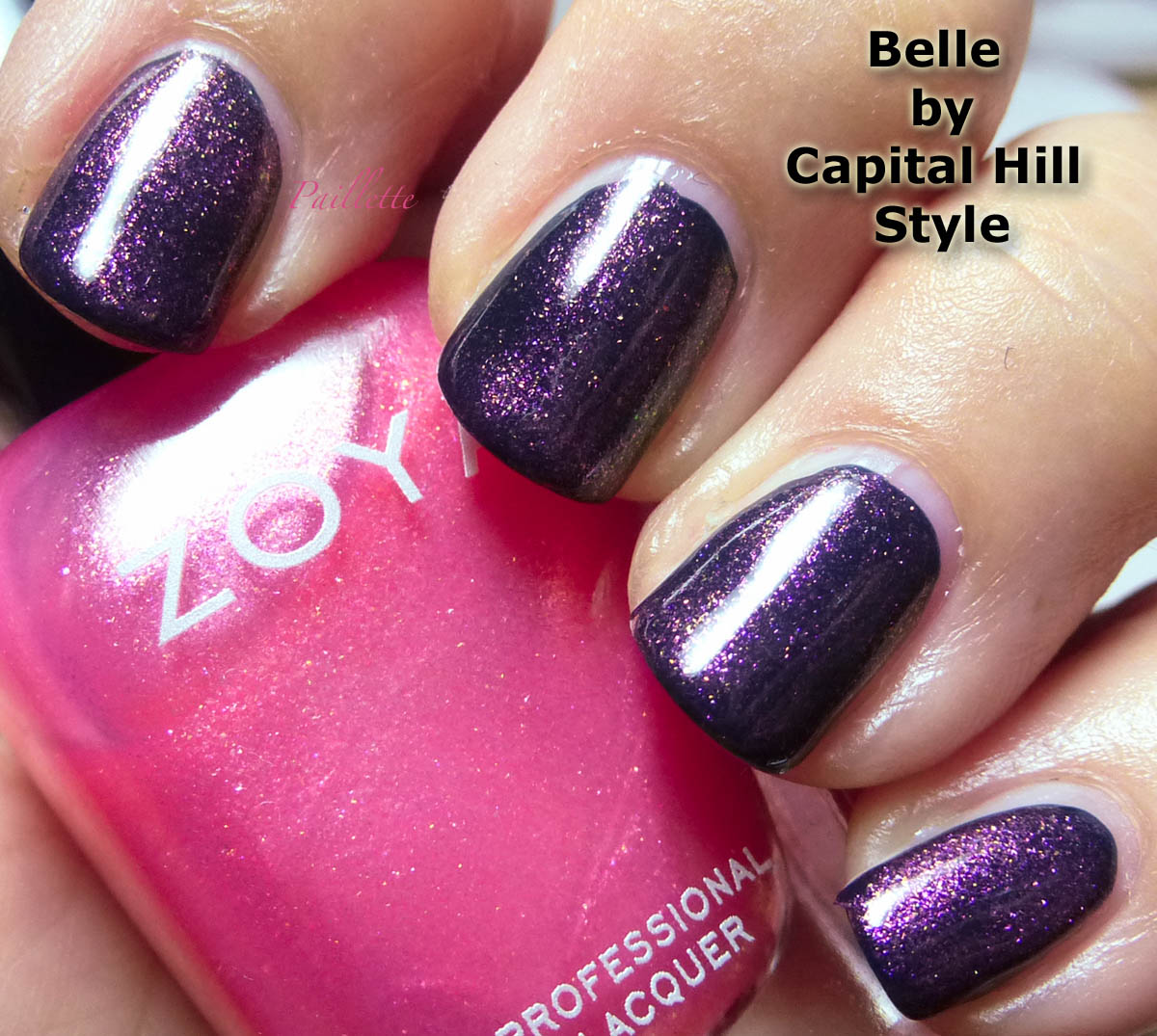
Belle by Capital Hill Style


Two coats of Belle over Color Club Coastal Creme.

Lovely topper. My favorite of the three next to Kate.


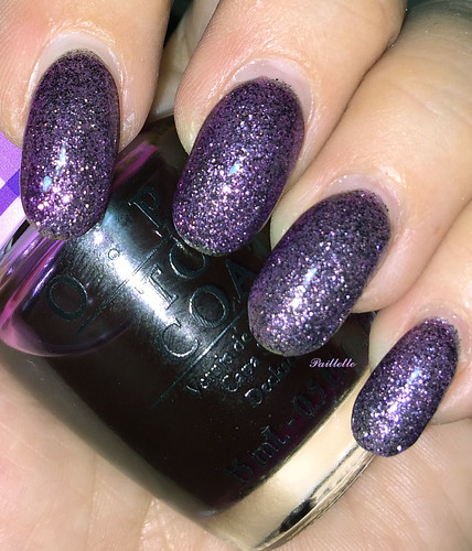
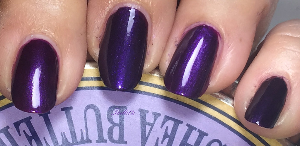
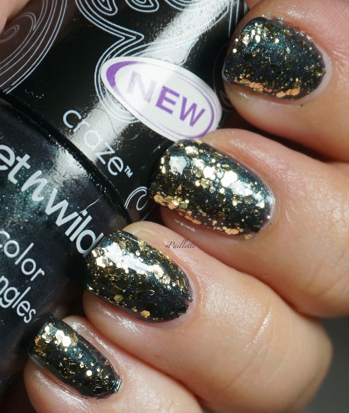
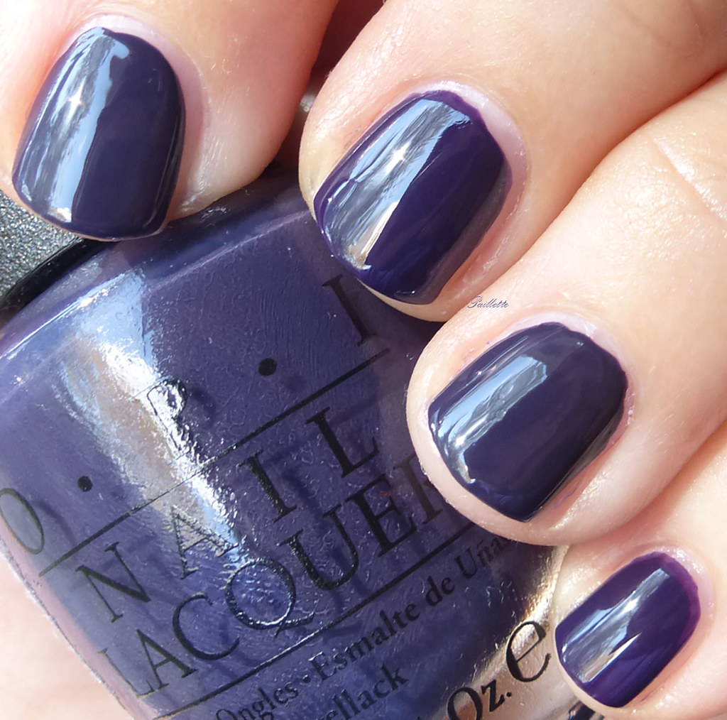
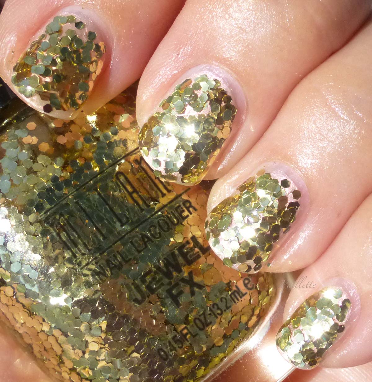
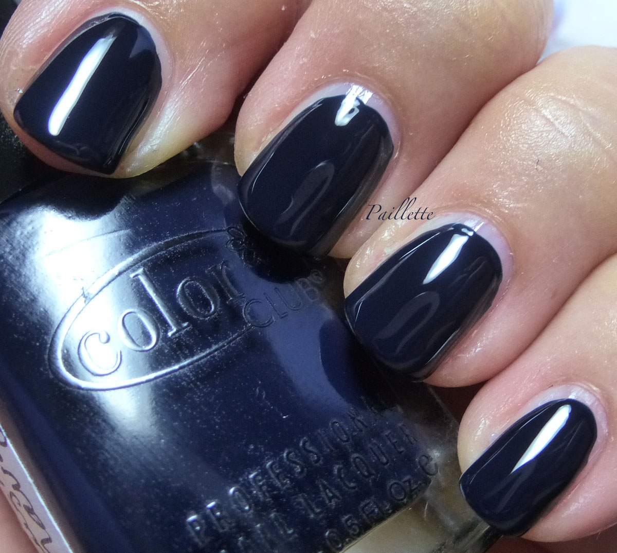
Here is two coats of Belle over Color Club Naughtical Navy. 

Just a quick shot of Naughtical Navy, because who doesn't love to spell Naughtical about 100 times?


Just about my favorite navy. Three coats. Heavenly!


To summarize: I am not sure this collection lived up to the hype.

I had a long paragraph about sheerness, tweaking with base colors, that I already have toppers similar to this, but in general, it's been just a let down for me.


Thank you for reading my little nail polish journal!

Thursday, April 16, 2015

Old Marsala Here To Stay

I almost got rid of this polish before I tried it on....


This photo was taken with my iPhone.

This is Essie Munis Mauve. 

Long before they had embossed bottles and their caps had that eponymous "E" they had, apparently a bland little square bottle and a plain white cap.

A very pre-"Free 3, 4, 5, 6 or 7" polish, this puppy reeks of old school chemistry.

It also goes on easily, smooths out beautifully and tip-toes around fussy dry time like Jerry tip-toed around Tom to get at the cheese.

I slapped this over a very lovely manicure while at work (sinner!) and two coats rendered the shade below invisible, and also into a dang fine base coat.

The color, when googled ranges from a dusty rose to a subtle berry, so I don't know if mine has had pigment aging issues, but I love this polish a lot.

I honestly won't be able to parse the difference between mauve and marsala, but I'll just go there and say "puce" people! PUCE!

I just had to get that in there. Of course the color trend makers couldn't use Puce as color of the year because it's just not got a savory history. Just read The Flea by John Donne and you get a flavor for what I'm talking about.

Meanwhile if anyone knows what collection this was from, I'd love to know. 

I found this on a blog sale and was intrigued by it, also I found it on Nail Supplies for an affordable price. Since this isn't on Essie's site, I'm guessing it's an old bottle.

Thanks for reading my little nail polish journal!

Saturday, January 31, 2015

Berry-ations Part 1

Wanted to do a random batch of swatches. I've had a lot of these for a long time. Dang, time to get them tried out!

All are three coats, none have top coats.

Pulled out a bunch of berry-ish polishes and had at it!


Sparitual Worldly Wise


Soft mulberry that pushes into the mauve rose category. Lovely little polish. I think my photo here is a touch light, though.

Not sure where I got this one, but I think it was a Spiritual sale, quite some time ago. It's no longer on their website. I looked it up to figure out what collection if was from, but couldn't find it, it barely shows up on the radar. So odd.


L'Oreal Sophisticate


Deeper glossy raspberry rose that I love quite a bit. 
Glossy finish, sans topcoat is always a win.

Found at the ol' Dollar Tree. I never even saw these in the main drug stores, which is weird because I got this only a couple of years ago. Odd.


Misa Push Upon It


This is from their Living In The Fast Lane collection from when I was really just starting out in polish, about 2009. Beautiful self-leveling creme. 

Rich raspberry that sends feelers into the red family.

I believe I purchased this from my usual online etailers, it's been quite a while. 
Need to wear this one more often.
Zero oddness.


Essie Tribeca


Very similar to Spiritual Worldly Wise, but more blue toned. My photo is a bit darker, though.
Glossy finish, but sheer. 

This could be used to make a pretty crelly. Might do that after a few wearings. 

I tried to google to find out what collection this was in, but dang, it's not to be found. More oddness.

Purchased, I think, either at a blog sale or eBay.


Here are some comparisons:


Same order left to right
Sparitual, L'Oreal, Misa, Essie


Here the top row is one coat, middle is two, bottom shows a bit better variation between the L'Oreal and Misa, they aren't really as close as they look in these photos.

Bottles!


This is with my flash, so it really brightens things up.
(I seem to have a ton of water bottles around! I recycle, but dang, odd!)


Weirdly enough, as I tried to let you know where you might find these polishes for purchase, only the Misa showed up. 
The other three were like ephemera, lost on the ether.
Although the L'Oreal was fairly commonplace about 2-3 years ago at the Dollar Trees I browsed through, it's nearly invisible now. Plenty of L'Oreal on eBay, but not much of the "Steel Color" stuff.


In a couple days I'll post part 2,  plus a bonus!


Thanks for reading my little nail polish journal!