Wednesday, May 29, 2013

Sparkling Foil (updated)

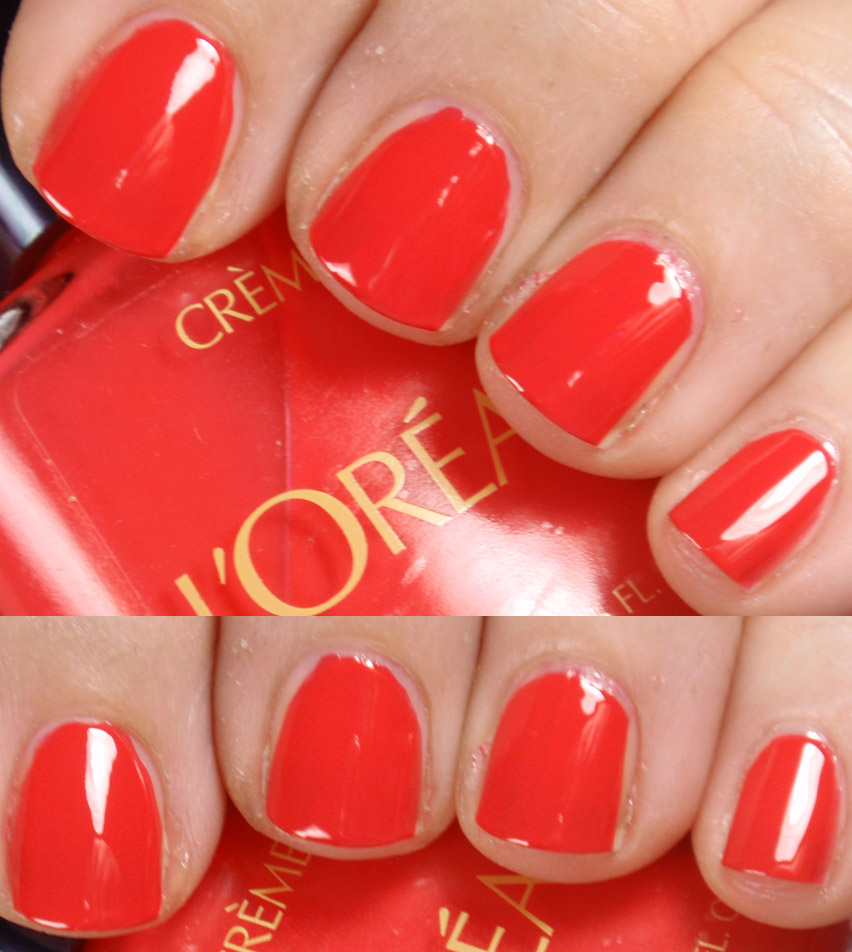
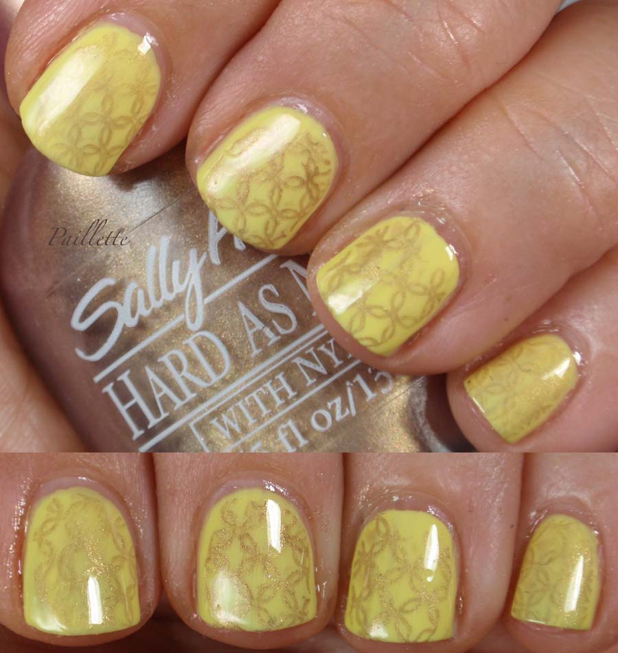
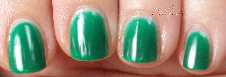
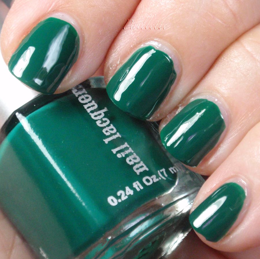
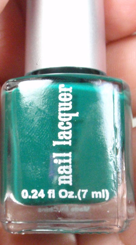
Diamond Cosmetics doesn't get much chatter around the web. A better formula than my Sally Hansen and L.A. Girl and a better price.
Unfortunately they pulled the web cart, so you can't shop right now. I emailed them to see when you can order again and will update my post when I get a reply.

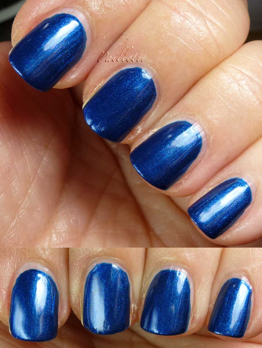
Meanwhile, Sparkling Sherry is a superb foil:


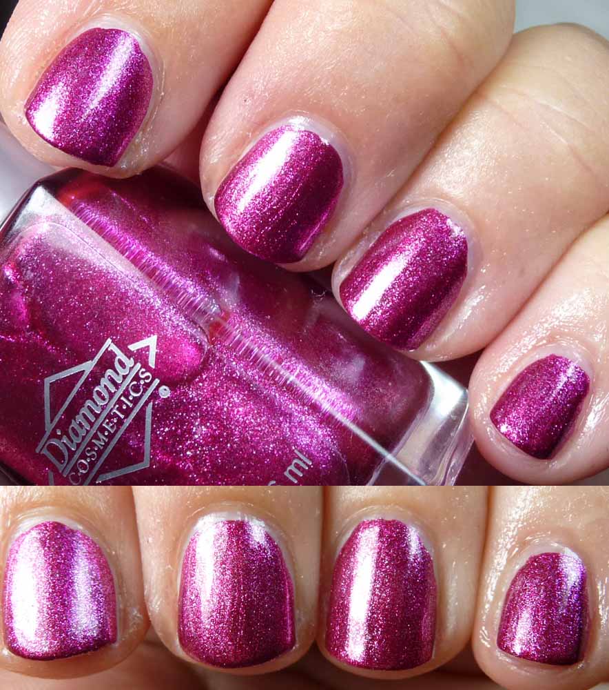
Very nearly one coat, this is two in the photo.

Easy formula, lovely deep magenta, flashy foil!

UPDATE: To paraphrase an email from Diamond Cosmetics, the cart will be gone for the "indefinitely" to focus on private label clientele and not be in competition with the labels they supply.

Insert sad face!!! 

I let them know that I love their polish and hope they think about coming back. I did mention, too that Markwin and Forsyth do multiple labels. Pewp!!!


Thanks for reading my little nail polish journal!

Sunday, May 26, 2013

Lilacs

Around here lilacs are blooming, white and deep purple, they are so wonderfully fragrant.

Clipping a bough of lilacs and keeping around for a few days is so fresh and lovely.

Here is Sally Hansen's Lively Lilac, in their Insta Dri line.


This is a two coat polish, perhaps a one coat.
Easy to work with and very quick to dry.
Thick enough, but not a globby mess.

The little bit of red on my index is my las mani, thought I would slap some stuff on after camping to try to get my nails in shape, so, whoopsie on that one!
I also pressed my fingers together while drying to get the photo, so I smudged it.

Good gravy, what a hot mess.
Still, great color. Not a flat creme, but a soft silvery shimmer runs throughout.

Thanks for reading my nail polish journal!

Tuesday, May 21, 2013

In Shadows

I love those graphic shades that remind me of comic book colors.
Not the brightly pigmented ones, but the shading colors of blues and greens that add depth but aren't really noticed.

When I was a kid I read a lot of shoujo manga. Aside from amazing technical craftsmanship, the beauty and dreamlike quality of the faces of the girls enthralled me. It was a world of impossibilities, filled with beauty, soap, fashion, and color.
I could digress on how the girls were of a perfect European type, completely unattainable by most mortal girls, but at the time who cared? I still have one from the "day" and even though it's very old, it holds up to today's manga.

Here are two shadowy shades today.

First up: It's Not Me, It's Blue


Sheer, but manifold in it's foil-y beauty. Four coats, no worries. The color is that of a blue gray sky where the protagonist waits for her boyfriend to come over and kiss her, she's nervous and her hair is blowing about in the wind and it's watercolored in shades of blue and deep gray.
(oh, he kisses her alright)


These glass fleck foils aren't quite as metallic as some of the foils with more silver in them (the bottles form a ring of silver sometimes in those), but it's got a gothic charm.


Up next: Sparitual Steel Magnolia


Three coats, somewhat frosty. I wonder how close this is to Orly Midnight Star? I am thinking less red leaning, however I am so shy on Orly dupes that if it wasn't I'd be surprise (looking at a quick google search seems to make me think it isn't, but some photos look very similar. Ah the webz).

Back to shoujo manga: This is the color of a school uniform (a constant in shoujo manga) or a backpack. Or a pensive horizon.

I will say that I also redid this manicure later and did it with MUA member Blitherboop's sponge method. It was much more amazing, no frost and just a fine shimmer. Looooooved! Didn't take a photo, but did really like the result - it solved the brushstrokes!

Steel Magnolia was found at an online beauty discounter like Hautelook, Ideeli or Gilt, can't recall which one it was. I believe it is discontinued through Sparitual. Bummer, it's a great color.

Even though they are nothing alike in their finish, they are similar in their color:


There is the distinct possibility that Steel Magnolia would be a great base for It's Not Me It's Blue, I didn't try it, but looking at these photos, it would work as a great base.

Last but not least:


Distinct gray-blue shades that are both very nice. It's an uncommon color and I don't have many colors in this particular range.

Like watercolor washes of shadows and skies and wind-blown hair and other details of my favorite manga.

Thanks for reading my little nail polish journal!

Sunday, May 19, 2013

Poppies!!!

L'Oreal Poppy.

Heaven!


Decadent, luxurious, rich, robust, and in need of a reblog.
Pardon the cutes, enjoy the color, forgive the photography, and let the color be king in this post.

Easy formula, amazing color. Reds like this are my favorite. The more I wear them, the less I really ever want to wear deeper reds at all.

Such a fresh shade for such an old bottle of L'Oreal ignored at the Dollar Tree.
Welcome home, little polish!

Thanks for reading my nail polish journal!

Friday, May 17, 2013

Blues Legend


When I typed that phrase into Google the first hit was Robert Johnson.

If you aren't acquainted with his work, please indulge yourself. Genius is not an overstatement.

Blues are fundamental to modern music as we know it. Musically it's like the change from the writing style of Henry James to that of Ernest Hemingway. 

Here are some tasty blues you should latch onto, if you get the blues, these blues will sing to you.


Left to right:
Sally Hansen Denim Creme
Sally Hansen Thinking of Blue
American Apparel Royal Mount

Not a dud among them.
Royal mount is slightly more pink, but all are gorgeous and glossy.

Three coats each, I did clean up a tad here and there. 

Here are the bottles:


Denim Creme is probably on eBay, I found it at a Dollar Tree. The matching cap just adds to it's sweetness.

Thinking of Blue is a Complete Salon Manicure that is not in the racks, but probably on eBay, found mine at a Walgreens. I don't know which release this was in, the drug store price point for SHCSM is rather high for the formula payoff. I believe that I found this on sale.

Royal Mount was a blog sale find, but is also at American Apparel's website. A formula not to be sniffed at, I kind of feel like it's a Color Club. But then again I think there is a lot of sub-contracting going when non-beauty brands get into makeup. Unfortunately I  have no evidence to support such a theory, but if you think about it, it's much easier to contact a company who "does polish" order new packaging and call it good. 

Meanwhile, enough with the speculation, this is my fave shade in the medium blue realm. 

Thanks for reading my little nail polish journal!

Thursday, May 16, 2013

Golden Veil

I found that I'd not swatched Sally Hansen Zippy Frost, so did it up fast:


Why Sally calls it a frost and not a chrome is beyond me, or at least a metallic. Quick an dirty, doing what this finish does best: showing ridges and every random dust flotsam that lands on my nail.

It's three coats, could easily be two. The color really isn't me, in fact it's a bronze with a pink cast. The very unmixed bottle has a clear layer of deep pink that holds more fascination to me than the final product. Ah well!

I thought it was dense enough to try stamping, so I put on a couple of coats of SinfulColors Unicorn and stamped with Zippy Frost.


SinfulColors Unicorn is an easy formula for a pastel. Took a bit of tweaking, some clean up, but all in all, I love the soft yellow. 

I'm not a super practiced stamper,  I am also not a perfectionist, so I left the drag effect, which kind of is a let down as I edited and post the photos.
I can't recall which plate this is, either. I think it's a Bundle Monster. 

I like the effect, though I feel I need to just jump in and practice, practice, practice.

Practice makes perfect. (Well, perfect practice makes perfect, according to a teacher from long ago).

Thanks for reading my little nail polish journal!

Tuesday, May 14, 2013

Essence Underwater and Above Par!


Essence again!

This one I can't recall where I got, but I feel it came in a swatch some time ago. Thank you sweet person!

To be honest, when petrol blue is declared a Pantone "color of the (insert season/year/decade) I will be one happy girl.

Here is a petrol blue to wrap yourself up in:


Three coats.
Secret shimmer in the larger incarnation of glass fleck style particles and a rich aqua blue.

Contorting my fingers to get the shimmer just was not finding the sweet spot, so I would call it a Top Secret Shimmer.

Meanwhile, love the formula, love the finish. A quick dry formula, too. Nice!!

Thanks for reading my little nail polish journal!

Sunday, May 12, 2013

Obscure Dupes

I'm in a blue frame of mind, colorwise. There are several coming up peppered with some other colors.

I also want to note that I'll be on vacation camping and am setting up the "schedule" posting feature in Blogger so I can keep up the momentum while I'm gone. My iPhone will erase a page if I try to edit it (sad face) and so I will try to respond only to comments but won't be editing stuff.

Onward!

Pulled out a WetnWild called Sapphire Blue (no longer appearing on the WnW website) and compared it with a Lina Gale (by Markwin) polish I'd gotten in a holiday pack at Ross.


Oddly familiar!

WetnWild is pretty good at rebottling polishes and looking around with that "who me?" face.

Here is a three coat shimmerfest:


Bright sapphire blue, beautiful shimmer, easy formula, and identical.
Left to right:

  • Lina Gale No Name
  • WnW Sapphire Blue
  • Lina Gale No Name
  • WnW Sapphire Blue


So nice. My only complaint would be that these are long gone (eBay for WnW) and really should be stand-bys in people's collections, these are a little bit on the warm, maritime side of navy compared to things like CC Hippy Trippie.

Little fail, much win.

Thanks for reading my little nail polish journal!

Friday, May 10, 2013

Oh Riley?

Zoya Riley that is!


Three coats, easy to use.
I didn't bother with cleanup. I've got to say it would have helped. Mea acetata.

Pretty!

Zoya calls it a "raspberry red" but it feels more like a cranberry shade. I suppose parsing the "berries' is silly.

In any even it's got a crelly sense to it, almost luminous feel when you look.

If you look closely you can see that I've put on a dose of hand creme and it's made it a bit shiny. eep!

Thanks for reading my little nail polish journal!

Tuesday, May 7, 2013

Green Party Part 3

Here is a comparison of all of the polishes swatched in the last two posts.

I feel, though, that the photos are a little dark. I took some under lamp and others in daylight. I've also lightened them up, too.

Kind of a fail. But here they are.


Left to right:
NYS Amaranth
Walmart Noname
Color Club Wild Cactus (Probably CC Abyss)
Catrice Forest Floor
Essie Going (blogged here)
Verity Aqua Blue

Here in daylight:


Daaaark.
Kind of a bummer. Makes them all look similar, but they are very different.

The upside: even when dark, they don't go totally black.

Hope you enjoyed the swatches!!! Thanks for reading my little nail polish journal!


Sunday, May 5, 2013

Green Party Part 2

Welcome back!

Here are three more greens!

Catrice Forest Floor


Three coats, amazing formula.
Super wow!
I got this in a swap, and really am glad that Catrice is available on eBay and soon on NinjaPolish.com.
Perfect green.
Love!


Up next is a conundrum, I have this labeled this Color Club Wild Cactus, but it might be Color Club Abyss.
I really am not sure.


I think this is a pretty accurate photo, though later, in a comparison shot, it looks darker.

The worst part is that this came in one of those Ross sets that has no names. This was full of CC holiday glitters and this one. I really wanted the glitters.

Three coats, easy formula. I think it's Wild Cactus, but it has less of that warm tone and much cooler, which seems to imply Abyss. Which makes me wonder why manufacturers do a lot of the same colors?  I'm only really realizing this as I type all this, all my comps call this Cactus....erp.

I feel like this is ok, but not a super fave.


Finally Verity Aqua Blue


Neither aqua nor blue, but a great green in a piney vein. If you like jelly finish, you probably need this one. Found on Amazon.
Three coats, easy formula. I think this photo is a little blown out, too.

Of all of my jelly finishes, I must say this is a favorite: good coverage, yet that translucent depth.

Part three will have a comparison of all five, plus a bonus.

Thanks for reading my little nail polish journal!

Friday, May 3, 2013

Green Party Part 1

Here are a few greens I didn't get to in March.

It's a multi-parter because it's a lot of pictures.

Here are two I love.

First up, an all time favorite, New York Summer Amaranth


A beautiful jelly green. My nails, due to genetics and staining, have a band of darkness before the white. It makes it look a little like a syrup.

Three coats, great formula.

Available at Transdesign, where I grabbed it. A perenial favorite.


I think it was a real hot color a couple of years ago when it was the prime ingredient in makeing the then-discontinued Nars Zulu.
I am not sure what the formula was, aside from adding black, but it was a very popular as a key ingredient.
I never got it, made my own "version", finally got Zulu, and got this and just enjoy it's pretty green color. Unfortunately my stained nails make it look a little like a syrup polish.


Next we have a real find.

An unnamed Walmart polish that showed up around Halloween about 2009.


Three coats of a rich cool green that is really a nice surprise for a little $1.00 bottle!
I bought 4-5, for some reason, and it's a really nice formula, surprisingly. I imagine Walmart subcontracted with someone like Bari - the Pure Ice and Bon Bons maker - or something like that. I've not seen nail polish on the Halloween aisle much. I didn't really look the last couple of times, but then again, I am spending less time in Walmartland. in general.

Here is the sweet little bottle:


Cute!
No printing on the back, just a little anonymous bottle of polish.

Ah well.
More green soon. Thanks for reading my little nail polish journal!