Back in the day "matchy match" beat "goes with" all day, every day.
There was a bespoke quality to it: your shoes and bag, your belt and gloves, your nails and your lipstick. You looked not merely coordinated, but it looked back on to pre-industrial crafted clothing made from materials that were not mass produced and workmanship that was by hand.
I have had these old Dollar Store Sally Hansens around for a long, long, long time. I love the shades, and I really regret dumping many of these after trying out this franken. (Gah!)
Okay, so what was I doing? I wanted to do two things:
1 - Add enough body to the polish without losing its shade intention to give a sheer polish better coverage
1 - Match the Sally Hansen cap.
Simple enough, no?
Well my biggest challenge was that this was a finite quantity of polish and that if messed up, game was up.
See what you think.
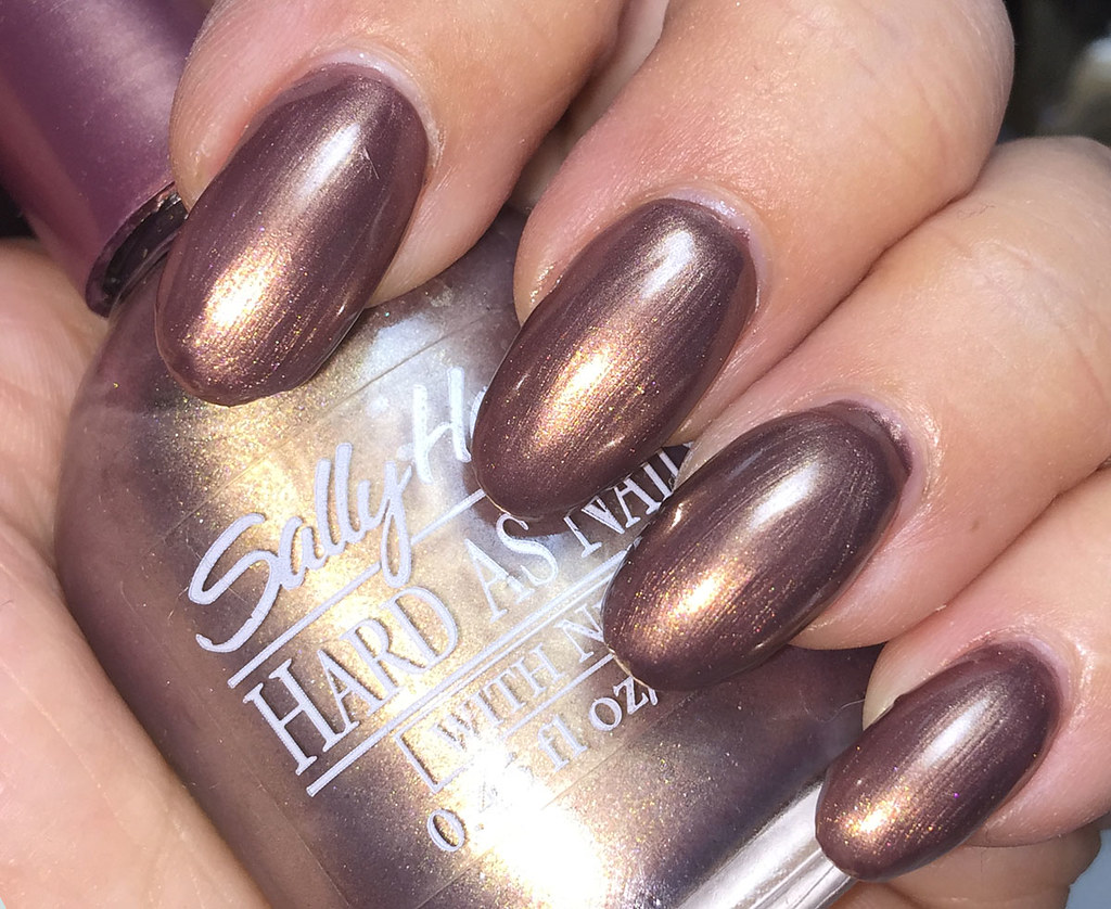
Sally Hansen Zippy Frost frankened with Color Club Ready to Royal
Ready to Royal is a deep vamp purple (blogged here, crying for a reblog) that has a red violet undertone. I think colors like this are superb for frankening into pale shades.
To keep on track, though, I added about 1/2 a teaspoon to this bottle. There was a fair amount of evaporation and usage!
I blogged Zippy Frost a long time ago here. I think the purple just adds a richness it lacked in its first iteration.
I love this chocolate mauve shade. The purple comes out a bit, but it doesn't really do it on the nail, which is fine. I may add more Ready to Royal as space allows, but right now, it's so creamy and frosty a the same time. Love it!
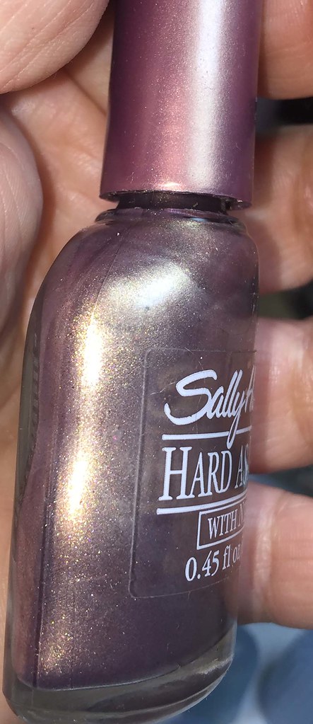
Here's a photo of the bottle and cap:
You can see the red violet purple coming out here much better.
Nearly a match!
Now you can see why I have sudden regret over purging a lot of my old Sally Hansen matching cap polishes!!
Sally Hansen No Name frankened with Color Club Secret Rendezvous and Sally Hansen Lively Lilac
It came out of a Dollar Tree pack and had the bottom half of the back label scraped off and there was no top label on the cap.
A gorgeous soft mauve pink with a great green shimmer, I tried to make it a topper, but it was in that realm of too milky to be a topper, too sheer to run solo. I really never found the right combo.
Here is a really old swatch. The green flash is not well served in any of my photos, but you can see it slightly in the early photo.
Looking at Lively Lilac, (blogged here and here) I knew it would add enough density, but could go too dark, so I grabbed CC Secret Rendezvous (blogged here) to lighten it up. CC SR isn't a one coater, so I knew it wouldn't obscure the shimmer.
This came out so well, I love it.
Such a win for both. Brushstrokes, I celebrated them!
I normally find frosts too sheer, but these are now quite a pair of favorites.
Thanks so much for reading my little nail polish journal!


No comments:
Post a Comment
I love comments!
Please email me at paillette.a.nail.journal@gmail.com to add your blog to my blogroll instead of posting your blog here!
Thank you!
Did I mention I love comments?
:D