ILNP Ballet Slipper is a soft bronzed pink holographic polish.
Alone it is a bit sheer for my taste, but as a layering polish it's just right.
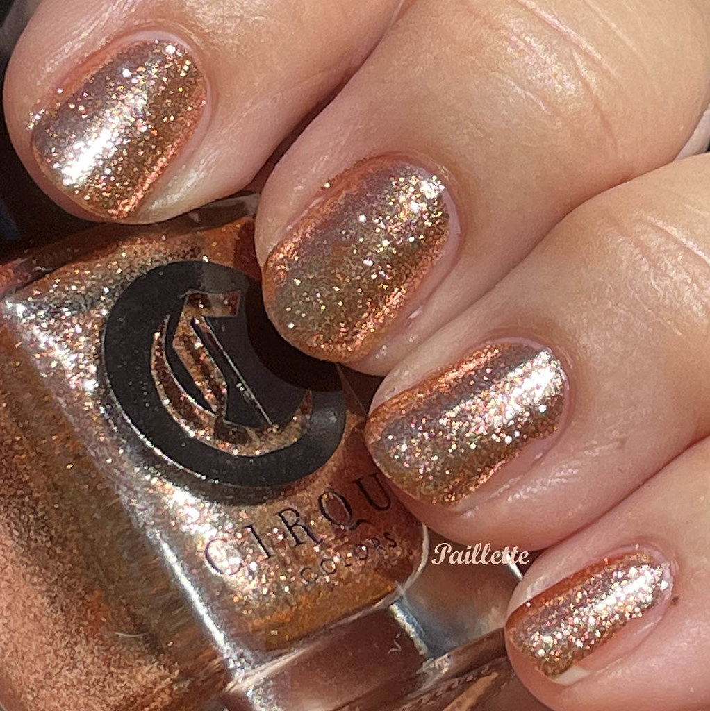
I paired it with Cirque Halcyon, a polish that holds the standing, running and jumping record for Great Rose Gold Polish. The good news: Halcyon is on Cirque Colors website. Awesome!!
Two coats Cirque Halcyon and two of ILNP Ballet Slippers:

Pink? I get a warm bronze rose at best.
Both are beautiful and pose and interesting combination.
Thanks for reading my little nail polish blog!