Hello! Thanks for coming back!
I've got part 2 of Color Club's Take Wing Collection. I'll post a back link to part 1 pretty soon.
A few things:
Sky High

This is a beautiful marine blue.
Almost a foil
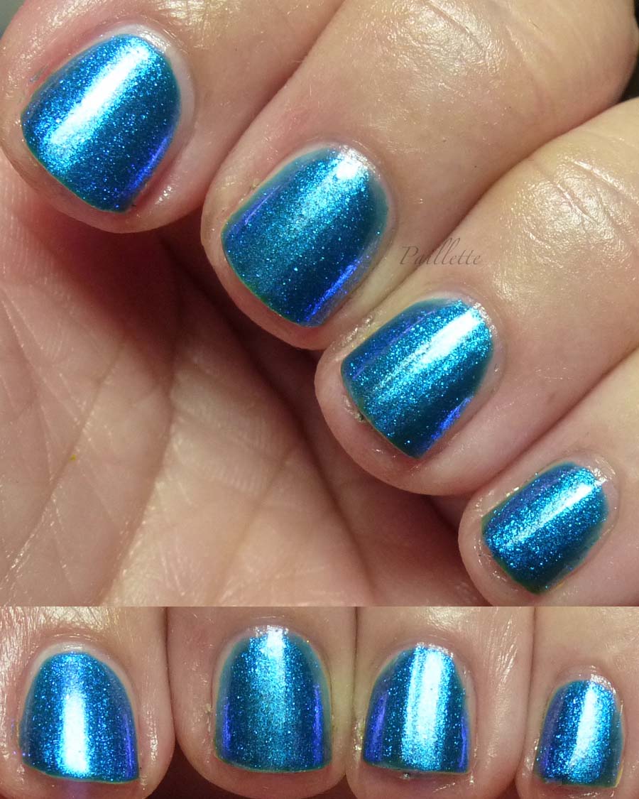
It is a bit sheer, and you can see around the edges that it almost looks a bit green.
I can't really discern much shift, if, however, you enlarge, you can see that it's a blue/purple shifting fleck particle in a peacock blue base.
Lovely.
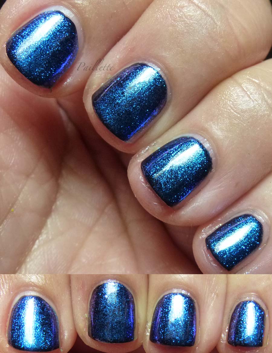
Over black - as expected, the base vanishes and you are left with the blue/purple shifting glass fleck.
This one is a win as topper. Nothing that CND produced in their effects line kicks up the dust in the blue family quite like this one. Flex those muscles, Sky High!
Come Fly With Me

Acid green, pushing into the lime family. I'd call it chartreuse, but i's a little more like yellow green spring buds pushing up into sunlight.
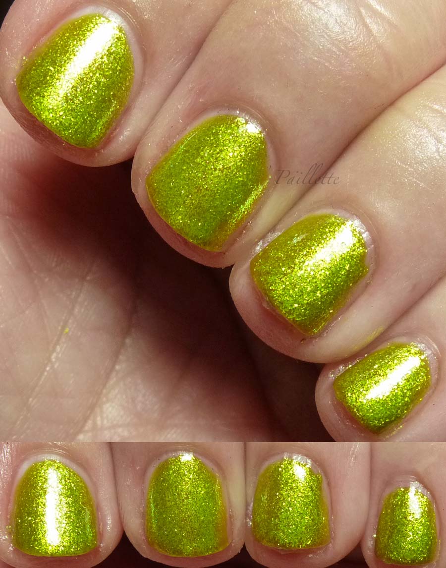
If you enlarge this one you can see that it's a little bit transparent and you could do another coat to get better coverage.
If it were over a yellow or a green, I feel it would pick up the base very nicely. Chameleon-like!
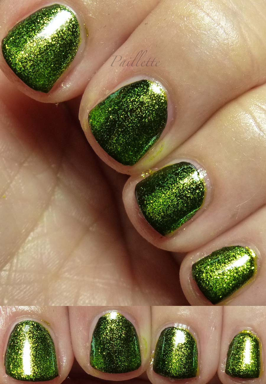
Over black it's not quite as impressive. There is gold/green color shift, however it doesn't spread out into a thin little topper as I'd hoped.
This will pick up a yellow, and make a green a bit more zippy, so for me it falls into the realm of "not so great over black, but better over medium to light colors". There's room for that in my collection!
Wing Fling
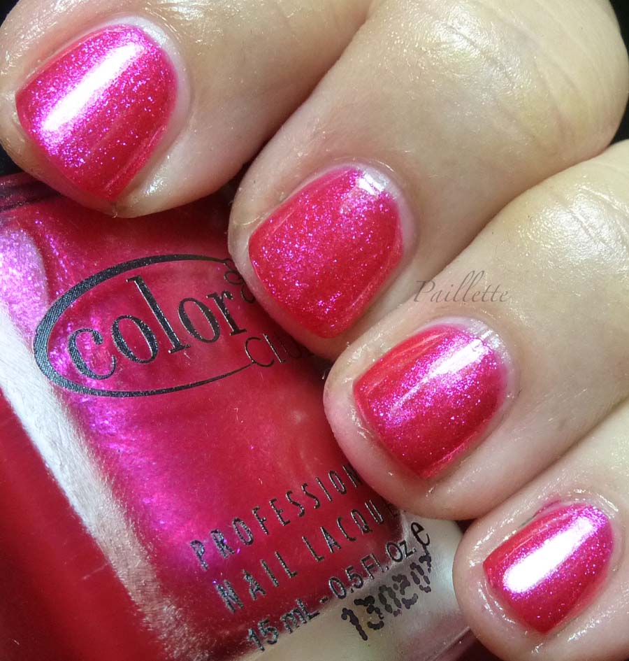
Pretty hot pink-going-red, packed with a purple glass fleck shimmer.
More shimmer than foil, but certainly not without pop.

Here you can see that it is easy to have a brushstroke issue. The middle finger has one. I should have redid it, but by this time I was pretty zonked and needed to finish.
This one isn't as exciting, I wish the fleck was more blue and the polish a wee bit more red. It does do a nice job. A purple would have been great instead of this color, in my opinion. But it's the only red, so I can see why they did it. Every collection needs a red or pink, right? ;D
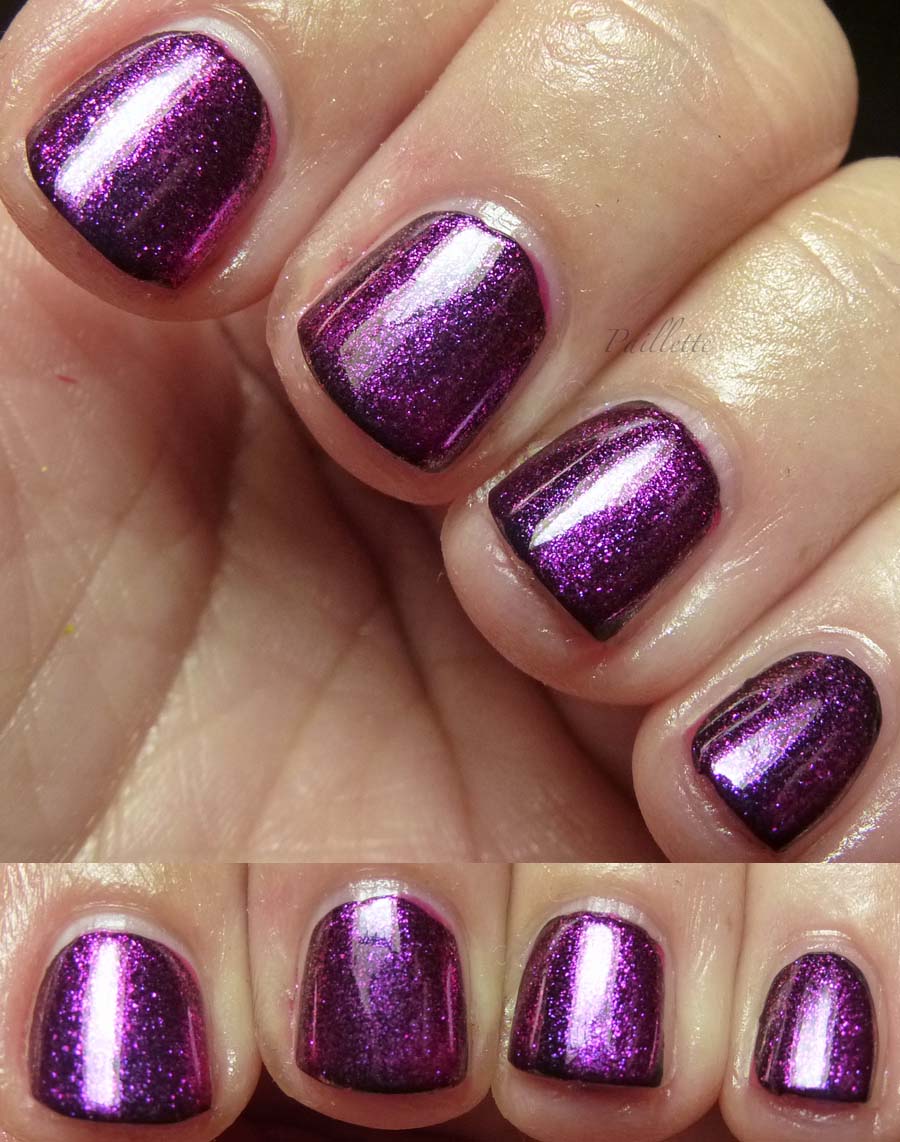
Over black the purple pops its head over the fence and says "Hello!"
I'd not call it a shift, but there is purple and pink particles that move into the grape realm. It's a nice little topper alone. I thought I'd dislike it, but no, it's a cutie.
So there you have it, an old collection that I finally got out of the drawer and swatched.
This finish is now fairly common, and it can be tricky with sheerness. I will crack these out again and experiment with base coats one of these days. Reblog? Not quite, just at the moment I'm done, I realize "oh, why didn't I do that?"
Final thought: if you don't want to buy the very extinct and hard to find CND Effects, these might not be a bad substitute.
I found my set at Ross for $7.99, but Ross now is devoid of CC, except for the odd Cosmetic Arts, or random mismatched set. Such a shame.
Some etailers keep them around $3.00-ish, which is a good price point.
Thanks for reading my little nail polish journal!
I've got part 2 of Color Club's Take Wing Collection. I'll post a back link to part 1 pretty soon.
A few things:
- Three coats, except for over black
- No top coat
- Could use a base of the same color for better depth
- Lighting is a single source Verilux lamp
- Some have better color shift than others over black
- They really like the sun!
Sky High
This is a beautiful marine blue.
Almost a foil
It is a bit sheer, and you can see around the edges that it almost looks a bit green.
I can't really discern much shift, if, however, you enlarge, you can see that it's a blue/purple shifting fleck particle in a peacock blue base.
Lovely.
Over black - as expected, the base vanishes and you are left with the blue/purple shifting glass fleck.
This one is a win as topper. Nothing that CND produced in their effects line kicks up the dust in the blue family quite like this one. Flex those muscles, Sky High!
Come Fly With Me
Acid green, pushing into the lime family. I'd call it chartreuse, but i's a little more like yellow green spring buds pushing up into sunlight.
If you enlarge this one you can see that it's a little bit transparent and you could do another coat to get better coverage.
If it were over a yellow or a green, I feel it would pick up the base very nicely. Chameleon-like!
Over black it's not quite as impressive. There is gold/green color shift, however it doesn't spread out into a thin little topper as I'd hoped.
This will pick up a yellow, and make a green a bit more zippy, so for me it falls into the realm of "not so great over black, but better over medium to light colors". There's room for that in my collection!
Wing Fling
Pretty hot pink-going-red, packed with a purple glass fleck shimmer.
More shimmer than foil, but certainly not without pop.
Here you can see that it is easy to have a brushstroke issue. The middle finger has one. I should have redid it, but by this time I was pretty zonked and needed to finish.
This one isn't as exciting, I wish the fleck was more blue and the polish a wee bit more red. It does do a nice job. A purple would have been great instead of this color, in my opinion. But it's the only red, so I can see why they did it. Every collection needs a red or pink, right? ;D
Over black the purple pops its head over the fence and says "Hello!"
I'd not call it a shift, but there is purple and pink particles that move into the grape realm. It's a nice little topper alone. I thought I'd dislike it, but no, it's a cutie.
So there you have it, an old collection that I finally got out of the drawer and swatched.
This finish is now fairly common, and it can be tricky with sheerness. I will crack these out again and experiment with base coats one of these days. Reblog? Not quite, just at the moment I'm done, I realize "oh, why didn't I do that?"
Final thought: if you don't want to buy the very extinct and hard to find CND Effects, these might not be a bad substitute.
I found my set at Ross for $7.99, but Ross now is devoid of CC, except for the odd Cosmetic Arts, or random mismatched set. Such a shame.
Some etailers keep them around $3.00-ish, which is a good price point.
Thanks for reading my little nail polish journal!
No comments:
Post a Comment
I love comments!
Please email me at paillette.a.nail.journal@gmail.com to add your blog to my blogroll instead of posting your blog here!
Thank you!
Did I mention I love comments?
:D