I still need to take time to organize my blues and purples. I don't have a lot of light blue, though, which, is odd.
First up...
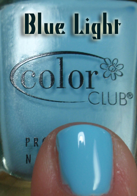
Color Club Blue Light


A rich bright blue. A little translucent, but not enough to call it a jelly or anything. What is nice is that it does have a luminous quality to it. Perhaps it falls into "sorbet" category. Though, I believe that Color Club calls this a creme. This is from the Flower Power collection, which was pretty nice.
Three coats, over a white background. No complaints here on drying, application is very easy, too. You can see I did clean up on my middle finger a bit, but left the others. My nails are small and I am so uncoordinated, I am always in awe of bloggers who can get perfect edges and cuticles. I strive, but I guess this is an old saw, so forgive the ramble!
Blue light! Bright light blue! Nice!
Next on the table...
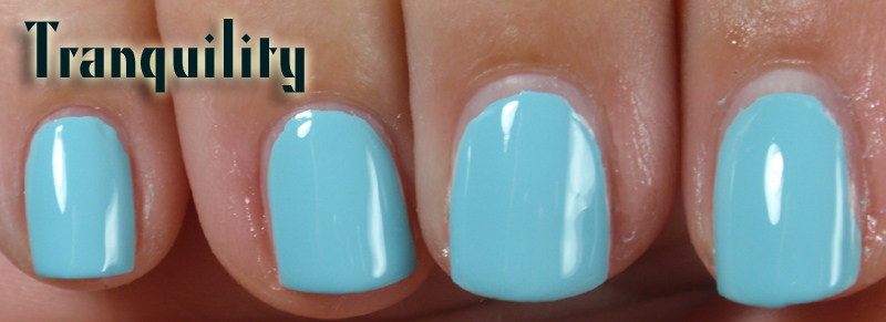
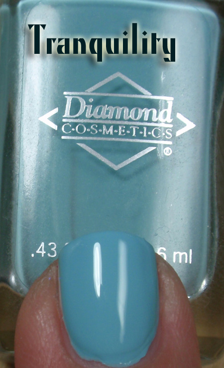
Diamond Cosmetics Tranquility


Three coats, but really, two would have been mucho puh-lenty! Great coverage, poppin' shine and a blue that is reminiscent of a Tiffany blue, meaning there is a bit of a marine/green quality to it.
If I were a nail stamper, this would be a go-to polish. Imagine it over an ivory or pale taupe? Man! I am serious! Wow! I need to try this! If you try it, I will make you a guest blogger! (fame, fortune and glory await!)
A blue with a gentle whisper of sea breezes and white sand beaches, a cotton blouse and a pair of khaki shorts, barefooted bliss.
Last but not least...
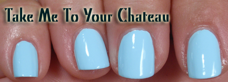
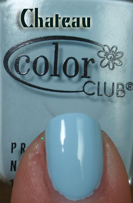
Color Club Take Me To Your Chateau


To me, the bluest of the lot. As with Tranquility, the coverage I felt was opaque in two, without drag or even any worries about streaks. Less intense than Blue Light (clearly showing it's neon collection roots) this feels like a blue that can go anywhere. My fingers do look a wee bit on the pink side, so I am guessing that this is the famed "lobster hands" effect. In the summer when my hands are tanned more, this is mitigated.
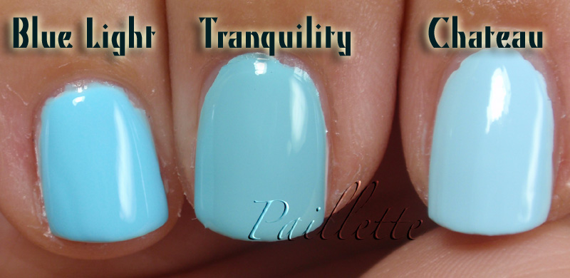
As you can see from the photo pairs, that lighting affects these a lot.
Here are some direct comps...

Really quite different!
Bottle shot:

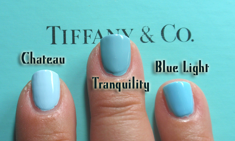
Finally I pulled out a Tiffany's box...

Interesting how Tranquility take an at bat at being close but a slight bit "dusty" by comparison. The other two, well, just different animals as far as light blue goes.
Photo here was taken with a pair of color corrected "Ott" type fluorescent bulbs, so it may be a bit truer in sunlight.
There you go! Three nice blues! All seem to have something really wonderful about them. I feel like Blue Light could be used to franken a pretty amazing jelly, too.
Thank you for reading my nail polish journal!
First up...
Color Club Blue Light

A rich bright blue. A little translucent, but not enough to call it a jelly or anything. What is nice is that it does have a luminous quality to it. Perhaps it falls into "sorbet" category. Though, I believe that Color Club calls this a creme. This is from the Flower Power collection, which was pretty nice.
Three coats, over a white background. No complaints here on drying, application is very easy, too. You can see I did clean up on my middle finger a bit, but left the others. My nails are small and I am so uncoordinated, I am always in awe of bloggers who can get perfect edges and cuticles. I strive, but I guess this is an old saw, so forgive the ramble!
Blue light! Bright light blue! Nice!
Next on the table...
Diamond Cosmetics Tranquility
Three coats, but really, two would have been mucho puh-lenty! Great coverage, poppin' shine and a blue that is reminiscent of a Tiffany blue, meaning there is a bit of a marine/green quality to it.
If I were a nail stamper, this would be a go-to polish. Imagine it over an ivory or pale taupe? Man! I am serious! Wow! I need to try this! If you try it, I will make you a guest blogger! (fame, fortune and glory await!)
A blue with a gentle whisper of sea breezes and white sand beaches, a cotton blouse and a pair of khaki shorts, barefooted bliss.
Last but not least...
Color Club Take Me To Your Chateau
To me, the bluest of the lot. As with Tranquility, the coverage I felt was opaque in two, without drag or even any worries about streaks. Less intense than Blue Light (clearly showing it's neon collection roots) this feels like a blue that can go anywhere. My fingers do look a wee bit on the pink side, so I am guessing that this is the famed "lobster hands" effect. In the summer when my hands are tanned more, this is mitigated.
As you can see from the photo pairs, that lighting affects these a lot.
Here are some direct comps...
Really quite different!
Bottle shot:

Finally I pulled out a Tiffany's box...
Interesting how Tranquility take an at bat at being close but a slight bit "dusty" by comparison. The other two, well, just different animals as far as light blue goes.
Photo here was taken with a pair of color corrected "Ott" type fluorescent bulbs, so it may be a bit truer in sunlight.
There you go! Three nice blues! All seem to have something really wonderful about them. I feel like Blue Light could be used to franken a pretty amazing jelly, too.
Thank you for reading my nail polish journal!
nice comparing. blue light looks like my fav.
ReplyDeleteGo Blue Light!
ReplyDelete:D
Cool comparison! Umm, according to VNS, Blue Light is also known as Factory Girl. Weird. Anyway, I'll keep an eye out at Ross.
ReplyDeleteThat is weird!
ReplyDeleteGood to know, thanks!!
Kinda scary that I have all three of these and haven't worn any of them yet! Throw out a few suggestions of the colors you'd like to see Tranquility stamped over and I'll see if I have anything close and stamp mine over it.
ReplyDeleteOh wow!! Awesome!!
ReplyDeleteI figured a taupe, an ivory and something like smokin' hot!
You wil rock it!
Post and I'll post a blog entry link!
*so excited!*