When I saw the new CQ display a few weeks ago I was pretty much not feeling much of the new spring action in the drug stores. WetnWild has let me down a lot of late, so I am pretty much passing on it, not feeling the limited edition N.Y.C. colors nor was I ever a mad fan of Maybelline's watery spring offering and Revlon leaves me cold unless it's a color I must own (drats you Not So Blueberry!).
Then I saw CQ 575 Slate. Hello Lover!

A deep petrol blue creme. Three coats here and a glossy finish sans topcoat. It photographs almost perfectly, I know I must not be lazy and always use two lights, or my pictures are a hot mess.
I am instantly and hopelessly in love with this creme. It is a bit muted, or "dusty" and yet it really is its own animal. Nothing that says "pine" or "teal" but just is wonderfully its own color.
I wanted to make sure it wasn't too green and was completely curious if I had anything close, but then I realized I wasn't up for a bunch of comps and I also suddenly realized I have to have a new category: blue greens or green blues. More drawer sorting!
OK, enough waxing on...the thing is that it's a great little polish, too. I had no trouble with application. Also, it dried quickly. There is no top coat, here, though. Frankly, it has really turned me onto creme finishes. Whoo! Talk about a change up! I am an unapologetic shimmer/foil/glimmer girl. Meme-tastic!
So, I did put on Essie's Going Incognito to kind of give a flavor for the blueness, yet greenness of this polish:

Essie comes through again: really love this formula a lot. Three easy-to-apply coats, dries even better than the CQ. A green that is really green with the slightest hint of blue, and also subdued. If this wasn't a subdued shade, it would scream "CHRISTMAS" and it really doesn't.
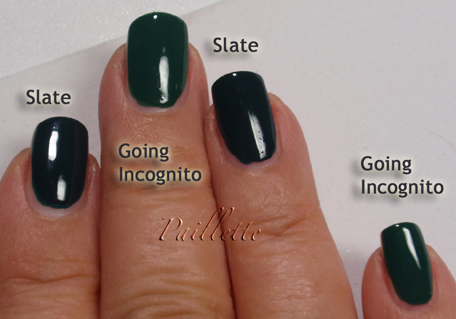
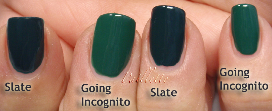
Here are some closer comparisons, just to show each polish off, not to imply that they are at all the same:


Here is a bottle shot, too. Mainly because I kind of like bottle shots:

Truth is I love Essie bottles. I love the name in raised letters and the squareness as well.
CQ always appear small to me, but really they are only slightly smaller, it's just that the bottle is a bit deeper so it disguises it. I think in the world of product marketing usually the opposite is true: make a small amount appear larger. The CQ bottles remind me of something rather old fashioned and almost Art Deco, which I do like a lot.
OK, that's it for now. I have to admit that I am still trying to use up those little linty polish removing cloths, but they are almost gone.
Thanks for reading my little nail polish journal!
Then I saw CQ 575 Slate. Hello Lover!

A deep petrol blue creme. Three coats here and a glossy finish sans topcoat. It photographs almost perfectly, I know I must not be lazy and always use two lights, or my pictures are a hot mess.
I am instantly and hopelessly in love with this creme. It is a bit muted, or "dusty" and yet it really is its own animal. Nothing that says "pine" or "teal" but just is wonderfully its own color.
I wanted to make sure it wasn't too green and was completely curious if I had anything close, but then I realized I wasn't up for a bunch of comps and I also suddenly realized I have to have a new category: blue greens or green blues. More drawer sorting!
OK, enough waxing on...the thing is that it's a great little polish, too. I had no trouble with application. Also, it dried quickly. There is no top coat, here, though. Frankly, it has really turned me onto creme finishes. Whoo! Talk about a change up! I am an unapologetic shimmer/foil/glimmer girl. Meme-tastic!
So, I did put on Essie's Going Incognito to kind of give a flavor for the blueness, yet greenness of this polish:
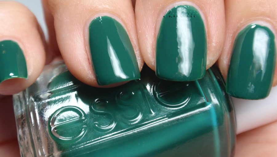
Essie comes through again: really love this formula a lot. Three easy-to-apply coats, dries even better than the CQ. A green that is really green with the slightest hint of blue, and also subdued. If this wasn't a subdued shade, it would scream "CHRISTMAS" and it really doesn't.
Here are some closer comparisons, just to show each polish off, not to imply that they are at all the same:
Here is a bottle shot, too. Mainly because I kind of like bottle shots:

Truth is I love Essie bottles. I love the name in raised letters and the squareness as well.
CQ always appear small to me, but really they are only slightly smaller, it's just that the bottle is a bit deeper so it disguises it. I think in the world of product marketing usually the opposite is true: make a small amount appear larger. The CQ bottles remind me of something rather old fashioned and almost Art Deco, which I do like a lot.
OK, that's it for now. I have to admit that I am still trying to use up those little linty polish removing cloths, but they are almost gone.
Thanks for reading my little nail polish journal!
Does Slate go black in regular room light? I like the color but have too many dark cremes that might as well be black.
ReplyDeleteIt is dark, and in low light, like a couple of tungsten bulbs in a couple of lamps around the room, yeah, it's pretty dark.
ReplyDeleteSo, on that, yes, black.
Not like true vamp that seems to take a lot of light to see the color, but in regular room light, I will say that it acts vampy.
:D
These colors are both amazing! What's funny is that I never realized you didn't wear many cremes. Aren't they awesome?
ReplyDeleteI admot this humble polish has turned my head!
ReplyDeleteSometimes I forget how amazing a simple creme can be!
:D
Admit...oops!
ReplyDelete