Back in 2014 Color Club did a "Made in New York" holiday collection. I only picked up the toppers, as the bases felt all to frosty and far too familiar in my collection.
I've blogged three here, with some new-to-the-blog bases, with a hold out for another day.
Big post, so enjoy!
First up is Lady Liberty.
She's a green glass fleck that pushes into a neon seafoam shade. I've never seen seafoam in any shade of green, but hey, it's a color that seems to be tres popular, wouldn't be surprised if Pantone brings it on next year.
Her it is over a deep green.
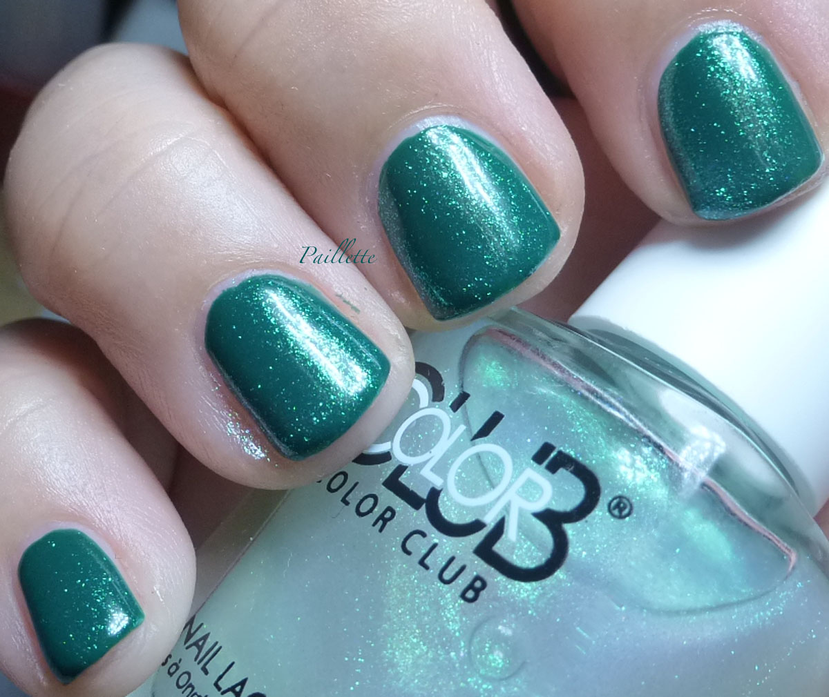
This is a rebottling of a trio of Walmart no name minis that came out years and years ago for their Halloween costume section. I snapped them up and truth be told, it's hard to top this green. Maybe Essie Going Incognito.
Here it is alone:
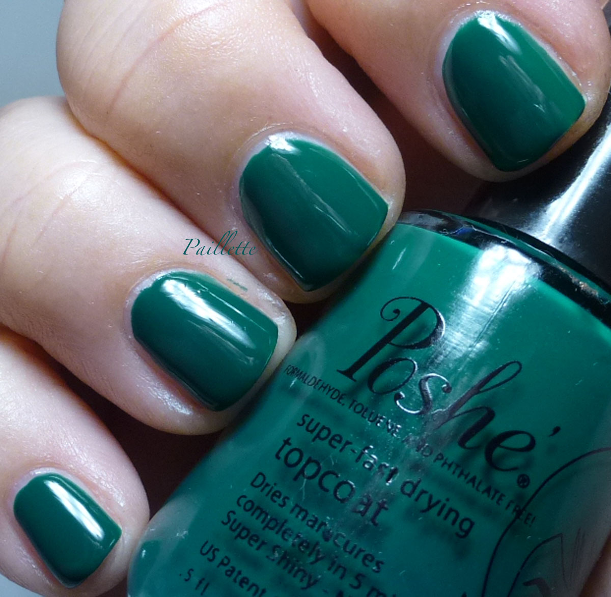
As a topper, Lady Liberty works very well. It needed another outing, I think it's a great polish.
Here is Lady Liberty over IBD Cashmere Cutie, a purply orchid pink.
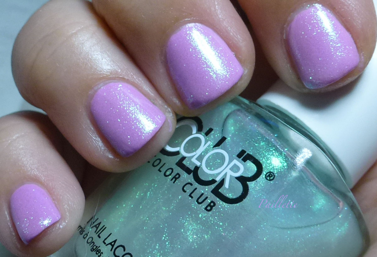
Since it is glass fleck instead of shimmer, it picks up the light much more readily than say a Pure Ice Heart Breaker. The green is less visible in this finish when the bright light hits it.
If I were trying to get a strong green effect over pink, I'd probably layer both.
Meanwhile, zero complaints on this one. If you only get one of this set, this is the one, it's the most unique of the bunch.
Next is Color Club Concrete Jungle
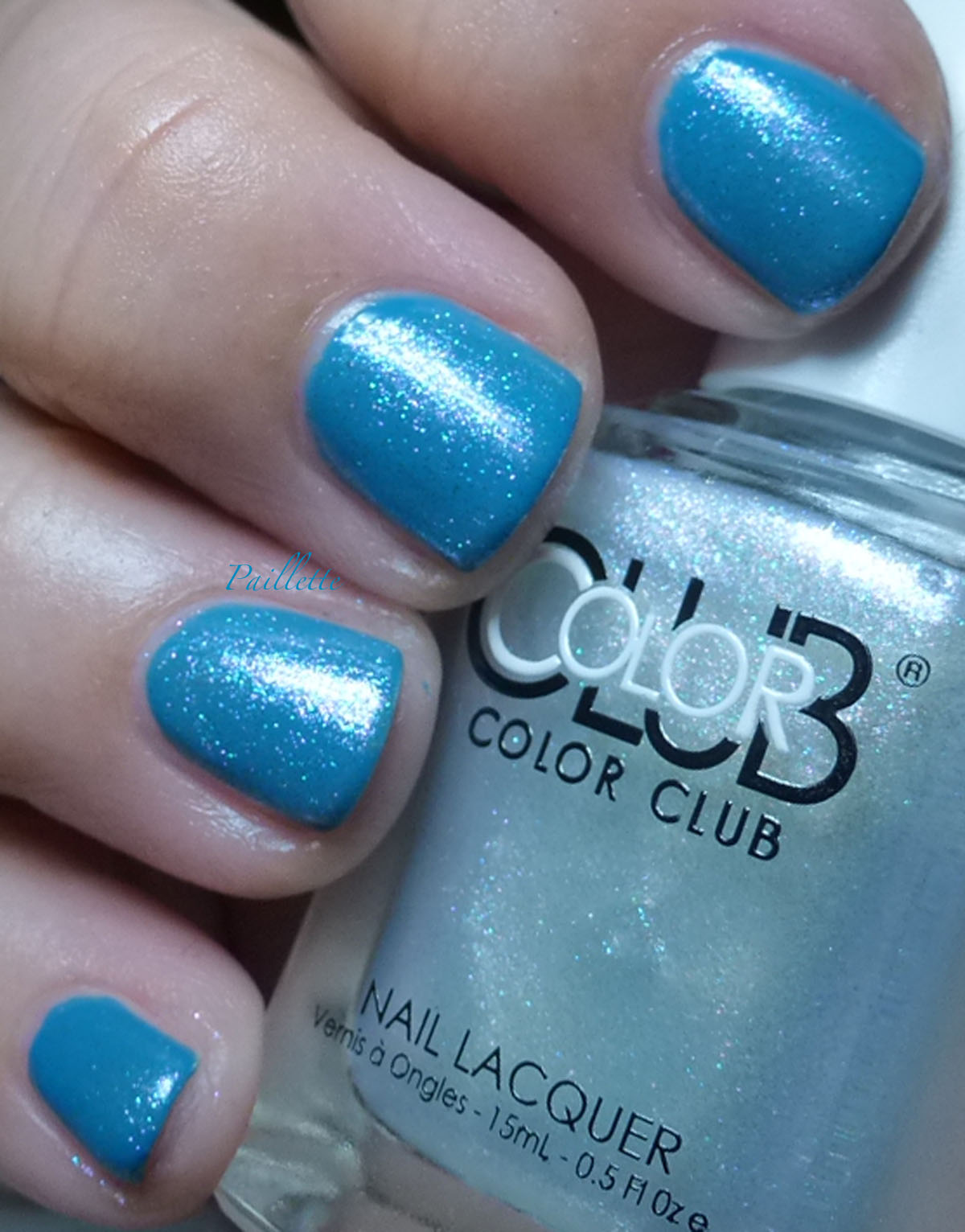
I put this over Zoya Frenzy.
Concrete Jungle is a silvery topper, fairly dense, with a combination of colors like pink, blue and a smattering of green. I find it a bit of a muddy silver with a pull into the aqua territory.
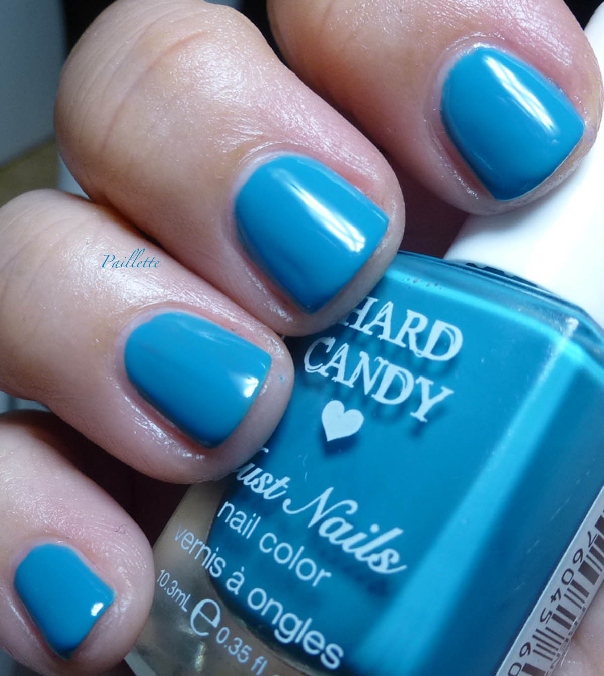
Here is Hard Candy Frenzy alone. It's a nice little polish, it's got a deep turquoise thing going on and I really haven't found one Hard Candy that disappoints. It's yet another winner.
Three easy coats and a glossy finish! Available on eBay and worth the price!
Here is Concrete Jungle over Elle Elle/Elle2Elle/LDL 207. A beautiful red creme I don't think I've blogged before, but doesn't seem to have its own photo.

You can see the density of the topper means that it can looks a little patchy: going on thicker here and there, so it is helpful to either thin or use it over a similar shade. Over the blue, I love, over the red, I'm not seeing a much excitement You can see the blue and pink in there, but it's scant.
Finally Color Club Million Dollar Listing
Here it is over OPI You Don't Know Jacques

A pretty golden sand shade that has beautiful pink shift that is hard to capture.
I find OPI YDKJ to be more of a yellow based taupe, and this works out very well.
Here's a better combo: over Essie Topless and Barefoot

Here the soft gold shimmer plays up nicely in the light. I'd call this "office ok" sparkle.
Very nice!! I definitely recommend this pretty sandy champagne shade.
There is a pink one, Bright Lights, Big City that I'll post soon. It's pretty as well.
Thank you for reading my little nail polish journal!
I've blogged three here, with some new-to-the-blog bases, with a hold out for another day.
Big post, so enjoy!
First up is Lady Liberty.
She's a green glass fleck that pushes into a neon seafoam shade. I've never seen seafoam in any shade of green, but hey, it's a color that seems to be tres popular, wouldn't be surprised if Pantone brings it on next year.
Her it is over a deep green.
This is a rebottling of a trio of Walmart no name minis that came out years and years ago for their Halloween costume section. I snapped them up and truth be told, it's hard to top this green. Maybe Essie Going Incognito.
Here it is alone:
As a topper, Lady Liberty works very well. It needed another outing, I think it's a great polish.
Here is Lady Liberty over IBD Cashmere Cutie, a purply orchid pink.
Since it is glass fleck instead of shimmer, it picks up the light much more readily than say a Pure Ice Heart Breaker. The green is less visible in this finish when the bright light hits it.
If I were trying to get a strong green effect over pink, I'd probably layer both.
Meanwhile, zero complaints on this one. If you only get one of this set, this is the one, it's the most unique of the bunch.
Next is Color Club Concrete Jungle
I put this over Zoya Frenzy.
Concrete Jungle is a silvery topper, fairly dense, with a combination of colors like pink, blue and a smattering of green. I find it a bit of a muddy silver with a pull into the aqua territory.
Here is Hard Candy Frenzy alone. It's a nice little polish, it's got a deep turquoise thing going on and I really haven't found one Hard Candy that disappoints. It's yet another winner.
Three easy coats and a glossy finish! Available on eBay and worth the price!
Here is Concrete Jungle over Elle Elle/Elle2Elle/LDL 207. A beautiful red creme I don't think I've blogged before, but doesn't seem to have its own photo.
You can see the density of the topper means that it can looks a little patchy: going on thicker here and there, so it is helpful to either thin or use it over a similar shade. Over the blue, I love, over the red, I'm not seeing a much excitement You can see the blue and pink in there, but it's scant.
Finally Color Club Million Dollar Listing
Here it is over OPI You Don't Know Jacques
A pretty golden sand shade that has beautiful pink shift that is hard to capture.
I find OPI YDKJ to be more of a yellow based taupe, and this works out very well.
Here's a better combo: over Essie Topless and Barefoot
Here the soft gold shimmer plays up nicely in the light. I'd call this "office ok" sparkle.
Very nice!! I definitely recommend this pretty sandy champagne shade.
There is a pink one, Bright Lights, Big City that I'll post soon. It's pretty as well.
Thank you for reading my little nail polish journal!
No comments:
Post a Comment
I love comments!
Please email me at paillette.a.nail.journal@gmail.com to add your blog to my blogroll instead of posting your blog here!
Thank you!
Did I mention I love comments?
:D